
R Graph Catalog. R Graph Catalog. About Vistat. Mathematical Annotation in R. R Core Team (R-core@R-project.org ) The R Project for Statistical Computing.
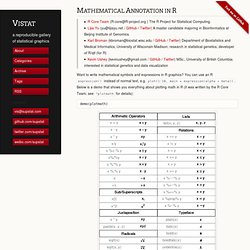
Lijia Yu (yu@lijiayu.net / GitHub / Twitter) A master candidate majoring in Bioinformatics at Beijing Institute of Genomics. Karl Broman (kbroman@biostat.wisc.edu / GitHub / Twitter) Department of Biostatistics and Medical Informatics, University of Wisconsin-Madison; research in statistical genetics; developer of R/qtl (for R) Kevin Ushey (kevinushey@gmail.com / GitHub / Twitter) MSc., University of British Columbia; interested in statistical genetics and data visualization Want to write mathematical symbols and expressions in R graphics? You can use an R expression() instead of normal text, e.g. plot(1:10, main = expression(alpha + beta)). Professor Bear F. Braumoeller. 10 Awesome Free Tools To Make Infographics.
Advertisement Who can resist a colourful, thoughtful venn diagram anyway?

In terms of blogging success, infographics are far more likely to be shared than your average blog post. This means more eyeballs on your important information, more people rallying for your cause, more backlinks and more visits to your blog. In short, a quality infographic done well could be what your blog needs right now. Designing An Infographic Some great tips for designing infographics: Keep it simple! Ideas for infographic formats include: Timelines;Flow charts;Annotated maps;Graphs;Venn diagrams;Size comparisons;Showing familiar objects or similar size or value. IDV User Experience. 10 tips for making your R graphics look their best. So you've spent hours slaving over the code for a beautiful statistical graphic in R, and now you're ready to show it to the world.
You might be printing it, embedding it in a document, or displaying it on the web. Don't do your graph a disservice by causing it to look anything less than perfect in its final venue. Here are 10 tips to help make sure your graphic will always look best. 1. Call the right device driver from a script It's tempting to just create graphics to the on-screen device (such as X11 on Linux or Quartz on MacOS) and then just use "Save As...
" from the menu. The best practice is to create a script file that begins with a call to the device driver (usually pdf or png), runs the graphics commands, and then finishes with a call to dev.off(). Png(file="mygraphic.png",width=400,height=350)plot(x=rnorm(10),y=rnorm(10),main="example")dev.off() 2. If you plan to print your graphic, you want to use a vector-based format. 3. Maps with R (I) « Omnia sunt Communia! This is the first post of a short series to show some code I have learnt to produce maps with R.
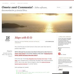
NOTE: Although the procedure described in this post is valid, there is a newer code version in one of the chapters of the book “Displaying time series, spatial and space-time data with R“ Some time ago I found this infographic from The New York Times (via this page) and I wondered how a multivariate choropleth map could be produced with R. Here is the code I have arranged to show the results of the last Spanish general elections in a similar fashion. Some packages are needed: Let’s start with the data, which is available here (thanks to Emilio Torres, who “massaged” the original dataset, available from here).
Each region of the map will represent the percentage of votes obtained by the predominant political option. The Spanish administrative boundaries are available as shapefiles at the INE webpage (~70Mb): (EDITED, following the question of Sandra). Then we shift the coordinates of the islands: Learning R. Sharp Statistics. Most ggplot2 tutorials start off using the qplot function or only use qplot.
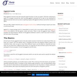
I find this confusing as qplot is a wrapper around the more versatile ggplot2 command. StatPlanet Map Maker – Interactive Mapping & Visualization Software. Ideas, issues, knowledge, data - visualized! Pearltrees - Google Chrome extension gallery. Data Scientist » Data Geek » Data Designer on Datavisualization. Catherine from visualizingeconomics.com has written an interesting article about the roles in data visualization.
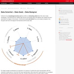
The posts that your reading right now are my thoughts about the diagram she created and how I would alter the stages in the process. I recommend reading her article first, as my answer is based on her thoughts. But here’s the diagram that illustrates well the basic idea: For highly complex visualizations it is important in my opinion to combine the visual representation with the interaction model early on. If we think that visual representation often starts with rough sketches it is my believe that interactivity should be treated the same way. The two fields strongly interact with each other and by planing the interactions together with the visuals the designer can find solutions to reduce information overload and to grant access to the needed information.
So, my suggestion would be to switch 6.refine with 7.interact. Tools on Datavisualization. A Carefully Selected List of Recommended Tools 07 May 2012 Tools Flash, JavaScript, Processing, R When I meet with people and talk about our work, I get asked a lot what technology we use to create interactive and dynamic data visualizations. To help you get started, we have put together a selection of the tools we use the most and that we enjoy working with.
Read more.