
Ha. Equilateral Confusion - chaotic triangles on an #equilateral grid. #generative #algorithm #art. Pixel Sorter sur Twitter : ".@L_Scanlon1: hi... On Generative Algorithms - Sand Creatures · inconvergent. When working on Sand Spline I got a few intermediary results that reminded me of cursive hand writing.
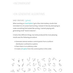
Instead of directly attempting to make something that looked like writing, I started playing with generating small "Sand Creatures". I tried a few different things, but what produced the most pleasing results was the following procedure: Generate several random control points from a uniform distribution confined to a sphere. Place them in an arbitrary order Create a B-spline from the control points in this order.
In order to add some texture to the shapes I make another spline by cloning the first set of control points, and offsetting all of them slightly at random. With a few changes you can also get quite different results, like the example below. The texture on these images would come out much better in a large print. Differential LatticeSand Glyphs. Scientific American sur Twitter : "The origin story behind @joydivision's album cover for #UnknownPleasures [VIDEO] #science. Pop Culture Pulsar: Origin Story of Joy Division’s Unknown Pleasures Album Cover [Video] The views expressed are those of the author and are not necessarily those of Scientific American.
![Pop Culture Pulsar: Origin Story of Joy Division’s Unknown Pleasures Album Cover [Video]](http://cdn.pearltrees.com/s/pic/th/division-pleasures-scientific-102248571)
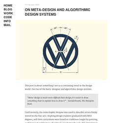
Sure, I was familiar with the graphic—and I’m not alone. Drop this image (right) on someone’s desk and chances are they’ll reflexively blurt, “Joy Division.” The band’s 1979 Unknown Pleasures album cover leaned entirely on a small mysterious data display, printed in white on black. No band name, album title or other identifiers. An interesting move for a debut studio album.
The cover image became an icon but remained mysterious. In late 2012 I saw the Unknown Pleasures album cover in a new light. As Saville explains, the cover is directly linked to a figure in The Cambridge Encyclopaedia of Astronomy (1977 edition)—a stacked plot of radio signals from a pulsar. Then, nearly two years later, when chatting with artist Philippe Decrauzat about his influences, my jaw hit the floor. 1. "Successive pulses from the first pulsar discovered, CP 1919, are here superimposed vertically. 2. 3. Metafont. One of the characteristics of Metafont is that all of the shapes of the glyphs are defined with geometrical equations.
In particular, one can define a given point to be the intersection of a line segment and a Bézier cubic. Mode of operation[edit] Unlike more common outline font formats (such as TrueType or PostScript Type 1), a Metafont font is primarily made up of strokes with finite-width "pens", along with filled regions. On meta-design and algorithmic design systems. 15 February, 2015 This post is about something I see as a continuing trend in the design world: the rise of the meta-designer and algorithmic design systems.
“Meta-design is much more difficult than design; it’s easier to draw something than to explain how to draw it” - Donald Knuth, The Metafont Book Until recently, the term Graphic Designer was used to describe artists firmly rooted in the fine arts. Aspiring design students graduated with MFA degrees, and their curriculums were based on traditions taught by painting, sculpture and architecture. Paul Rand once famously said: “It’s important to use your hands. This has obviously changed with the advent of computers (and the field of web design in particular), but not to the degree that one would expect.
So what is meta-design? As a simple example, take this logo for a concert hall in Portugal. 1 Design products are becoming increasingly dynamic, which makes it difficult to sustain a design process based on static prototypes. Architectural Letterforms Come to Life for ‘Deepblue Networks’ For a recent promotional campaign, German creative firm Deepblue Networks collaborated with illustrator and graphic designer Florian Schommer of Kjosk Collective to create a series of animated buildings using the letters of their logo.
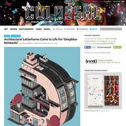
The 8 illustrations turn each letter of the logo into a multi-story building and imagines the staff working inside. You can see the full presentation here. On meta-design and algorithmic design systems.