
Kmetcalf - Silk. Excel. Walk through the analytical process one technique at a time.
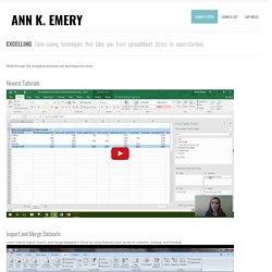
Newest Tutorials Import and Merge Datasets Learn how to import, export, and merge datasets in Excel by using features such as text to columns, vlookup, and hlookup. Organize Your Spreadsheets. A Data Journalism Expert’s Personal Toolkit. People regularly ask what tools to use or what programming language to learn for data-driven journalism (ddj).
There is no right answer for it, especially considering that technology and tools available are evolving quickly in the field. Nathan Yau from FlowingData recently described how he works in data visualization. His post applies perfectly to data-driven journalism tools: “What tool should I learn? What’s the best?” If you’re familiar with a software set already, it might be better to work off of what you know, because if you can draw shapes based on numbers, you can visualize data. I was interested to review my own toolkit. Before I dive into my typical workflow and tools for 2016 so far, I should mention that I work as the sole data journalist in my newsroom. Also, by ideology and because I am a nerd, I use (nearly) solely open-source free tools. Data Acquisition, Cleaning, Formatting. OpenRefine.
R: The R Project for Statistical Computing. Draw Freely. Updated collection: 298 data visualisation resources. Nicar15-solo-panel-tipsheet.md. Want to team up?
We're gauging interest in forming some kind of an informal group of lone data journalists to help us better connect and collaborate. If you're interested, please fill out our form and we'll go from there. Thanks! How to Present Data When You’re Presenting: Storyboarding Your Data Visualizations in Videos, Webinars, Presentations, and More. I remember the exact moment when I discovered–and got addicted to–data visualization.

I was an internal evaluator at a 300-person human services organization. Being an internal evaluator means your “clients” are your coworkers who work down the hall from you. You talk to each other about their data all the time. You build strong relationships. You also build friendships, and with these friendships come candid conversations and brutal honesty about data.
Open data tools on EU lobbying - POLITICO. The Data Visualisation Catalogue. How to make infographics: a beginner’s guide to data visualisation. As a growing number of international NGOs are using infographics, charts and interactive maps to share success and highlight disaster, how can organisations with less resources create high quality visualisations without having to pay to outsource them?
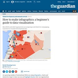
We’ve put together a beginner’s guide for visualising development data. Organising your data The first thing you need to do is have a clear idea of the data you want to visualise. Are you trying to highlight a particular disparity between money spent in one place and another? Are you trying to show a volume of activity going on in one location? Let’s imagine I’m running a campaign calling for better sanitation worldwide. While I have data for over 10 years, I just want the figures for 2000 and 2012, so the first thing I need to do is remove any irrelevant columns and rows (tip: save a separate copy of the original first). iLab: Immersive Visualization Lab. Recent years have seen rapid growth in new media technology that is redefining how media content is acquired or created, modified and displayed.
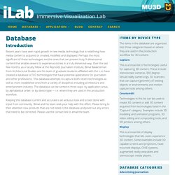
Perhaps the most significant of these technologies are the ones that can present truly 3-dimensional content that enable viewers to experience stories in a truly immersive way. Over the last few months, as a faculty fellow at the Reynolds Journalism Institute, Bimal Balakrishnan from Architectural Studies and his team of graduate students affiliated with the iLab have created a database of 3-D technologies that have potential applications for journalism and other professions.
This database attempts to capture both recent technologies as well as more established ones from a variety of disciplines including architecture and entertainment industry. The database can be sorted in three ways: by application areas, by alphabetical order, or by device type — i.e. where they are used in the production workflow. 38 great resources for learning data mining concepts and techniques - Import.io.
Tik Tok. Intro to Data Mashing and Mapping with Google Fusion Tables. Note: This was originally intended to be a short tutorial for students in my Data Journalism class that would be both a primer for basic data mashing concepts and a practical walkthrough for the latest iteration of Google Fusion Tables.
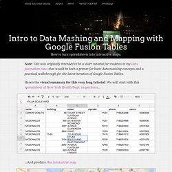
Here’s the visual summary for this very long tutorial: We will start with this spreadsheet of New York Health Dept. inspections… …And produce this interactive map (Note: This is just a non-interactive screenshot; Visit the full interactive page is here) If you’re new to data analysis and visualization, this guide is (hopefully) for you. It covers the most recent overhaul of Google Fusion Tables in 2013 but the concepts are meant to be universal. Table of contents Prerequisites and Background The tools. Data Journalism Tools - Silk. Fusion Tables Kiplinger OSU – Google Drive. Timeline JS3 - Beautifully crafted timelines that are easy, and intuitive to use. MIT – Docubase. Google News Lab – Mike Reilley. Tool: MULTIMEDIA STORYTELLING - How to find a form that fits the content. How to find a form that fits the content There is a form that suits every element of a story best – no matter if you're telling your story in print or online.
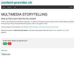
This tool helps you to decide which part of your story is best presented as text, pictures, video or as a graphic or chart. This tool is based on the Flowchart «MULTIMEDIA STORYTELLING - How to find a from that its the content». Start with the question «What is the story about?» And answer every question either with «yes» or «no». Is the story about (a) person(s)? Yes No (start over) ToDo-List Timeline Mit einem Timline-Tool knnen Text, Bilder und Videos auf eine Zeitachse dargestellt werden. Video-Portrt Ein Video-Portrt stellt einen oder mehrere Protagonisten vor. Beispiel: Animiertes GIF Animierte Gifs lassen sich einfach aus Video- oder Bildsequenzen erstellen, zum Beispiel auf ezgif.com Prozess in einem Video zeigen Prozesse, die von Auge sichtbar sind, kann man mit einem Video festhalten.
Animation. Excel Add-Ins - Silk. Silk – Publish your data online. The Data Visualisation Catalogue. Tabula: Extract Tables from PDFs. Timeline JS3 - Beautifully crafted timelines that are easy, and intuitive to use. Búsqueda avanzada de Google. VIS. Visual Investigative Scenarios platform: Pages. Tabula: Extract Tables from PDFs. A Data Journalism Expert’s Personal Toolkit.