

Wedding Invitation Designers. Graham & Brown Wallpaper, Wall Art & Paint online store, buy wallpaper direct from the manufacturer. 50 examples of logo design that cleverly use negative space in typography. Logos are symbols used to quickly communicate a brand to an audience, just one small logo design can communicate so much.
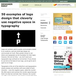
Many people choose to use letters and typography as the foundation for their logos. However, this can be tricky – you don’t want your typographic logo confused as normal text. If you choose to use text as the basis of your logo, you’ve got to set it apart as an image. Typography is the art of the letterform and typographers closely analyze and carefully craft every detail of each character – even the negative space, called the counter. We often ignore and overlook the counter space because that’s not what we normally read.
This logo design cleverly uses the image of its namesake to form the first two letters. Even without the words underneath, you’d know that the company behind this logo does something with electronics. Again, Wiesinger Music hints to their services through making their typography into an image. Elefont Effective Sports French Bakery Gecko Mosleep Human. Design - Toxel.com. Clever Business Cards April 27th, 2015 | Design | Unusual business cards help make a great first impression.
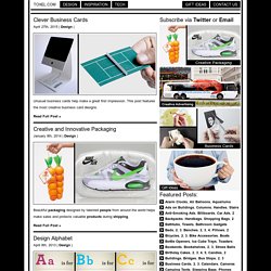
This post features the most creative business card designs. Read Full Post » Creative and Innovative Packaging January 9th, 2014 | Design | 40 Stunningly Creative Resume Designs on DeviantArt. A showcase Of Amazing Logo illustration. 40+ Letterpress Business Cards. We use colours to make our business cards unique.
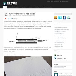
However, there are times when the absence of color can make our designs very elegant and pretty. The business cards featured in this entry are printed on paper stock using the printing process called letterpress. Letterpress printing is relief printing of text and image using a press with a “type-high bed” printing press and movable type, in which a reversed, raised surface is inked and then pressed into a sheet of paper to obtain a positive right-reading image. Letterpress business cards are a very popular choice, and in this post we’ll showcase 40+ letterpress cards. I think, that these examples will provide some inspiration if you are considering designing some new business cards. 1. 2. 3. 21 Folder Design Ideas to Impress Your Clients With. 27th October 2010, in Design Inspiration Presentation folders play an important role in marketing; they are used for document management and brand establishment.
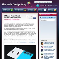
Therefore, businesses are always on the lookout for people who can create folder designs that will effectively sell their products and services. As a designer, you need more than the standard creativity to be able to create folder designs with unique competitive advantages. For a folder design to impress, it must be able to embody business processes while still having an aesthetic appeal. Of course, it’s never easy to create that balance. This is a guest post from Joan Esperida. Rating: 4.7/5 (16 votes cast) Joan Esperida Joan Esperida is a blogger who loves digital art. Design trends for 2011. Everything inside the design world is permanently changing, evolving and adapting into new ways of expression and communication looking to satisfy the new consuming needs and set innovative exchanging channels. 2010 made a huge closure for the final year of the first XXI century decade, we witnessed the rising of tablets (iPad, Samsung Galaxy Tablet among others), the demise of Internet Explorer 6 and the absurd fanaticism towards Flash (though it’s losing a lot of fans), which is going to be slowly replaced by HTML5 (we’re not saying that Flash is dead, only that HTML5 will begin to cover many of its current uses).
Editorial disclaimer Of course that the common design elements such as typography, navigability, color and more have also changed and as you will see on this article, these changes must be apprehended by every designer that wants to set his mark during 2011. No more clutter, it’s time to clean things up More good examples Don’t be shy, start playing with typefaces. Roger Oddone. 20 Unique and Creative Logo Designs. Logo is a symbol or emblem commonly used by companies and individuals to aid and promote instant public recognition.
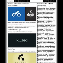
This post features our favorite examples of unique, memorable, and creative logos designed by talented artists from all over the world. Killed Productions Logo Clever logo designed by Sean Heisler for Killed Productions. [link] Spartan Logo Brilliant logo by Richard Fonteneau designed for Spartan golf club. Twins Logo Creative logo with “2″ instead of “N” designed by Action Designer. Negative space in logo design. It’s hard to beat a clever use of negative space.
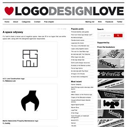
Here are 35 or so logos that use white space well, along with the designers/agencies responsible. A.G. Low Construction logo By Rebecca Low Martin Newcombe Property Maintenance logo By buddy. The Design Inspiration - Daily Logo Designs, Illustration Art, Website Showcase, Photos and Patterns. Identity Inspiration.