

4 essential UX rules taught by eye-tracking research. Don’t Use Automatic Image Sliders or Carousels, Ignore the Fad. Du zoning au mockup, itinéraire d'une maquette web. Il n’est pas toujours évident de s’y retrouver dans le vocabulaire, nouveau et souvent anglophone, de la conception web.
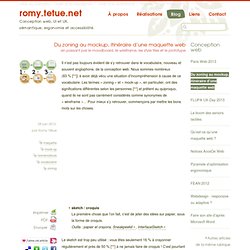
Nous sommes nombreux (83 % [**]) à avoir déjà vécu une situation d’incompréhension à cause de ce vocabulaire. Les termes « zoning » et « mock-up », en particulier, ont des significations différentes selon les personnes [**] et prêtent au quiproquo, quand ils ne sont pas carrément considérés comme synonymes de « wireframe »… Pour mieux s’y retrouver, commençons par mettre les bons mots sur les choses. sketch / croquis La première chose que l’on fait, c’est de jeter des idées sur papier, sous la forme de croquis.Outils : papier et crayons, Sneakpeekit, InterfaceSketch. Pourquoi leboncoin.fr est-il le premier site de ecommerce français ? Il faut le voir pour le croire.
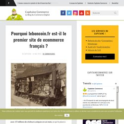
Le 1er site de ecommerce en France (selon les chiffres de Médiamétrie) en mars 2013 est Leboncoin.fr avec 17 millions de visiteurs uniques en un mois, ce qui le place à la 11ème position des sites les plus visités en France. Loin devant La Redoute ou Amazon (enfin, pas trop loin, quand même). Why Is Facebook Blue? The Science Behind Colors In Marketing. Editor's Note: This is one of the most-read leadership articles of 2013.
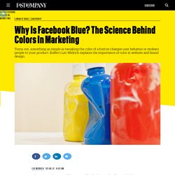
Click here to see the full list. Why is Facebook blue? According to The New Yorker, the reason is simple. To Infinite Scroll or Not to Infinite Scroll: Where We’ve Come So Far. Today we’re delving into the most relevant facts on how infinite scrolling turned out to become such an acclaimed technique all over the web, and why, despite its popularity, it’s not yet all that widely adopted in web design.
This feature appeared at a point in the history of the Internet when the amount of information to be presented on web pages increased, and the speed of connections allowed the reader to access and transfer information at greater rates. The question of infinite scrolling on web pages is one of the aspects involved in the user experience design, and isn’t as cut-and-dry as you might think. Beginnings and Popularisation At Google, it’s called continuous scrolling and can be also be referred to as endless scrolling. This technique is notably used in the news feed page on Facebook; the images search results page of Google and the Twitter timeline. Mobile Form Usability: Place Labels Above the Field. This is the 2nd in a series of 8 articles on mobile usability that draw on findings from our mobile e-commerce usability report.
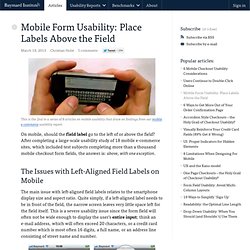
On mobile, should the field label go to the left of or above the field? After completing a large-scale usability study of 18 mobile e-commerce sites, which included test subjects completing more than a thousand mobile checkout form fields, the answer is: above, with one exception. The Issues with Left-Aligned Field Labels on Mobile The main issue with left-aligned field labels relates to the smartphone display size and aspect ratio. Quite simply, if a left-aligned label needs to be in front of the field, the narrow screen leaves very little space left for the field itself. GDS design principles.
Blog › Guidelines pour produire des PSD adaptés au web. Je préparais dernièrement un document pour un boulot afin de montrer à des boîtes de créa print comment faire des PSD propres pour le web.
Le but inavouable de la démarche était d’éviter de se retrouver avec des charniers inexploitables en intégration, chose qui arrive encore un peu trop souvent. Pas de règles de ninja ou de gimmicks avant-gardistes ici, juste des bonnes bases saines pour faire un boulot clean. J’ai omis sciemment les nouveautés CSS3 et autres gadgets pour me focaliser sur l’essentiel.
Après avoir soumis ma petite liste sur Twitter et à quelques copains, j’ai constaté que beaucoup avaient leur mot à dire sur la question et il m’a paru intéressant de publier la chose pour avoir des retours plus complets. Dernière modification : le 12 juin 2014. Préparer le fichier. Design Tip: Never Use Black by Ian Storm Taylor. One of the most important color tricks I’ve ever learned was to avoid using the color black in my work.
Mrs. Sticky Menus Are Quicker To Navigate. Advertisement Most designers would agree that navigation is one of the most critical components of a website.
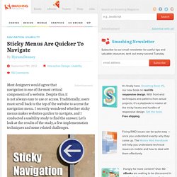
Despite this, it is not always easy to use or access. Traditionally, users must scroll back to the top of the website to access the navigation menu. I recently wondered whether sticky menus makes websites quicker to navigate, and I conducted a usability study to find the answer. Let’s look at the results of the study, a few implementation techniques and some related challenges. Sticky Navigation Defined. It's Not All Doom And Gloom On The Web. Advertisement In this article I’d like to discuss the changes happening on the Web and argue that its future is not as problematic and endangered as a lot of people make it out to be.
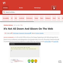
The article is based on the talk I’ve presented at the Smashing Conference1 a couple of days ago, and you can also see the slides2 and watch the screencast3 (see below). I have been developing websites professionally for the greater part of the last 15 years, and written quite a few books and a lot of articles. The Anatomy Of A Perfect Landing Page. 21 Beautiful Contact Pages. As web designers, each project you work on has a unique set of goals and requirements.
However, we all have one goal for all our projects – to impress people, creating the websites that are memorable. Who wouldn’t like this, right? To accomplish this purpose, we usually think of all kinds of content strategies or… For any website, content is the most important part. So, naturally, you would want it to be as simple and straightforward as possible, in order not to worry about viewers trying to understand the cryptic messages hidden behind poor color choices and messy fonts. One Page Portfolio. Hand-coded HTML and CSS is what I do. 16 Pixels: For Body Copy. Anything Less Is A Costly Mistake.