
CSS3 Layout. CSS3 Layout presentation at In Control Orlando. Today I spoke at In Control in Orlando on CSS3 Layout.
For a decade we’ve been using floats for creating CSS layouts, and while they’re still the best choice for creating most multi-column designs, we’ve all been frustrated by their quirks and limitations. So in this presentation, I talked about some of the new and exciting CSS layout techniques that are either working right now, right around the corner, or a little ways down the road. I focused on how Grid Layout and Flexible Box Layout (aka Flexbox) will be able to be used in the future to create layouts, but also how to use Flexbox in practical ways as a progressive enhancement technique for the layouts you’re crafting today.
You can view the slides on SlideShare, or download the slides here: CSS3 Layout (PDF, 2 mb) CSS3 Layout Demos I showed a few examples of how to use Grid Layout and Flexible Box Layout and wanted to share my demo files with you so you could poke around in the code if you like. Related resources. Learn CSS Layout.
Grid-layout. Display: inline-block et les espaces indésirables. La valeur inline-block de la propriété display est à la mode, même si elle demeure encore trop peu connue et mal utilisée.
Elle offre de multiples avantages dont le principal est de pouvoir disposer des éléments les uns à côté des autres, tout en étant dimensionnés et sans les retirer du flux. L'un de ses inconvénients majeurs est l'apparition d'un espace indésirable et incompressible de prime abord entre les blocs. S'il n'est pas gênant, tant-mieux; sinon, de multiples techniques plus biscornues les unes que les autres existent. Le cas «white-space» Comme tous les éléments de type inline ou de contenu textuel, les objets munis de la déclaration display: inline-block respectent la règle des caractères blancs (whitespace), c’est-à-dire que n’importe quel caractère HTML espaçant deux éléments va immanquablement apparaître entre leurs deux boîtes.
L’espace créé par le white-space est d'environ 4 pixels, mais ne vous y méprenez pas : cela varie selon les navigateurs et la taille de police. CSS display: inline-block: why it rocks, and why it sucks. Usually when you want a horizontal list, you need to use float in the CSS code to make it work, with all its drawbacks.
However, there is an alternative with display: inline-block. Problems with float The problem when you have float in your CSS code is that you need to take some precaution to make the surrounding element to encompass the floated elements, and also to avoid following elements in the code to sneak up next to it. Another problem is that if you have a floated list that will take up several rows (visually speaking) and the content is of varying height, you are in for a world of hurt.
Understanding CSS’s vertical-align Property. “Vertical-align isn’t working!”
Cried the web developer. The vertical-align property is one of those features of CSS that sounds pretty self-explanatory, but can cause problems for CSS beginners. I think even many CSS veterans have had problems figuring this one out at times. In this post, I’ll try to cover it in an understandable manner. What it Does Not Do The common misconception about vertical-align is that, when it’s applied to an element, it will make all the elements inside that element change their vertical position.
This reminds me of something we used to do back in the days of table-based layouts: <td valign="top"> Whatever... <td valign="top"> Whatever... In the case of this table cell example, the “valign” property (now obsolete in HTML5) would cause the elements inside of it to get pushed to the top of the table cell. But this is not how vertical-align works. What it Actually Does. The Perfect 3 Column Liquid Layout: No CSS hacks. SEO friendly. iPhone compatible.
Download this layout (25kb zip file).
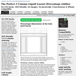
Percentage dimensions of the holy grail layout All the dimensions are in percentage widths so the layout adjusts to any screen resolution. Vertical dimensions are not set so they stretch to the height of the content. Maximum column content widths To prevent wide content (like long URLs) from destroying the layout (long content can make the page scroll horizontally) the column content divs are set to overflow:hidden. 800 x 600 Left & right columns: 162 pixels Center page: 357 pixels 1024 x 768 Left & right columns: 210 pixels Center page: 459 pixels The nested div structure I've colour coded each div so it's easy to see: The header, colmask and footer divs are 100% wide and stacked vertically one after the other.