

Writing DRYer vanilla CSS. 5 July, 2013 When dealing with code, we often strive to make things DRY.
DRY code usually means two things: Less actual code, meaning smaller file sizes, less for the user to have to download, more efficient code, etc.Less to have to maintain; not repeating yourself means that you can make fewer changes to your codebase. Simple, obvious stuff, I’m sure you’ll agree. When we talk about DRY CSS, we usually mention things like OOCSS, abstractions, variables in Sass, etc. When DRYing out code for maintainability, it is preferable to DRY out the things most likely to change, even if that does result in more code at the end. This is a fairly innocuous looking snippet of CSS; we simply want to pop different coloured borders on the top and bottom of a div.
Let’s rewrite this CSS a little more verbosely, but a lot DRYer (in terms of code that is likely to change): Or even: Far more CSS, but far less repetition! Another decent example, using borders again: Once again, more code, but far DRYer. Web Developer Checklist. How to Use BrowserID on Your Site - GitHub. iPhone Stencil Kit. Share Quickly sketch out iPhone UI prototypes.
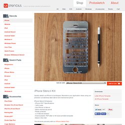
Brainstorm your application ideas using our precision cut stainless steel stencil and mechanical pencil. iPhone Stencil Kit features: - iPhone iOS 7 Specifications - 148% scale- One iPhone UI Stencil - Zebra mechanical pencil - Plastic protector - 2 UI Stencils stickers - Downloadable .PDF letter or A4 sized printable template - Made in the USA This kit works precisely with our iPhone Sketch Pad. Sticky Menus Are Quicker To Navigate. Advertisement Most designers would agree that navigation is one of the most critical components of a website.
Despite this, it is not always easy to use or access. Traditionally, users must scroll back to the top of the website to access the navigation menu. I recently wondered whether sticky menus makes websites quicker to navigate, and I conducted a usability study to find the answer. Let’s look at the results of the study, a few implementation techniques and some related challenges. Sticky Navigation Defined Sticky, or fixed, navigation is basically a website menu that is locked into place so that it does not disappear when the user scrolls down the page; in other words, it is accessible from anywhere on the website without having to scroll. Usability Study Research Conditions For the study, I created two test websites that were nearly identical. 1. 2. 100% Preferred Sticky Menus Without Knowing Why Desktop Software Navigation Menus.
L’accessibilité et le responsive : un certain conflit d’intérêt ? Si vous vous considérez webdesigner/intégrateur au top de votre art, vous êtes sans doute habitué à contempler les constantes nouvelles tendances que l’on voit défiler dans nos métiers.
Évidemment, j’imagine que vous ne vous autorisez pas à embrasser ces nouvelles tendances sans en remettre en cause les impacts sur les axes habituels de la qualité web (que ce soit par les dégradations apportées par la technologie en elle-même, ou parce que nous en sommes encore au stade de peaufinage des bonnes pratiques). Dans tous les cas, la “mode” du Responsive Web Design ne peut pas avoir échappé à votre radar, et vous vous êtes peut-être même trouvés en situation de tenter d’en décortiquer les usages pour vous faire un avis critique. Vous avez entendu à droite et à gauche “Le responsive, ça fait mal aux performances !”
Blog Archive » Cross-Browser Debugging CSS. I was helping Laura (a developer who works with me) learn about cross-browser debugging this week, which got me excited to share my process.
20 Free E-Books for Designers and Bloggers. The best way to learn something may be – keep that thing near to you whenever you want that, can you carry your books all the time with you to get some help in trouble situation?
Guess no! So the alternate might be E-books, the complete digitization of your printed material. GDS design principles. Les 10 lois du design - DesignMichel. Nous sommes des designers.
Enfin, nous essayons de notre mieux de l’être, honnêtement. A Real Web Design Application. The web and its related disciplines have grown organically.
I think it’s safe to say the web is not the domain of just the geeks anymore—we all live here. And those of us who work here should have sophisticated, native tools to do our jobs. How to Approach a Responsive Design. So I’ve got a confession to make: When we started working on the new Boston Globe website, we had never designed a responsive site before.
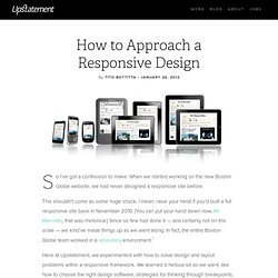
This shouldn’t come as some huge shock. I mean, raise your hand if you’d built a full responsive site back in November 2010. (You can put your hand down now, Mr. Marcotte, that was rhetorical.) Since so few had done it — and certainly not on this scale — we kind’ve made things up as we went along. The Smashing Book #2 (printed) Well-respected professionals have worked with us to provide exciting and comprehensive chapters: The Principles of Good Graphic Design, Matt Ward and Alexander Charchar This chapter looks at some key concepts of graphic design as they relate to modern Web design.

It looks at a number of the central elements and methodologies that drive the act of designing itself, and it discusses the sometimes subtle but always significant divide between the merely good and truly great. This chapter is about: The meaning of graphic design. The difference between good and great design. Visible vs. Usability Testing. Vol-763/posterB.pdf. The Shallows.