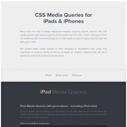

Master CSS pixels for Retina displays. CSS Media Queries for iPads & iPhones. iPad Media Queries iPad Media Queries (All generations - including iPad mini) Thanks to Apple's work in creating a consistent experience for users, and easy time for developers, all 5 different iPads (iPads 1-5 and iPad mini) can be targeted with just one CSS media query.

The next few lines of code should work perfect. iPad in portrait & landscape @media only screen and (min-device-width : 768px) and (max-device-width : 1024px) { /* STYLES GO HERE */} iPad in landscape @media only screen and (min-device-width : 768px) and (max-device-width : 1024px) and (orientation : landscape) { /* STYLES GO HERE */} iPad in portrait @media only screen and (min-device-width : 768px) and (max-device-width : 1024px) and (orientation : portrait) { /* STYLES GO HERE */ } iPad 3 & 4 Media Queries If you're looking to target only 3rd and 4th generation Retina iPads (or tablets with similar resolution) to add @2x graphics, or other features for the tablet's Retina display, use the following media queries. Vexing Viewports.
“The Web is Agreement.”

Jeremy Keith’s eloquent statement neatly summarizes the balance that makes it possible for us to build amazing things. Each week, new devices appear with varying screen sizes, pixel densities, input types, and more. As developers and designers, we agree to use standards to mark up, style, and program what we create. Browser makers in turn agree to support those standards and set defaults appropriately, so we can hold up our end of the deal. This agreement has never been more important. That’s why it always hurts when a device or browser maker does something that goes against our agreement. You see, Apple’s newest tablet, the iPad Mini, creates a vexing situation: Its device-width viewport tag defaults to the same values as Apple’s original iPad (768x1024 pixels), even though the Mini's screen is physically 40 percent smaller.
Two iPads, one too small. But Cupertino isn’t the only culprit out there. The trouble with pixels#section1 Enter viewports#section2. First, Understand Your Screen « James Pearce. I unashamedly maintain that there is so much more to being successful on the mobile web than dealing with screen size.

But I do accept that dealing with screen size is at least a first step. Thank goodness then, that the matter of screen size is so simple and well understood. Really? As web developers, we will often need to know the screen size of the device we are displaying content on. Perhaps on the server, perhaps on the client, perhaps to be used as a clause in a media query. But how best to measure it? Required reading at this point is PPK’s viewport article. But last week I pushed out an update to src.sencha.io which allows client-side screen size parameters. So for this blog post, I looked at a range of these metrics, and recorded their values for a variety of mobile browsers and page conditions. Methodology I’m sorry to say that the tests were run on emulators rather than real devices, but covered iPhone (iOS v5.0 and iOS v4.3), Android v2.3, Android v4.0, and Opera Mobile v11.0.
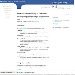
Browser compatibility — viewports. Page last changed today Related files: Last major update on 12 November 2013.

Here’s the inevitable compatibility table that goes with my viewport research. It treats the viewports themselves as well as some related items. position: fixed was moved to the CSS test pages. See A tale of two viewports for a further explanation of these terms. CSS pixels Expand and contract with zooming; it’s this pixels that are taken as measurement grid for all CSS declarations.
Device pixels Formal number of pixels on device. Device pixel ratio The ratio of physical pixel count and ideal viewport. Layout viewport The initial area of the HTML element. Visual viewport The actual screen viewport through which you look at the layout viewport. Ideal viewport The one you get when using width=device-width.
This table looks into the properties that are necessary to read out useful information about the three viewports and the two types of pixels. Test page. iOS 6 WebKit 536.