
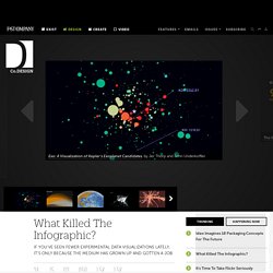
Money & Speed: Inside the Black Box (Marije Meerman, VPRO) SGB USS – L’inégalité en matière de fortune est grossièrement sous-estimée. Sondage représentatif de l'USS et d'Unia sur la répartition de la fortune en Suisse En Suisse, la fortune est répartie de manière extrêmement inégale.

Beaucoup plus que ce que nous tous le pensons. C’est la leçon d’un sondage représentatif réalisé auprès de 1 000 Suisses et Suissesses* que l’USS et Unia présentent sous forme d’une vidéo. Si nous pensons que les 20 % les plus riches possèdent plus de la moitié de la fortune privée totale, la réalité est par contre beaucoup plus violente. En effet, le cinquième le plus riche des Suisses et Suissesses possède six fois plus que tous les autres ensemble, soit 86 % de la fortune ! Die Wahrheit über die Vermögensverteilung in der Schweiz. What Killed The Infographic? A few years ago, the Internet was awash in groundbreaking data visualizations.
There was Aaron Koblin's deeply influential map of flight patterns around the U.S. Periscopic's exhaustive, haunting portrait of gun violence in the United States.
The Manufacturing Giant You've Never Heard Of. For an $18 billion manufacturer that has been around for more than 45 years, Jabil Circuit has a remarkably low profile.

But the St. The Work of Edward Tufte and Graphics Press. Edward Tufte is a statistician and artist, and Professor Emeritus of Political Science, Statistics, and Computer Science at Yale University.
He wrote, designed, and self-published 4 classic books on data visualization. The New York Times described ET as the "Leonardo da Vinci of data," and Business Week as the "Galileo of graphics. " He is now writing a book/film The Thinking Eye and constructing a 234-acre tree farm and sculpture park in northwest Connecticut, which will show his artworks and remain open space in perpetuity. He founded Graphics Press, ET Modern gallery/studio, and Hogpen Hill Farms LLC. Abstract - The Office For Creative Research. Ben Rubin Ben Rubin is an internationally renowned media artist based in New York City.
What Killed The Infographic? A few years ago, the Internet was awash in groundbreaking data visualizations.
The most racist places in America, according to Google. Where do America's most racist people live?
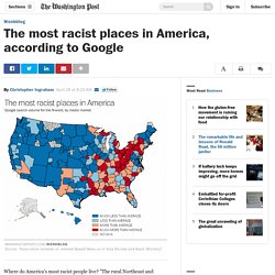
"The rural Northeast and South," suggests a new study just published in PLOS ONE. Porn data: visualising fetish space. Porn is one of the biggest yet worst-covered topics in popular discourse.
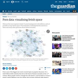
It’s a multi-billion dollar industry that sits at the heart of human sexuality in the 21st century. This is the best explanation of gerrymandering you will ever see. Gerrymandering -- drawing political boundaries to give your party a numeric advantage over an opposing party -- is a difficult process to explain.
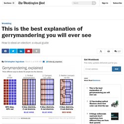
If you find the notion confusing, check out the chart above -- adapted from one posted to Reddit this weekend -- and wonder no more. Suppose we have a very tiny state of fifty people. Noticias. La Editorial Pontificia Universidad Javeriana publicó el Libro Tubérculos Andinos.

Conservación y Uso desde una perspectiva Agroecológica, que plasma los resultados de un proceso de investigación que durante tres años, llevaron a cabo las investigadoras Neidy Clavijo Ponce, María Teresa Barón y Juliana Combariza de la Facultad de Estudios Ambientales y Rurales en dos municipios del Departamento de Boyacá. Transformaciones culturales de la geografía colombiana. El profesor Arias, quien coordinó el equipo en los Llanos, hizo una lectura histórica de las formas en que ha sido concebida la naturaleza de esta región, primero como “natural”, para la ganadería extensiva, y más reciente y aceleradamente como “natural”, para la agroindustria a gran escala. A tale of four world cities – London, Delhi, Tokyo and Bogotá compared. Cities are not static. Like living organisms they change and adapt over time. Some grow and others shrink in response to economic, political and environmental shifts. But they do this in radically different ways, reflecting local responses to regional, national and global changes.
Recently, LSE Cities focused on the patterns of growth, governance, transport and density of the four national capitals of Japan, India, Colombia and the UK. The best stats you've ever seen - Hans Rosling. Information Is Beautiful. Interactive: Snake Oil Supplements? The scientific evidence for health supplements. See the data: bit.ly/snakeoilsupps. Martin Wolf on why trade imbalances matter - world brand:ft comment Video.
The Pentagon's $1.5 Trillion Mistake. What Happened to the Milky Way? Information Is Beautiful. How Top Designers Tell Clients That Their Taste Sucks.
Resources sin revisar. Processing. Edward Tufte. Big Data y Smartcities PARTE I: ¿Cómo adquirir información de las Ciudades Inteligentes? Visual Intelligence. Designing Data Visualizations. The beauty of data visualization - David McCandless. Data visualization- Collections at OpenProcessing. Programmes - Data Journalism Awards 2014. Emma Joy Lovell, Process Book, NSCAD University by Emma Lovell. N3t3t 1118314042infographics by Camilo Ramirez. Chartist Is An Elegant Solution To Responsive Infographics. On Tuesday, the editor-in-chief of The Verge tweeted that he deleted his site’s iPhone app (which won’t be updated any longer) in favor of using the new responsive website. Beyond the surprise that such a recently built website wasn't responsive in the first place, it proved once again that all news organizations must build websites that scale to different device sizes.
Part of having a responsive site, however, is making sure all the items on the site are responsive as well. Just scaling down the size of pictures and charts, which is what most sites do now, doesn't solve the problem.