

Make Your Mockup in Markup. We aren’t designing copies of web pages, we’re designing web pages.
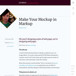
Andy Clarke, via Quotes on Design The old way I used to think the best place to design a website was in an image editor. I’d create a pixel-perfect PSD filled with generic content, send it off to the client, go through several rounds of revisions, and eventually create the markup. Does this process sound familiar? That process is whack, yo! Recently, thanks in large part to the influence of design hero Dan Cederholm, I’ve come to the conclusion that a website’s design should begin where it’s going to live: in the browser. Die Photoshop, die Some of you may be wondering, “what’s so bad about using Photoshop for the bulk of my design?” The application Adobe Photoshop CS4 has unexpectedly ruined your day. Photoshop’s propensity to crash at crucial moments is a running joke in the industry, as is its barely usable interface. Text rendered in Photoshop (left) versus Safari (right). A necessary evil? Get started by getting naked. Mockup in Markup: My Blog: Graham Miller. By Graham Miller Fifteen Reasons Why I Design in a Browser, Rather than Photoshop.
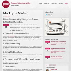
I believe 'design' isn't about how it looks, it's about how it works. Photoshop is a great tool, and it used to be the second part of my design process (after I'd made a start with a pencil and a bit of paper), but I changed, and these are the reasons why: 1. You Can Put the Content First As a certain Jeffrey Zeldman said "Content precedes design. 2.
User experience enhancements with jQuery and CSS3 can't be seen in a flat psd. 3. Need some assistance? 4. Spending too much time on small aesthetic details at the cost of usability issues can be damaging to the success of the site. 5. Don't like that column on the right? Style Tiles. Responsive Web Design in the Browser Part 2: The Tools. Now that we’ve killed Photoshop, we need to get into the nitty gritty of how to still make a living without our favorite, yet most frustrating app.
After all, talking about what’s broken without offering a solution doesn’t do anyone any good. In this second installment of Responsive Web Design in the Browser, I want to talk about what I use everyday to try and escape the gnarly grasp of the Photoshop beast. It’s not a perfect system yet, but it’s getting better everyday. I hope this gives you a starting point and a few resources to develop your own process for designing in a post-Photoshop world. Important note: You may be a designer that designs only in Photoshop and you’ll argue that this article suggests that all designers should code. Responsive Web Design in the Browser Part 1 : Kill Photoshop. If you’re like me then you’ve had a love/hate relationship with Photoshop for almost a decade.
The software is bloated, it crashes right at the moment you forgot to hit save, and it produces a design that is nothing more than a useless and non-functioning image to send to clients. Despite loathing the software that is the staple of our industry, we can’t live without it. High fidelity mockups have spoken in a way that we just can’t beat with any other applications… until now.
Let’s explore the next stage in the evolution of the web and one where Photoshop is a waste of our valuable time. Here’s how to kill Photoshop and do responsive web design in real-time with the only app we need: the browser. Why Kill Photoshop? 1. The main reason to kill Photoshop is because it doubles or even triples your current workload. 2. This brings me to my second point. 3. If you’re designing in the browser you can make changes to your design in real-time. Client wants a red headline? Has responsive design killed Photoshop for web designers? Design Short Audio Tips: The estimated time to read this article is 2 minutes Subscribe to these quick tips using iTunes or RSS | Download Audio If you follow me on Twitter, you will know that I have been in Germany speaking at the Smashing Conference.
It was a superb conference; I learnt so much and got to hang out with some amazingly talented people. Unsurprisingly, the one theme that ran through the entire event was responsive design and the fact that we have no idea how people are viewing our sites. Of course this has always been the case, but as Jeremy Keith pointed out, as web designers we have participated in a consensual hallucination that somehow we could define the users viewing experience. But with the explosion of devices capable of accessing the web, it is becoming harder than ever to maintain that hallucination. This obviously has a huge number of consequences. After all the first thing you do in these tools is set a canvas size.