
The long, incredibly tortuous, and fascinating process of creating a Chinese font. The story of Chinese characters begins with, of all things, turtle bellies.
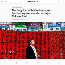
The kings of the Shang Dynasty—which ruled from the 16th to the 11th centuries BC—had questions. Questions about what the king should do, like whether to “perform a ritual for Father Ding and offer to him thirty captives from the Qiang nomad tribe as well as five penned sheep,” according to one translation (pdf, p. 5). As with many ancient human-rights abusers, the king turned to his royal soothsayers to decide the lives of these captives. The soothsayers etched these pressing questions directly onto the shoulder blades of oxen and the under-shells of turtles, which are also known as plastrons. They then poked the inscribed animal parts with hot metal rods until cracks formed.
Tens of thousands of these etchings, known as “oracle bones,” have survived all the way to today. The long, incredibly tortuous, and fascinating process of creating a Chinese font. What It's Like To Design A Font From Scratch. Steve Matteson has designed some of the most ubiquitous typefaces in the world, and engineered the original core fonts for Microsoft, adapting Times New Roman, Arial, and Courier, which you've probably used for term papers or resumes or anything else you wrote in Word.
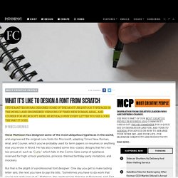
He has also created some less-classic designs that he's not too proud of, such as "Curlz," which falls in the Comic Sans camp of typefaces reserved for high school yearbooks, princess-themed birthday party invitations, and mockery. But that is the plight of a professional font designer: One day you get to make lasting letter sets, the next you have to pay the bills. "Sometimes you have to do work that you're not really proud of," Matteson, the creative type director at Monotype, told Fast Company. "That's why we call it work instead of play. " Matteson's interest in words began as a teenager, and he set up a printing press in his basement. Designing Typefaces Is More About Restraint Than Freedom. FOOD TYPE. Why Don't Online Readers Like Italics? You can see just about anything you want on the Internet, for better or worse, but one thing you don't come across very often is a major news site that's heavy on italics.
So it was striking to see the recently restyled New York Times homepage feature large, italicized headlines running down the left side of the page. Choosing the perfect Typeface – Cucumbertown’s journey. Update: Cucumbertown is in midst of a design overhaul.
We are now focusing on mobile and web and the design changes are not yet reflected on the site. Subscribe, if you want to keep yourself updated. The journey is exciting and we are chronicling everything. Typographic conscience hit the web design world quite some time ago. Negative Space. Chineasy - Where characters are revealed. The Kama Sutra Project — A-Z. Alfabeto de siluetas desnudas de Anastasia Mastrakouli: el lenguaje vuelto carne y expresión (FOTOS) Show captions Showing image 1 of 27 Oír los pensamientos,ver lo que decimostocarel cuerpode la idea.
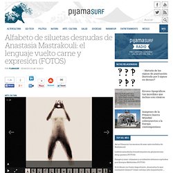
Octavio Paz, “Decir: Hacer” El cuerpo humano es, sobre todo, un vehículo de comunicación, un medio que transmite y vincula por medio de un lenguaje que en cierta forma es y no es ese mismo al que estamos acostumbrados, pues aunque parte inevitablemente de este, en cierta forma se transmuta y se purifica, pero curiosamente al mismo tiempo cobra una dimensión totalmente real y física: se encarna. En un ejemplo sumamente literal del lenguaje vuelto cuerpo, la artista de origen griego Anastasia Mastrakouli ideó un “Alfabeto de Siluetas Desnudas”, imágenes en las que de lejos se alcanza a distinguir el perfil de las letras del alfabeto latino, pero una mirada atenta nos las revela formadas con un cuerpo femenino, nada menos que el de la propia Mastrakouli. Quizá ahora cabría preguntarse qué palabras, qué frases, qué líneas se escribiría con esta singular tipografía. En Faena Sphere: Going Glitch: 15 Logos From The Post-Computer Era. One way to subvert the sleek, unctuous image of corporate greed is to mess shamelessly with company logos--distorting, fragmenting, and distressing the symbols that are synonymous with capitalism.
Well, that used to be the case back in the 1990s, before companies decided to stop being square and learn how to do the subverting themselves, in the name of "cool. " (See Thomas Frank’s seminal book, The Conquest of Cool, for more on that phenomenon). Today, even big players like Nike often take risks with their brand mark, enlisting designers to twist their identities to the point of near-illegibility. A techno-collage identity for an experimental film. A hand-painted font for a band, made while listening to their music. A limited-issue Nike Hyperdunk logo, which looks inspired by industrial manufacturing. In The Political Realm, Typography Is Power. Protest has gone undeniably digital since the Arab Spring, with online tools guiding and broadcasting protest.
One vestige of the '60s still hangs on though: the handwritten poster, which is much in evidence at rallies and walks across the country (and world). Voices, a new book by German publishing house Cake, examines the DIY type design found on protest signs, investigating why a scrawled slogan has greater power to move us than a well-set Helvetica or Univers.