background preloader

GRID / LAYOUT TOOLS

Facebook Twitter

Gridset. The Semantic Grid System. Style Tiles. Multi-Device Layout Patterns. Through fluid grids and media query adjustments, responsive design enables Web page layouts to adapt to a variety of screen sizes. 
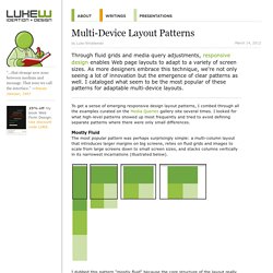
As more designers embrace this technique, we're not only seeing a lot of innovation but the emergence of clear patterns as well.

I cataloged what seem to be the most popular of these patterns for adaptable multi-device layouts. To get a sense of emerging responsive design layout patterns, I combed through all the examples curated on the Media Queries gallery site several times. I looked for what high-level patterns showed up most frequently and tried to avoid defining separate patterns where there were only small differences. Mostly Fluid The most popular pattern was perhaps surprisingly simple: a multi-column layout that introduces larger margins on big screens, relies on fluid grids and images to scale from large screens down to small screen sizes, and stacks columns vertically in its narrowest incarnations (illustrated below).

Column Drop Layout Shifter. Responsive Layouts, Responsively Wireframed. Responsive layouts, responsively wireframed Made with HTML/CSS (no images, no JS*) this is a simple interactive experiment with responsive design techniques. 
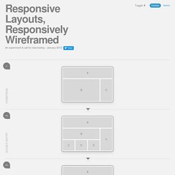
Use the buttons top-right to toggle between desktop and mobile layouts. Using simple layout wireframes, this illustrates how a series of pages could work across these different devices, by simulating how the layout of each page would change responsively, to suit the context. Responsive layouts? Producing static wireframes to design layouts for websites, web applications and user-interfaces has worked well for a long time. However, this solution creates a new problem: How should we go about the process of designing these variable layouts?

Enter, responsive wireframes? The 'wireframes' on this page (which are only very simple, high-level examples) were created with HTML/CSS, and some argue that this is the answer; to design in the browser. So which is better? Traditional wireframes? HTML? So, what's the answer? Just wondering... SimpleGrid.