
50 Totally Free Lessons in Graphic Design Theory. Understanding Visual Hierarchy in Web Design. Visual hierarchy is one of the most important principles behind effective web design.
This article will examine why developing a visual hierarchy is crucial on the web, the theory behind it, and how you can use some very basic exercises in your own designs to put these principles into practice. Republished Tutorial Every few weeks, we revisit some of our reader's favorite posts from throughout the history of the site. This tutorial was first published in October of 2010. Design = Communication At it's core, design is all about visual communication: To be an effective designer, you have to be able to clearly communicate your ideas to viewers or else lose their attention.
To figure out why this is true, it's important to understand a little bit about the way that we see things. Chances are, you don't see "two circles"; Instead, you saw "one black circle and one smaller red circle". Let's now look at a more complex image: The Dawn of Hierarchy Consider the following image of two text blocks: Size. Teach Yourself Graphic Design: A Self-Study Course Outline. How Designers Can Avoid Making Mistakes. Principles of Design - Explore the Principles of Graphic Design - Examples and Tutorials.
Take Your Web Design Skills From Amateur To Professional. When I first set out to design websites I was a bit lost.

I entered the field from the development side and didn’t have a formal design degree. While I’ve always trusted my eye to tell me what was good and what wasn’t, my eye often told me my early designs fell more into the wasn’t category than the was. When I talk to others first embarking on a web design career, I get the feeling my experience isn’t so unique. The good news is a few basic principles of design can dramatically improve your skills and help take your designs from amateur to professional.
These principles have an easy to remember and ironic acronym. Because these principles are so important I think a series of posts is in order. I first learned all these principles from Robin Williams (no, not that Robin Williams) book The Non-Designer’s Design Book. As luck would have it as I was preparing this post I discovered Andrew Houle wrote a very similar post on myInkBlog. Alignment Repetition Take a look too at the sidebar. Five Bad Client Types to Avoid. The focal point of your graphic designing business is ‘The Client’.
Without a client, you are merely fulfilling your passion as a graphic designer and nothing else. A client is your chief source of income and is critical to your survival in the design business. But you mustn’t get overly dependent on clients. Some clients are such that they become a torture for graphic designers. They can do things that are out of the limitations of a client-designer relationship.
Here are some characteristics that will help you identify a potential troublemaker client so that you can avoid them. The ‘know-it-all’ clients Some clients have a knack of acting over-smart in front of the designers. 7 Key Principles That Make A Web Design Look Good. Oct 15 2009 By Juul Coolen Everyone and their grandfather (and dog) seems to have a website these days.
The Web is getting more crowded by the day, with literally dozens of websites being added as you read this article. It is becoming harder and harder to get noticed among the masses. Design Basics: Proximity To Know What Belongs With What. So far in this series we’ve taken an amateur design and improved it in several ways.
We aligned design elements to provide a sense of order, we used repetition to create visual themes, and last week we used contrast to differentiate elements and call attention to them. Today we’ll talk about the last of the four basic design principles, proximity. Proximity is about grouping related items. It lets you know at a glance that one sentence describes an image, while another sentence has nothing to do with that image.
Proximity uses space to show similarity between elements and gives visual clues as to what goes with what. Gestalt Principles Applied in Design. By Michael Tuck Web designers, like other artists and craftsmen, impose structure on the environment.

We enforce order and beauty on the formless void that is our blank computer screen. We do it in different ways — creating an organized layout first, writing text and content first, or even basing a design concept on an image, a color palette, or something that visually trips your trigger, whether it’s a sunset or a Song Dynasty painting. Wherever you gain your inspiration, it’s often not just the particular element that sparks your artistic impulse; it’s the totality of the element and its surroundings. Grasping that totality concept — both the individual element and the whole in which it exists are important both separately and together — is essential to understanding how gestaltism influences our design choices.
Gestalt Principles of Perception: 1 - Figure Ground Relationships. Almost everything that makes graphic design work can be found in a set of laws and principles collectively known as the Gestalt principles of perception.
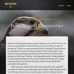
There is no more powerful tool at a designer’s disposal than a comprehensive grasp of these principles. By the same token, those who don’t have a good grasp of them are lost when faced with design projects and often go “fishing” on design gallery sites, being relegated to cliché motifs and layouts. But clients deserve better than our vague understanding. If you haven’t already, resolve to learn the Gestalt principles of perception. Why learn this stuff? The name makes them sound complicated, but Gestalt principles are not so difficult to get your head around. First, here are simple definitions for the Gestalt principles of perception: Figure Ground Relationship Elements are perceived as either figures (distinct elements of focus) or ground (the background or landscape on which the figures rest).
A Look into Color Theory in Web Design. Unarguably one of the most important aspects of any design is its colors.
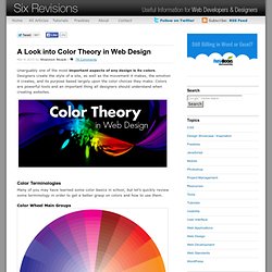
Designers create the style of a site, as well as the movement it makes, the emotion it creates, and its purpose based largely upon the color choices they make. Colors are powerful tools and an important thing all designers should understand when creating websites. Color Terminologies Many of you may have learned some color basics in school, but let’s quickly review some terminology in order to get a better grasp on colors and how to use them.
Color Wheel Main Groups Colors are traditionally shown in a color wheel, and from this wheel, we can separate colors into three main groups: primary, secondary and tertiary. The three primary colors are red, blue and yellow. Mix the primary colors together, and you get the secondary colors. Tertiary colors are comprised of the middle colors like yellow-green and blue-green.