
The Geography of Well-Being. Economic growth has long been the basic metric through which we evaluate economic and social progress.
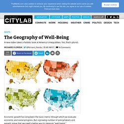
But a growing number of policymakers and experts argue that we need a better way to measure “well being.” In a report released today, the Social Science Research Council’s Measure of America project takes a crack at it with their own metric. Inspired by the UN’s influential Human Development Index for nations, their American Human Development Index develops measures of well-being for America’s 435 congressional districts (plus Washington, D.C.). This allows us to see how patterns of uneven and unequal socio-economic well-being exist not just between but within many of America’s largest metros. The overall index is based on three key dimensions of well-being: A long and healthy life, as measured by life expectancy at birth.
The overall American Human Development Index is graded on a one to ten scale, with ten being the highest score. Top image: SSRC/Aarian Marshall. Mapping Migration in the United States. On Thursday, we published a series of interactive charts showing how Americans have moved between states since 1900.

The charts show striking patterns for many states: You can trace the rise of migrant and immigrant populations all along the Southwest, particularly in Texas and Arizona; the influx of New Yorkers and other Northeasterners into Florida starting in the 1970s; and the growth in the Southern share of the Illinois population during the Great Migration. In 1900, 95 percent of the people living in the Carolinas were born there, with similarly high numbers all through the Southeast. More than a hundred years later, those percentages are nearly cut in half.
The Best and Worst Places to Grow Up: How Your Area Compares. How much extra money a county causes children in poor families to make, compared with children in poor families nationwide.
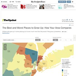
Manhattan is very bad for income mobility for children in poor families. It is better than only about 7 percent of counties. Location matters – enormously. If you’re poor and live in the New York area, it’s better to be in Putnam County than in Manhattan or the Bronx. Not only that, the younger you are when you move to Putnam, the better you will do on average. But even Putnam County is below the national average. These findings, particularly those that show how much each additional year matters, are from a new study by Raj Chetty and Nathaniel Hendren that has huge consequences on how we think about poverty and mobility in the United States.
Consider Manhattan, the focus of this articleour best guess for where you might be reading this article. Countybluered. 2050 Map Megaregions2008. Red State, Blue City: How the Urban-Rural Divide Is Splitting America - Josh Kron. Partisan lines that once fell along regional borders can increasingly be found at the county level.
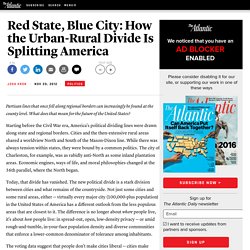
What does that mean for the future of the United States? Starting before the Civil War era, America's political dividing lines were drawn along state and regional borders. Cities and the then-extensive rural areas shared a worldview North and South of the Mason-Dixon line. While there was always tension within states, they were bound by a common politics. The city of Charleston, for example, was as rabidly anti-North as some inland plantation areas.
Today, that divide has vanished. The voting data suggest that people don't make cities liberal -- cities make people liberal. The only major cities that voted Republican in the 2012 presidential election were Phoenix, Oklahoma City, Fort Worth, and Salt Lake City. The gap is so stark that some of America's bluest cities are located in its reddest states. This divide between blue city and red countryside has been growing for some time. Place. Richard Florida and Bill Bishop, in their different ways, have pointed out the increased geographic clustering of the educated/creative classes.
Broadly speaking, the creative classes tend to cluster in urban areas near oceans, leaving the vast middle “hollowing out,” as Richard Longworth put it. This wasn’t always true. As late as the 1970’s, middle-class life in, say, Ohio wasn’t all that different economically or politically than middle-class life in New Jersey. (New York City was always something of an outlier.) But various dynamics over the last generation or two have clustered demographic likes with likes. Most community colleges in America were built before what Bishop calls The Big Sort. I was reminded of that in looking at this story in IHE, and especially at the accompanying map. The divergence shows up in a number of ways. It also means that issues of cultural ‘fit’ are growing more complicated. CSA-maps-SMS-vs-Phone-small. Half Of The United States Lives In These Counties.