
Untitled. 4 tendencias en diseño web para 2016. Mirar hacia el futuro está de moda y nosotros no íbamos a ser menos.
Os contamos cómo van a ser las tendencias en diseño web del 2016. Ni somos Martin McFly ni tenemos un Delorean y tampoco una tía tarotista. Pero te contamos cuáles van a ser las tendencias en diseño web en 2016. Nuevo Diseño Flat Google nos lo presentó hace ya (casi) un par de años, la digievolución de lo que ya era una realidad. No sabemos si esta historia es más un cuento que un hecho real. Ejemplos:Material InteractionCanaltp Tipografía Otra de las tendencias en diseño web que veremos cada vez más frecuentemente es el uso expresivo de la tipografía. Tus conocimientos tipográficos serán fundamentales para conseguir un buen resultado, si eres principiante sudarás con esta técnica. Ejemplos:White Frontier BreweryVintage hope Animaciones No es ningún secreto que las animaciones bien utilizadas enriquecen notablemente la experiencia dentro de cualquier web, sea cual sea su propósito.
Ejemplos:Le MugsFor better coffee. Awwwards - Website Awards - Best Web Design Trends.
Slide and Push Menus. Fixed menus that will slide out from the sides of the page and in case of the right and left side optionally move the body.
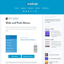
View demo Download source A set of fixed menus that will slide out from any of the edges of the page. The two menus that slide out from the left and right side can also be used in combination with the body moving to the left or right side, respectively, hence being “pushed”. There are examples of how to trigger the opening and closing of the menus and some example media queries. The HTML The CSS Note: Classie is being used here – class helper functions by @desandro. Slide and Push Menus. 12columns ~ margin:20px — based on the Simple Grid system.
Intacto 2013 FLAT DESIGN vs REALISM. Intacto 2013 FLAT DESIGN vs REALISM. Top 10 Fonts Web Designers Love - Hongkiat. When I was starting out with Web and graphic design, I was always wondering about the fonts that real designers use.
So I conducted a research to find out the most popular fonts designers like to use, their best practices, and also out of personal curiosity, their typographical needs. It would be nice to know which font is good for which situation and today I am sharing with you the results of my research. Through a combination of data collected from Polldaddy, Forrst, Facebook and Twitter, I got feedback from 34 designers from 14 countries answering questions about their favorite fonts and explaining to me why they love them.
By analysing all the input submitted I have uncovered some interesting information, which has been put together in an infographic by friends in Piktochart. Below that, check out the Top 10 list of free and premium fonts, and some of the interesting reasons why designers have their favorite fonts. Click on image to see in full scale. Top 10 Favorite Free Fonts Jr! 100 Days of Fonts. The full-stack employee. What is a full stack employee?
Just as there are full-stack engineers and full-stack startups, the full-stack employee has a powerful combination of skills that make them incredibly valuable. They are adept at navigating the rapidly evolving and shifting technological landscape. They make intuitive decisions amidst information-abundance, where sparse facts mingle loosely with data-drenched opinions.
Full stack employees are capable of speaking design lingo, know that using Comic Sans is criminal, and are adept at making mocks in Keynote, Sketch, or Skitch (if it comes to that). And they know the difference between UI and UX. They can cross the aisle to talk to engineering and can make sense of algorithms, programming, and instinctively understand that scaling the backend isn’t the same as scaling the frontend. They’re on the latest social apps, and know how to self-promote. CSS Puns & CSS Jokes ~ Curated by Saijo George. Best Practices For Call To Action Buttons - Lockedown Design. Call to action buttons are exactly what they sound like — buttons on forms that entice your customers to take action.
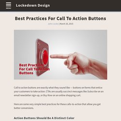
CTAs are usually succinct messages like Subscribe on an email newsletter sign-up, or Buy Now on an online shopping cart. Here are some very simple best practices for these calls-to-action that allow you get better conversions. Action Buttons Should Be A Distinct Color Every website has a color palette. But your call-to-action buttons should be a different color than anything else on your site. The color that you pick for your CTAs should also fit within the color scheme for your website, no doubt about that. Many designers will obsess over what color to make their CTA buttons. The most important thing is to make the call-to-action a contrasting color from the rest of the color palette. Concise, Descriptive Text There’s a few things I’ve heard recently that have made me shift how I think about button text.
The examples from above now become Show Me My Free Report. Customize and download. Bootswatch: Free themes for Bootstrap. Design. Can I use... Support tables for HTML5, CSS3, etc.