
In Climbing Income Ladder, Location Matters. ATLANTA – Stacey Calvin spends almost as much time commuting to her job — on a bus, two trains and another bus — as she does working part-time at a day care center. She knows exactly where to board the train and which stairwells to use at the stations so that she has the best chance of getting to work on time in the morning and making it home to greet her three children after school. “It’s a science you just have to perfect over time,” said Ms. Calvin, 37. Her nearly four-hour round-trip stems largely from the economic geography of Atlanta, which is one of America’s most affluent metropolitan areas yet also one of the most physically divided by income. The low-income neighborhoods here often stretch for miles, with rows of houses and low-slung apartments, interrupted by the occasional strip mall, and lacking much in the way of good-paying jobs.
“Where you grow up matters,” said Nathaniel Hendren, a Harvard economist and one of the study’s authors. The gaps can be stark. 10th percentile. How to create a Then vs. Now interactive chart in Excel? Posted on August 6th, 2013 in Charts and Graphs - 37 comments You have been there before.
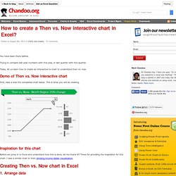
Trying to compare last year numbers with this year, or last quarter with this quarter. Today, let us learn how to create an interactive to chart to understand then vs. now. Demo of Then vs. Now interactive chart First, take a look the completed chart below. Inspiration for this chart Before we jump in to Excel and understand how this is done, let me thank NY Times for providing the inspiration for this chart. Creating Then vs. 1. As usual, the first step is to get the data in to Excel. 2. Since our chart will display values for one region at a time, we need a mechanism to let user control which region is displayed.
Edward Tufte's Slopegraphs in Excel - E90E50fx. Freddy: What a filthy job.Igor: Could be worse.Freddy: How?

Igor: Could be raining. by The FrankensTeam Introduction [...] Back in 2004, Edward Tufte defined and developed the concept of a “sparkline”. What’s interesting is that over 20 years before sparklines came on the scene, Tufte developed a different type of data visualization that didn’t fare nearly as well. It’s curious that it hasn’t become more popular, as the chart type is quite elegant and aligns with all of Tufte’s best practices for data visualization, and was created by the master of information design.
This is the introduction of Edward Tufte’s “Slopegraphs” by Charlie Park, if you have not already done so you should definitely read it. Edward Tufte’s “Slopegraphs” After you read this post, you’ll probably want to check out the follow-up, A Slopegraph Update.

Back in 2004, Edward Tufte defined and developed the concept of a “sparkline”. Odds are good that — if you’re reading this — you’re familiar with them and how popular they’ve become. What’s interesting is that over 20 years before sparklines came on the scene, Tufte developed a different type of data visualization that didn’t fare nearly as well. To date, in fact, I’ve only been able to find three examples of it, and even they aren’t completely in line with his vision. It’s curious that it hasn’t become more popular, as the chart type is quite elegant and aligns with all of Tufte’s best practices for data visualization, and was created by the master of information design.
In this post, we’re going to look at slopegraphs — what they are, how they’re made, why they haven’t seen a massive uptake so far, and why I think they’re about to become much more popular in the near future. Burden of global diseases. This is what it looks like in Excel Tricks for creating the chart in Excel Today's chart was a bit of a nightmare.
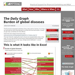
We wondered why The Economist presented the data in this manner: there are many ways to present a change in rankings, nearly all superior to this one. Additionally, it was quite challenging to replicate the chart in Excel but we got it done. The columns with disease names for 1990 and 2010 are plain Excel cells with conditional formatting.
The connecting lines between the 1990 and 2010 columns look like some sort of Line chart but are in fact created using an X Y (or Scatter) chart. However, the data-set needed to do so is tricky. Oh yes, we also had to check "display values in reverse order" for the y-axes. The rest of the exercise was re-shuffling of the data-set to get the numbers correctly lined up. Note: the two Pie charts at the bottom follow the text-book rules for plain-vanilla Pie charts and we won't elaborate on them. The stats: