
Forecasting the World. Washington's Blog. Creative - Fiscal FactCheck. Summary Washington's spending has recently been higher as a percentage of the nation's economic output than at any time since World War II. But by the same measure, Washington's revenues are the lowest in more than 60 years. So does the U.S. have "a spending problem," as Republicans keep repeating in the current debate over how to reduce the nation's record deficits?
Or is the problem that taxes are not high enough? Those questions frame a long-running partisan debate, and as usual we won't offer an opinion one way or the other. Some key facts we think are worth considering: Federal spending ("outlays" in budget jargon) is expected to equal 24.1 percent of the nation's gross domestic product in the current fiscal year, which ends Sept. 30. It's easy to argue one side or the other by just citing facts that support a particular view, and omitting others. Analysis A glance at this chart quickly puts our current fiscal mess in historical context. What has produced these huge budget gaps? U.S. The Math Book: Milestones in the History of Math – Neatorama. I love math (though it's debatable whether math loves me back, I suspect not) so it's a pleasure to read Cliff Pickover's newest creation, The Math Book: From Pythagoras to the 57th Dimension, 250 Milestones in the History of Mathematics.

Don't let the title fool you - The Math Book is a thoroughly enjoyable "walk" through the history of mathematics with each milestone narrated by Pickover in a short and sweet fashion (and surprisingly, with very little equations) that even non-mathemagicians like myself can enjoy. If you've ever heard the terms Bessel functions, Transcendental numbers, and Riemann hypothesis, and want to know more, then this is the book for you. Below is an excerpt from the book (selecting which ones to show was a hard thing to do - there were just so many interesting articles!)
: RulesofThumb.org - Homepage. Is the Stock Market Cheap, or Expensive? - (Click to enlarge)

4-2-10-Swing-Analog-1907-2009.gif (GIF Image, 750x562 pixels) - Scaled (92%) Credit Spread. How Andreessen Horowitz Evaluates CEOs. US Federal Budget: US Budget Breakdown for FY11 - Charts. S&P 500 PE Ratio Chart - 10 Year Average. Most Interesting Illusions. Here is a cool collection of ‘Most Interesting Illusions’ from around the world.

Squares A & B are the same shades. This optical illusion was created by Edward H. Adelson, Professor of Vision Science at MIT. Winner of 2 gold & 1 silver award at the 2004 Clio awards, these ads used combined words to make images. So what do you make out of this one? Is this window seen from above or seen from below? Are they walking on the wall? Is she wearing spectacles? Here is another great optical illusion photo of a Lufthansa 747-400 & a United Airlines 757-200 which were on simultaneous approaches to runways 28L & 28R at San Francisco.
Double words illusions: When you see the image of love in mirror its changed into something opposite. The word reflection of "Teach" is "Learn". Yellow area reads as "Optical" while the colored area reads as "Illusion". Brown area reads as "Me" while the colored area read as "You".
Print Ads Using Illusions. Other Posts:Art From Above.Bubble Gum Walls.Upside Down Houses. Investment Company Institute - Mutual Fund Money Flows. The reality of S&P 500 earnings - The Sovereign Speculator. To say that stocks are anything other than dangerously overpriced with a P/E of over 130 and a yield of 2.5% on unsustainable dividends is either farcical or fraudulent.

For such a simple little metric, the P/E ratio is subjected to all kinds of perversions to deflate it to levels that can be passed off as reflecting value. At the very least, most bubbleheads try to make it less scary than its current level of 133 for the S&P 500. Do-it-yourself P/E and dividend analysis It is very easy to find out what the real index PE is at any given time.
Dr. Housing Bubble Blog. Shadow Government Statistics » Home 2. 27 Visualizations and Infographics to Understand the Financial Crisis ... I've said it before, and I'll say it again.
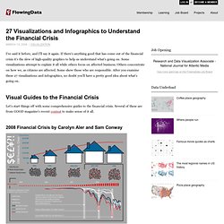
If there's anything good that has come out of the financial crisis it's the slew of high-quality graphics to help us understand what's going on. Some visualizations attempt to explain it all while others focus on affected business. Others concentrate on how we, as citizens are affected. Some show those who are responsible. After you examine these 27 visualizations and infographics, no doubt you'll have a pretty good idea about what's going on.
Visual Guides to the Financial Crisis Let's start things off with some comprehensive guides to the financial crisis. 2008 Financial Crisis by Carolyn Aler and Sam Conway A Visual Guide to the Financial Crisis by Jess Bachman Jess from WallStats put this together for the Mint blog. The Global Finanical Crisis by Cypher 13 Where Did All the Money Go? From Feliciano Rahardjo Looks like the beginning of a comic book.