
Untitled. 'Dance Your Ph.D. 2010' Winner Announced. What kind of science makes the best dance?
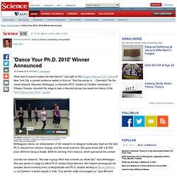
Last night at the Imagine Science Film Festival in New York City, a packed audience waited to find out. "And the winner is ... Chemistry! " As the crowd cheered, Maureen McKeague, a chemistry Ph.D. student at Carleton University in Ottawa, Canada, mounted the stage to take a bow and accept her award as champ of the "2010 Dance Your Ph.D. " contest. McKeague's dance, an interpretation of her research on designer molecules, beat out the best Ph.D. dances from physics, biology, and the social sciences. Just like her research, "this was a group effort that involved our whole lab," says McKeague. The lab is exploring a chemical technique called SELEX--systematic evolution of ligands by exponential enrichment--which generates short segments of DNA and RNA called aptamers. When DeRosa learned about the Ph.D. dance contest, says Bernard, "she told us that SELEX would make a really great dance. " Maps: How Mankind Remade Nature.
As scientists get used to the idea that Earth is in a new geological age, that the Holocene — the last geological age — has been replaced by Anthropocene, they’re figuring out how it got to be that way.
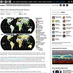
Two years ago, ecologists Erle Ellis and Navin Ramankutty at the University of Maryland, Baltimore County, released a map of the world’s biological areas, traditionally known as biomes. Similar maps were found on science classroom walls across the land, but theirs was different in one very fundamental way: They updated the definition of biome to reflect how human beings used the land. Ellis and Ramankutty said this was much more relevant to the 21st century, with more than six billion people using more of Earth’s water, energy and matter than any other species, than classical biomes that didn’t account for humanity’s influence.
They called their newly-defined areas “anthromes,” short for anthropological biomes. It was a map for the anthropocene. Modern Science Map. 500 Years of Science, Reason & Critical Thinking via the medium of gross over simplification, dodgy demarcation, glaring omission and a very tiny font.
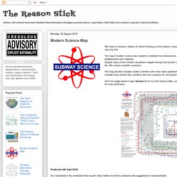
The map of modern science was created to celebrate the achievements of the scientific method through the age of reason, the enlightenment and modernity. Despite many of the scientific disciplines mapped having more ancient origins, I have restricted the map to modern science starting from the 16th century scientific revolution. The map primarily includes modern scientists who have made significant advances to our understanding of the world, however I have also included many present day scientists who fuel a passion for, and advances in, science through communication and science popularisation. Click the image below to open Version 2.1 of my html Science Map, you will then be able to pan around the map and click on the scientists for more information. Postscript (4th Sept 2010): Thanks Crispian.
TOP TEN GREEN ARCHITECTURE PROJECTS OF 2008 Top Ten Green Architecture of 2008 – Inhabitat - Green Design Will Save the World. Gapminder: Unveiling the beauty of statistics for a fact based world view. Network Visualization. Immersion by the MIT Media Lab is a view into your inbox that shows who you interact with via email over the years.
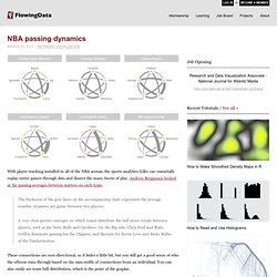
Immersion is an invitation to dive into the history of your email life in a platform that offers you the safety of knowing that you can always delete your data.Just like a cubist painting, Immersion presents users with a number of different perspectives of their email data. It provides a tool for self-reflection at a time where the zeitgeist is one of self-promotion. It provides an artistic representation that exists only in the presence of the visitor. It helps explore privacy by showing users data that they have already shared with others. Finally, it presents users wanting to be more strategic with their professional interactions, with a map to plan more effectively who they connect with. The base view is a network diagram where each node represents someone you've exchanged email with. Size Comparison - From a Molecule to a Galaxy In One Single Shot (Annotations On)
New: Science-Artists feed. In addition to last week's Art Evolved Aggregate feed, I've made a Science-Artists feed, collecting scientific illustration, science-inspired art and science cartooning on blogs.
After a discussion with Bora Zivkovic via Twitter, we both agreed something larger than paleo-art (though that's included) would be great to have. And it's included on Scienceblogging.org! Visual art and illustration are essential to effective science communication (and can be fun and inspiring), and I love that Bora, Anton and Dave recognize this.
Thanks! I've likely missed some - there are a lot of talented people out there, so please suggest others! For the moment, I've mostly left out comic strips and photography and I'm focusing on scientific illustration, digital and traditional painting and drawing, and cartooning. A tip of the hat to Richard Carter, FCD for suggesting the use of FriendFeed when I was creating both feeds. The illustrated guide to a Ph.D.