
What's The Secret To Great Infographics? In the early aughts, Kim Rees loaded a single website and had a life-changing experience.

It was IBM’s Glass Engine, an interactive visualization of composer Philip Glass’s work. The software featured some amazing capabilities, like rearranging over 60 of his compositions with a few clicks of a mouse. Since graduating from NYU with a computer science degree in hand, she’d worked on interactive installations, Flash games, and more traditional web design with partner Dino Citraro. But the Glass Engine was different. It was information she could actually hear and feel. "I remember how excited Kim was when she found it," Citraro writes, "and looking back on it now, it was an epiphany moment for us both.
" Twitter Company conversations mapped. The Story. Allt du beh?ver f?r att komma ig?ng. Homicide map. Räntekartan - SvD Näringsliv - nliv.se. HBL: Bostadspriser i Helsigfors. Mapping Ratata: Who’s Hot? The Saddest Map In America. Yep, there it is: the result of a scholarly study by Dorothy Gambrell of the “missed connections” section of Craigslist.

This is where you thought you saw your future spouse or date or hook-up, state by state. It is, in some ways, a sign of where we are now most likely to see people we don’t know in various parts of the country. It’s also a sign of male loneliness or romance: men seeking to find a possible love-mate outnumber women 86 – 14. Nationally, the chart shows that great arc of life. In your twenties, you are most likely to think you’ve caught the eye of someone in an ice cream shop; in your thirties, in a bar; in your forties, a strip club or adult bookstore (those still exist?). Now look at the South – more people spy love at Wal-Mart than anywhere else, from Florida all the way to New Mexico. Seven dirty secrets of data visualisation. The pitiful cult of ‘data journalism’
Times were that you could pick up a copy of the Wall Street Journal and be simultaneously educated and entertained by their informative infographics, which were lovingly crafted from authoritative data and accompanied by judicious analysis.

The key to success with these graphics was that they explained something about the data you might not have gleaned simply by looking at a column of numbers. The Economist, too, was pretty good at revealing trends and interesting correlations with clear, unfussy graphs. Then something odd happened. The nationals started getting a taste for these fancy ways of explaining data. But in imitating the method, they forgot the purpose, and began to drizzle their pages in useless, stupid pie charts that added nothing to the written stories beside them. Beyond the crime scene: We need new and better models for crime reporting. The classic crime beat, dating from at least the mid 19th century, is evolving.

It has to evolve. There are good reasons to believe that the routines of “traditional” crime coverage produce a journalism that just isn’t as good as it needs to be. We need to try something new. These changes start with the spot story: the routine, straightforward “this just happened” report. The police and the courts have always been the primary sources for such stories, but the authorities are increasingly publishing their reports and documents directly. Fortunately, a number of people and organizations are pioneering new approaches to crime reporting. Anyone can do it. Data journalism is the new punk.
This is a chord… this is another… this is a third.
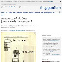
NOW FORM A BAND So went the first issue of British punk fanzine Sideburns in 1977 in the "first and last part in a series". It might be 35 years old, but this will do nicely as a theory of data journalism in 2012. Why? Arguably punk was most important in its influence, encouraging kids in the suburbs to take up instruments, with little or no musical training. Crucial to it was the idea: anyone can do it. Is the same true of data journalism?
Now is the time to examine this - in May 2010, we published this piece on how reporters would soon be flooded with a "tsunami of data". There are even different streams now - short-form, quick-and-dirty data visualisations of the kind we do every day on the Datablog, right through to complex investigations and visualisations - such as our riots data analysis or the kind of projects which made the shortlist of the Data Journalism Awards, from around the world. How riot rumours spread on Twitter. FOI Friday. How to dodge a conviction if you assault someone < Brighton Argus Thousands of criminals including sex offenders, arsonists and violent offenders have avoided conviction.

Sussex Police introduced community resolution in 2011 to deal with low-level crimes. But The Argus can reveal that the policy has been used more than 11,000 times in the past three years and has even been used in a case of sexual assault against a child. Figures released under the Freedom of Information Act show it was used 1,200 times to deal with assaults resulting in an injury, and another 1,531 for assaults without injuries.