
Journalism in the Age of Data. DataVis Tutorials - Principles. Stanford Visualization Group. Tableau. Web-based Analytics. WebApps DataVis. Processing. R-project. Hans Rosling näyttää parhaat koskaan näkemänne tilastot. Nya siffror visar på dubblad bostadssegregation. Ulla-Britt Nilsson bor i Vråen i Värnamo i Småland har sett sin stadsdel förvandlas sedan hon flyttade in 1978.

Det som SCB kallar utländsk bakgrund - att en person är född i utlandet eller båda föräldrana är födda utomlands - en sådan bakgrund har nu nästan alla hennes grannar. – Jag bor i en länga med 12 lägenheter och jag är den enda svenska, sedan är det spanjorer, chilenare, afrikaner, iranier och bosnier, säger hon. Det som hänt i Ulla-Britt Nilssons kvarter, det har hänt på många håll i Sverige. Andelen personer med utländsk bakgrund har ökat kraftig, men bara i vissa bostadsområden. När Sveriges Radio jämför den tiondelen av svenska postnummerområden som har den högsta andelen personer med bakgrund i ett annat land, och lägger åren 1990 och 2010 bredvid varandra - då har andelen fördubblats, från en knapp fjärdedel av befolkningen, till nästan hälften.
Wealth Inequality in America. 38 Maps You Never Knew You Needed.
The Sexperience 1000 - Sexperience. Welcome to The Sexperience 1000, an interactive journey through the sexual experiences and preferences of one thousand British individuals.

What’s the favourite sexual position of iPhone users in the North? Do country music lovers over 55 prefer to do it in the dark? Explore the 20 questions of our survey and discover what the great British public get up to between the sheets… Filter Filter by region, age, etc. and compare to yourself. How to Use Twitter Plus Needlebase to Discover Fabulous Things. My PR buddy Julie Wohlberg asked me tonight if I knew any good journalists she should invite to a social media conference in Florida called SheCon.
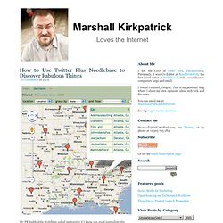
ReadWriteWeb’s Sarah Perez in Tampa was apparently inaccessible, so I took a few minutes to explore some possibilities…with web applications! I used the DIY data extraction and normalization service Needlebase, along with Twitter list search engine Tlists and of course Twitter itself to discover a list of journalists in the South of the US who have more than 2000 Twitter followers. (Mapped above) It wasn’t hard to do at all! Data-driven journalism.
Gapminder: Unveiling the beauty of statistics for a fact based world view. - Gapminder.org. Data Miner UK. Clairemiller.net. Have completely failed to add a tutorial for making heat maps using Google Fusion Tables.

To make this work, you have to first collect up some shapefiles – you can download them from open data sites, often as a KML, which can be directly uploaded or as shapefiles, which can be converted using Shape to FT. The Middle Super Output Areas used below are available for download from the ONS. Alternatively download this Google Fusion Table and then upload the downloaded file to your own Google account. To make a Fusion Table heat map, you will need a table containing your shapefiles and one containing your data. For this example, I’m using the claimant count data, which gives an indication of the number of people claiming jobseeker’s allowance at low levels.
Looking at the many faces and forms of data journalism. Over the past year, I’ve been investigating data journalism.

In that work, I’ve found no better source for understanding the who, where, what, how and why of what’s happening in this area than the journalists who are using and even building the tools needed to make sense of the exabyte age. Yesterday, I hosted a Google Hangout with several notable practitioners of data journalism. Video of the discussion is embedded below: Over the course of the discussion, we talked about what data journalism is, how journalists are using it, the importance of storytelling, ethics, the role of open source and “showing your work” and much more.
Participants Guests on the hangout included: Anthony DeBarros, director of content at Gannett Digital [Profile] Simon Rogers, editor of the Guardian Datablog and Datastore. Projects Here are just a few of the sites, services and projects we discussed:
Datawrapper ist ein Projekt der ABZV. Is this an Excel killer? QueryTree app lowers the bar on data journalism. Sometimes the most impressive tools solve a problem you never knew you had.

In the case of QueryTree, a new data analysis tool, that problem is something most people never question: spreadsheets. For all the shiny-shiny copy-and-paste-click-and-drag-ness in new journalism tools, most data digging comes back to at least some simple spreadsheet work, and that represents a significant hurdle for many journalists used to working with simpler tools. While interface design has undergone generations of improvement on the web, spreadsheet software interfaces have remained largely unchanged for decades.
So why did no one think to do this before? You only need 10 choices QueryTree is a drag-and-drop spreadsheet analysis tool. Group performs the same function as pivot tables in traditional spreadsheet packages: it aggregates your data so you can, for example, see the total amount of payments to one company rather than having to add them manually. Join the dots Multiple angles Plug and play.