
Beautiful Maps, and the Lies They Tell, An Op-Ed From Runkeeper. This Fun Maps post is guest-written by Margaret McKenna, Head of Data and Analytics at RunKeeper, a free app for running, cycling and other fitness activities Recently the Flowing Data blog released a series of captivating maps created using public running routes from RunKeeper.
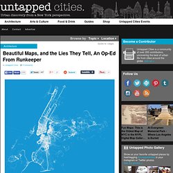
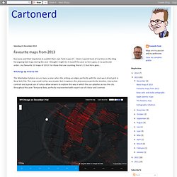
Many media outlets picked up the maps, and local newspapers were happy to see a reflection of their hometowns. But tension arose around what the maps meant. The Flowing Data editor suggested that the maps could be used by public officials for city planning. Meanwhile, The Washington Post’s Know More blog suggested the maps proved that only rich people use apps for fitness. RunKeeper’s map,left, with random data pulled from 2013 in New York City, Flowing Data’s original map at right.
The Most Amazing, Beautiful and Viral Maps of the Year - Wired Science. New MIT Media Lab Tool Lets Anyone Visualize Unwieldy Government Data. In the four years since the U.S. government created data.gov, the first national repository for open data, more than 400,000 datasets have become available online from 175 agencies like the USDA, the Department of Energy, and the EPA.
Governments all over the world have taken steps to make their data more transparent and available to the public. But in practice, much of that data--accessible as spreadsheets through sites like data.gov--is incomprehensible to the average person, who might not know how to wrangle huge data sets. Never-ending tables mean next to nothing to me, even if I know that they might be hiding some interesting relationship within their numbers, like how income stacks up with happiness. To wade through what César Hidalgo, director of the Macro Connections group at the MIT Media Lab, calls "the last 10 inches" separating people from their government's incoherent tables and spreadsheets, Hidalgo turned to visualization. DataViva.info. Quantum GIS.
OpenStreetMap. Ten Things to Consider When Making a Map. What makes a good map?
When done well, a map is a vehicle for effective communication. There are many cartographic principles to help guide effective map making. Below are ten common considerations that all cartographers should incorporate as part of their map making process. This list isn’t meant to be a comprehensive list but rather a starting point of things to contemplate.
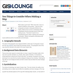
Different cartographic presentations will require additional points of consideration and techniques. 1. The extent of the geographic area mapped will affect a whole slew of cartographic choices from the map projection used to data and symbology choices. 2. There are two main reasons to include data on a map: to support the subject matter of the map and to provide orientation (e.g. streets, cities, points of interest). 3. The choices of symbology can make or break a map. Consider the intended audience of the map when selecting design choices. 4. India national highway map. Should you be using intensity maps? As a retailer, you’re probably used to using surveys as a means to understanding customer behavior.
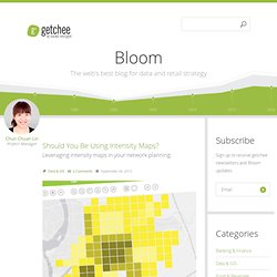
Traditionally, once you get the data, you might start working in excel or some other statistical software, cranking out brilliant correlations or percentage checks. There are plenty of available tools which can help you connect spatial and consumer profile data to better plan and manage services, but before you start applying survey results to business strategy, creating intensity maps could help you gain a better understanding of consumer behavior. Favourite maps from 2013. Everyone and their dog tends to publish their own 'best maps of...'.
Given I spend most of my time on this blog haranguing bad maps during the year I thought I might try it myself this year so here goes, in no particular order...my favourite 10 maps of 2013. For those that are counting, there's 11 but here goes... NYCHenge by Andrew Hill The Manhattan Solstice occurs twice a year when the setting sun aligns perfectly with the east-west street grid in New York City.
This map could not be any simpler but it captures the phenomena perfectly. Our Favorite Maps of 2013. The digital maps we loved in 2013 didn't simply illustrate novel or useful information (how people travel, where they live, what it means to live without much money).
They did it in ways we'd never seen before, manipulating time, dimensions, perspective, even the atmosphere. Map design: a list of helpful online resources. Whether they’ve been making maps for 20 years or two weeks, just like any designer, cartographers need inspiration when starting their latest project.
Inspiration can come from many places and take many forms. Here at Ordnance Survey we use a range of resources and we want to share some of them with you. In this post we list several online resources that can help with your latest map design; from choosing the right colour palette to selecting great fonts. Using Color in Maps. Tutorial de GIMP (para novatos) Map Analysis online book. Software GIS gratuito de ESRI. Aplicaciones Web de mapas: ¿qué herramientas necesito aprender? La siguiente entrada es parte de una serie de entradas en las que damos respuesta a las preguntas relacionadas con la consultoría GIS que nos habéis ido enviando en los últimos meses.
Las preguntas enviadas fueron: “¿Qué herramientas necesito aprender para crear una aplicación web de mapas en una intranet?” “¿Cómo interactúan las distintas aplicaciones Web de mapas con las aplicaciones Web Móviles?” A – ¿Qué herramientas necesito aprender para crear una aplicación web de mapas en una intranet? Para crear una aplicación Web de mapas para una intranet habrás de conocer las mismas herramientas que para crearla para internet.
Bien, lo primero, a mi modo de ver, es que ver en qué supuesto encaja tu desarrollo. Maps.stamen.com. Tools for creating ideas. Design and publish beautiful maps. The Art of the Basemap. “Graphical elegance is often found in simplicity of design and complexity of data.” – Edward Tufte Data visualization is the art of quantitative story telling.
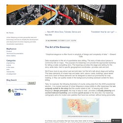
The story of data about places is commonly told on maps. The purpose of a basemap is to provide the appropriate backdrop for telling a really compelling story. The basemap provides the stage and setting for the story, while data—tied to specific geographical coordinates– provides cast and plot. We’ll have more to say about cast and plot later, but first let’s talk about stage and setting. Take, for example, the following illustration of county voting data from the 2008 presidential election. 2008 presidential election results by county It is these very principles that we have also been able to bring to Tableau, one of Urban Mapping’s primary partners. Classic Basemap Style, available through Tableau (and Mapfluence) Walkingtools.