

UI Matters: How an Interface-Lift Can Make or Break a Brand - Ad. The Current State of Web Design: Trends 2010 - Smashing Magazine. Web design is a fickle industry.
Just like every other form of artistic expression, Web design has undergone a continuous and surprisingly fast evolution. Once a playground for enthusiasts, it has now become a mature rich medium with strong aesthetic and functional appeal. In fact, we are experiencing what could be the golden era of Web design — or at least the best period thus far. We have powerful new tools at our disposal (CSS3, HTML5, font-embedding, etc.), a plethora of freely available resources, a strong design community and also (if you needed any more!) Reliable support of Web standards in the major browsers. We’re seeing better interaction design and more aesthetically pleasing designs.
Please note: this article is the first in our series on the current state of web design. 1. As designers, our job is to communicate ideas effectively. Attractive things work better and help focus and keep the user’s attention. 20Large version21 Further Reading Link 27Image source3128 FFFFound! 10 UI Design Patterns You Should Be Paying Attention To. Advertisement Design patterns were first described in the 1960s by Christopher Alexander, an architect who noticed that many things in our lives happen according to patterns.
He adapted his observations to his work and published many findings on the topic. Since then, design patterns have found their place in many areas of our lives, and can be found in the design and development of user interfaces as well. In short, design patterns are solutions to recurring problems. By extension, UI design patterns are solutions to common user interface problems. You may be interested in the following related posts: 1.
To fully appreciate the problem of registration, we should consider an annoyance that has led to the opinion that sign-up forms must die. When would you actually use lazy registration? Amazon lets you browse and add products to your shopping cart before signing up. This pattern is meant to allow users to use your system and take action before registering. Recommended reading 2. 35 Excellent Wireframing Resources. Advertisement Wireframing is one of the most valuable parts of any web design project. It can save a designer tons of time by hashing out the details of a site’s architecture, functionality, and content prior to actually starting a visual design. But if done inefficiently, it can end up costing more time and can even create bigger headaches for both the client and the designer.
Below are more than 35 resources for creating better wireframes, including tutorials on different methods and a variety of tools available. 15 Essential Checks Before Launching Your Website. Advertisement Your website is designed, the CMS works, content has been added and the client is happy.
It’s time to take the website live. Or is it? When launching a website, you can often forget a number of things in your eagerness to make it live, so it’s useful to have a checklist to look through as you make your final touches and before you announce your website to the world. This article reviews some important and necessary checks that web-sites should be checked against before the official launch — little details are often forgotten or ignored, but – if done in time – may sum up to an overall greater user experience and avoid unnecessary costs after the official site release.
Favicon. Planning And Implementing Website Navigation - Smashing Magazine. Advertisement The thing that makes navigation difficult to work with in Web design is that it can be so versatile.

Navigation can be simple or complex: a few main pages or a multi-level architecture; one set of content for logged-in users and another for logged-out users; and so on. Because navigation can vary so much between websites, there are no set guidelines or how-to’s for organizing navigation. Designing navigation is an art in itself, and designers become better at it with experience. It’s all about using good information architecture: “the art of expressing a model or concept of information used in activities that require explicit details of complex systems.” Organizing Navigation Structure Perhaps the most difficult part about navigation on the Web is organizing and designing it. Primary vs. Most websites, especially those with a lot of content or functionality, need navigation menus. 1SpeckyBoy2.
9 Common Usability Mistakes In Web Design. Advertisement By now, all good designers and developers realize the importance of usability for their work.
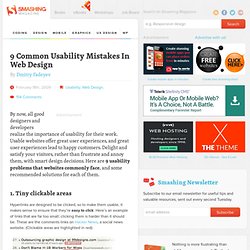
Usable websites offer great user experiences, and great user experiences lead to happy customers. Delight and satisfy your visitors, rather than frustrate and annoy them, with smart design decisions. Here are 9 usability problems that websites commonly face, and some recommended solutions for each of them. 1. Hyperlinks are designed to be clicked, so to make them usable, it makes sense to ensure that they’re easy to click.
Here’s an example of the same interface element, the comments link, but this time with a much larger clickable area: Newspond comments link. Why would we want a larger clickable area? <a href=" style="padding: 5px;">Example Site<a> The CSS has been placed inline together with the markup to make the example simpler, but in real life you’ll likely want to add this styling to your CSS file by giving the link a class or id and targeting it with that. 2.