
Design Principles - Symmetry. Principles of Graphic Design. Responsive Web Design - Envato Tuts+ Web Design Article. Design Theory - Envato Tuts+ Web Design Tutorials Category. 10 Web Typography Rules Every Designer Should Know. When someone visits a website you’ve designed, the odds are that they don’t care much about the colors, images or sounds, they’re immediately looking at the text.
No matter how many bells and whistles you’ve built into a website, everyone relies on text to accomplish whatever they’re visiting the site to do. That alone should make typography, the art of arranging type, a priority for any web designer. In this article we take a look at 10 easy rules to keep in mind when designing your next web project. 1. Read through the text yourself With a design like JonesingFor a designer without a great grasp of the text would have struggled to put together the typography that makes this site really work. Some web designers think that just copying and pasting out of a text file constitutes the total of their textual duties.
You can kick your typography up yet another notch, if you can read through the text once it’s in place in your design. 2. 3. 4. 5. 6. 7. 8. 9. 10. User Experience, Design Process and User Interface. Principles Of Design, Infographic and Design. Webui1. Basics Behind Color Theory for Web Designer. As a collective digital artist, it is important to understand the fundamental science behind color theory.
It’s a popular topic with a vast spread of information to retain and digest. Not only does this topic focus on arts and design, it also involve jist of optics science. (Image source: Shutterstock) There is plenty to cover on this topic so we’ll be glossing over some of the key points to extract what should be emphasize. Each of these topics consist of examples on which pertain towards color schemes and combination. Beginnings of Color Theory When starting off into the pool of colors, we should base ourselves in square one. These primary colors may be combined together in a mixing process to create other color scheme. Tertiary Color Pallet Once we have our color wheel started we can use these resources to create tertiary colors. Next we’ll be going over some of the most popular color schemes. Monochromatic Colors Analogous Scheme.
Visual Design. Some foundational ideas are so thoroughly ingrained in modern life that we hardly see them for their ubiquity and familiarity.
The concept of “module and program”—regular building blocks of repeating patterns that when joined together produce an organized whole—permeates our information-age lives even more thoroughly than it did the lives of our ancestors in the industrial revolution launched by manufacturing innovators like Eli Whitney. As the industrial world grew more complex, document designers in the mid-1800s began to adapt modular programs to newspaper, catalog, financial, and other publications, and modern page layout was born. In the early twentieth century the Bauhaus designers adopted the elements of visual logic discovered by the Gestalt perceptual psychologists, and those German and Swiss designers created modern graphic design (see Visual Design Principles sidebar, below). The designer's guide to grid theory.
Grids are like the invisible glue that holds a design together, so whether you work in print or on the web you need to understand grid theory.
There's been a resurgence in the popularity of the grid in recent times. This has come about as the web has matured into a more capable design platform, and web designers (and developers) have created reusable CSS libraries and frameworks to simplify the process of deploying and leveraging grids to create balanced page layouts. For an entire generation of designers on the web, however, the grid is something of a mystery. While art college graduates will know all about it, for self-taught web designers, there's much theory and rationalisation of the grid as a design tool that simply isn't covered by the typical blog posts and conference talks. Guide to the grid We're here to set that straight with this simple pocket-sized guide to the grid, including a small smattering of theory! 01. So, how do you use a grid to establish a meter and rhythm?
02. Webui1. Design Theory - Tuts+ Web Design Category. Learn Web Design, Web Development, and More. Type On Screen: 5 Faces for UI Design. « Back to Blog on Wednesday 14th of August 2013 Interface elements are about task completion.
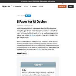
Our labels and CTAs get visitors from their arrival point to where they want to be, so that text needs to be as readable as possible. Today, our friend Dan Eden presents five faces to help you get the job done. Here I’ve pulled together five useful typefaces for user interface design, which I’ve mocked up in a simple screen for an imaginary smartphone application that I’ve called Righter. Avenir Next First up, it’s the Avenir Next typeface. Try styling Avenir Next. Proxima Nova The Proxima Nova family has been doing the rounds on the web for a long time now, and for good reason – functional and friendly, it’s like Helvetica let its hair down. Try styling Proxima Nova. Alright Sans Arguably the most functional of my selection, the Alright Sans typeface features the dynamic terminals of Proxima Nova’s “e, a,” and “t”, along with an x-height as generous as Helvetica’s.
Verdana Pro Condensed Droid Sans. Improving UI Design Through Better Typography. Effective design and good typography go hand-in-hand.
This is especially true when you consider UI design - where text content makes up the bulk, or in some cases the entirety of a given interface. This sentiment of synergy might best be described in the case where a typeface in UI design is at its best when going unnoticed. Often referenced in discussions on typography for digital interfaces, Oliver Reichenstein article, “Web Design is 95% Typography” presents one of the most salient points regarding the place of text in UI design: A great designer knows how to work with text not just as content, he treats text as a user interface” While optimizing typography includes maximizing readability, accessibility and graphic balance, it is in large part, about usability.
4 tips on typography in UI design. Communication plays a vital role in design.
Whether you design websites, mobile apps, or wearable UIs, your creations have to clearly communicate their intent and purpose. And since text does a lot of the heavy lifting in communicating purpose, you need a solid understanding of typography. Of course, designing a user interface differs from designing an ebook or blog theme. But the principles of type-centric design still apply. After all, on-screen communication happens through words, and type is the UI of language. 4 tips on typography in UI design.