
Compose to a Vertical Rhythm. “Space in typography is like time in music.
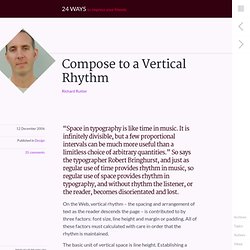
It is infinitely divisible, but a few proportional intervals can be much more useful than a limitless choice of arbitrary quantities.” So says the typographer Robert Bringhurst, and just as regular use of time provides rhythm in music, so regular use of space provides rhythm in typography, and without rhythm the listener, or the reader, becomes disorientated and lost. On the Web, vertical rhythm – the spacing and arrangement of text as the reader descends the page – is contributed to by three factors: font size, line height and margin or padding.
All of these factors must calculated with care in order that the rhythm is maintained. The basic unit of vertical space is line height. Establishing a suitable line height The easiest place to begin determining a basic line height unit is with the font size of the body copy. Spacing between paragraphs With our rhythmic unit set at 18px we need to ensure that it is maintained throughout the body copy. BlueTrip CSS Framework. 960 Grid System. The Perfect 3 Column Liquid Layout: No CSS hacks. SEO friendly. Download this layout (25kb zip file).
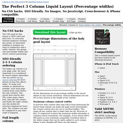
Percentage dimensions of the holy grail layout All the dimensions are in percentage widths so the layout adjusts to any screen resolution. Vertical dimensions are not set so they stretch to the height of the content. Maximum column content widths To prevent wide content (like long URLs) from destroying the layout (long content can make the page scroll horizontally) the column content divs are set to overflow:hidden. 800 x 600 Left & right columns: 162 pixels Center page: 357 pixels 1024 x 768 Left & right columns: 210 pixels Center page: 459 pixels The nested div structure I've colour coded each div so it's easy to see: The header, colmask and footer divs are 100% wide and stacked vertically one after the other. ProQuest Information and Learning - 0321193121 - Cascading Style. CSS Templates. Columns & Grids. May 13, 2005 10AM PST The difficulty of grid systems in web pages, the compromise of columns.
I seem to quite often go back and forth between creating organic layouts with intuitive proportions, and creating a grid that I can hang my various elements on. Lately I’ve been more interested in the latter. Frequently I’ve caught myself calculating in my head what 750 divided by 3 minus two 10px margins equals.
One of the larger problems in working with grids in web pages is that you often can’t do much about vertical proportions. Open Source Website Templates and Downloads. Free CSS Layouts And Templates. Advertisement As a web-developer you don’t have to re-invent the wheel all the time.
If it just has to work, and has to be valid, and has to have a nice, visually appealing design hierarchy, you just can use css-techniques developed in the web-dev-community over the last few years. If you take a look around, you’ll find many templates, which include basic (X)HTML/CSS-markup. You can start from there, learning and exploring the possibilities of CSS and modifying templates for your exquisite taste. Below you’ll find a list of resources which offer free, gorgeous and valid CSS-based templates – usually with images and full layout structure, such as headers, navigation bars, content containers, sidebars and footers.
Creative Behavior - Articles - The Organic Grid. Grid-based layout. Problem The user needs to be able to scan, read and understand a page quickly Solution Use a grid system for the placement and alignment of all visual objects on the web page From www.audi.nl Use when You are designing a conventional website that needs to follow the normal visual design standards. How A grid is a technique that comes from print design but easily be applied to web design as well. A grid is a consistent system for placing objects. At the unit level of cells (e.g. 20x20 pixels) See for example the Audi example above where a strict underlying grid is used for all elements on the page. Really Undoing html.css. There’s an aspect of document presentation most of us don’t consider: the browser defaults.
If you take an HTML or XHTML document—for the purposes of this exercise, assume it contains no presentational markup—and load it up in a Web browser with no CSS applied, there will still be some presentational effects. A level-one heading, for example, is usually boldfaced and a good deal larger than other text, thus leading to the old stereotype of headings being “big and ugly”; the pre element typically honors whitespace and uses a monospace font; a paragraph is separated from other elements by a “blank line”; and so on. From a CSS point of view, all this happens because the browser has built-in styles. Tantek recently wrote about his creation of a file called undohtml.css, whose sole purpose is to strip away some of the default browser styles applied to common elements. There’s also: There is more to the presentation story than just html.css.