
Data Visualization. Data Visualization / Infographics. Business Intelligence and Analytics Software. Boarrd. by weLaika — Rails Rumble MMX. Allynbauer/statuspanic. Progressive <canvas> pie charts. Peity (sounds like deity) is a jQuery plugin that converts an element's content into a <svg> mini pie 2/5 donut 5,2,3 line 5,3,9,6,5,9,7,3,5,2 or bar chart 5,3,9,6,5,9,7,3,5,2 and is compatible with any browser that supports <svg>: Chrome, Firefox, IE9+, Opera, Safari.
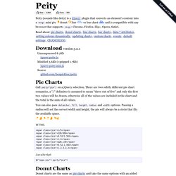
Download version 3.2.1 Uncompressed 8.7Kb jquery.peity.js Minified 3.6Kb (+gzipped 1.7Kb) jquery.peity.min.js Source github.com/benpickles/peity Pie Charts Call peity("pie") on a jQuery selection. You can also pass delimiter, fill, height, radius and width options. <span class="pie">1/5</span><span class="pie">226/360</span><span class="pie">0.52/1.561</span><span class="pie">1,4</span><span class="pie">226,134</span><span class="pie">0.52,1.041</span><span class="pie">1,2,3,2,2</span> JavaScript $("span.pie").peity("pie") Donut Charts Donut charts are the same as pie charts and take the same options with an added innerRadius option which defaults to half the radius. $('.donut').peity('donut') Line Charts $(".line").peity("line") Events.
Measure Anything, Measure Everything. Measure Anything, Measure Everything Posted by Ian Malpass | Filed under data, engineering, infrastructure If Engineering at Etsy has a religion, it’s the Church of Graphs.

If it moves, we track it. Sometimes we’ll draw a graph of something that isn’t moving yet, just in case it decides to make a run for it. In general, we tend to measure at three levels: network, machine, and application. Application metrics are usually the hardest, yet most important, of the three. Meet StatsD StatsD is a simple NodeJS daemon (and by “simple” I really mean simple — NodeJS makes event-based systems like this ridiculously easy to write) that listens for messages on a UDP port. We like graphite for a number of reasons: it’s very easy to use, and has very powerful graphing and data manipulation capabilities. Not only is it super easy to start capturing the rate or speed of something, but it’s very easy to view, share, and brag about them.
Why UDP? So, why do we use UDP to send data to StatsD? Dashing - The exceptionally handsome dashboard framework. Flat And Thin Are In. Advertisement In the last several years, we’ve seen a rapid shift in software and app interface design, from 3-D and skeuomorphic to flat and minimal.
Although this trend has become nearly ubiquitous, let’s take a moment to consider how we got here and what influence it’s having on interface design as a whole. Additionally, I’ll share some tips and considerations on designing flat interfaces. Interfaces on a Windows Phone 8 and Apple’s iOS 7. What Happened? So, how did the collective consciousness swing from a love of all things textured, beveled and drop-shadowed to a desire for flat colors and simple typography? Information Overload As a constantly connected culture, we deal with a nonstop flow of information, some of it important and relevant, most of it not.
Free of clutter: Geckoboard‘s visualisations are designed to make key data easy to interpret at a glance. Simplicity Is Golden Beautiful and minimal: The Blue weather app by Oak. Content Is King, Again Technological Literacy Process Grid. RazorFlow PHP Dashboard Framework - HTML5 Dashboards for web and mobile. Leftronic.