

FlexNav - Flexible, Device Agnostic Navigation. A Device-Agnostic Approach to Complex Site Navigation FlexNav is a mobile-first example of using media queries and javascript to make a decent multi-level menu with support for touch, hover reveal, and keyboard tab input accessibility.
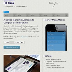
Special attention is paid to touch screens using tap targets (the key feature of FlexNav). Note: If you find a bug, please file an issue and note device and browser versions. Download on GitHub → Basic Usage Start with a simple unordered list, adding in the class and data attributes:<ul class="flexnav" data-breakpoint="800"><li>... Hide the Address Bar within Mobile Safari. With both iOS and Android-driven devices using WebKit as their browser's rendering engine, web developers have many advantages: A rendering engine with capable of flawless CSS animationsA rendering engine that's fast...very fastA rendering engine that's modern and forward-thinking These advantages allow us to create web apps within that browser that look as good as native applications.
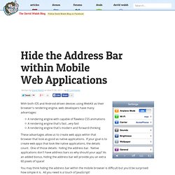
If your goal is to create web apps that look like native applications, the details count. One of those details: hiding the address bar. Native applications don't have address bars so why should your app? You may think hiding the address bar within the mobile browser is difficult but you'd be surprised how simple it is. The JavaScript window.addEventListener("load",function() { setTimeout(function(){ window.scrollTo(0, 1); }, 0);}); The window.scrollTo method is the key to hiding the address bar.
14 DIY mobile app development resources for small businesses. This post was updated April 8, 2014, to reflect the ever-changing mobile application development landscape.
Many small businesses sill shrug off the idea of creating a mobile app but the case for doing so continues to become stronger, not just when it comes to engaging more effectively with customers but for empowering employees. I wrote about one example of the latter scenario last month: ski and board shop Mount Everest in Westwood, N.J., created a mobile app to extend its LightSpeed point-of-sale (POS) solution so that the sales team is alerted when priority orders arrive. Its app helps the retailer boost credibility with certain search engines by responding more quickly. "This was essentially the only way to play. We wouldn't be able to do what we are doing without it," said Ryan McGarry, manager of e-commerce operations for the retailer.
I mentioned two similar examples involving FileMaker late last year. Jquery-ui-map - Google map v3 plugin for jQuery and jQuery Mobile. The Google Map version 3 plugin for jQuery and jQM takes away some of the head aches from working with the Google Map API.
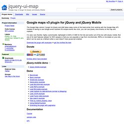
Instead of having to use Google event listeners for simple events like click, you can use jQuery click events on the map and markers. It is also very flexible, highly customizable, lightweight (3.2kB or 3.9kB for the full) and works out of the box with jQuery mobile. But one of its best features (atleast for SEO people) is that you can populate a map from microformats, RDFa or microdata on your site, which can be used as a fallback when a user doesn't have javascript enabled. Download the plugin with examples or get the minified file here Donate Entities which have donated. Tiggzi: Mobile App Builder Help. Reference. Mobile Development Forums for Red Foundry. Fixed Positioning for Mobile Browsers. Organizing Mobile.
When it comes to organizing the content and actions on mobile, solid information architecture principles like clear labeling, balanced breadth and depth, and appropriate mental models remain important.
But the organization of mobile web experiences also needs to: Align with how people use their mobile devices and why.Emphasize content over navigation.Provide relevant options for exploration and pivoting.Maintain clarity and focus.Align with mobile behaviors Article Continues Below In the previous part, we talked about the constraints and capabilities that make designing for mobile unique.
Similarly, the desktop web also has a set of limitations and possibilities that make it distinct. Dev Center » Chris-Software.com. Add to home screen. Support Development Add To Homescreen is a free, open source javascript software.
It is released under the MIT License which basically grants you complete freedom in usage for open source and commercial applications. That being said the only way for me to subtract hours from my day work and keep implementing this script is through donations. If you find this widget useful and wish to support future development, please consider a donation. Overview The script opens an always-on-top message inviting the user to add the application to the home screen. ATH by default looks something like this But appearance is customizable with plain old CSS. The script is compatible with iOS 6+ and Chrome 31+. Languages The message changed in v3 so unfortunately all the languages supported in v2 are not available anymore.
Adaptive Images in HTML. How To Build A Mobile Website. Advertisement Over the past few years, mobile web usage has considerably increased to the point that web developers and designers can no longer afford to ignore it.

In wealthy countries, the shift is being fueled by faster mobile broadband connections and cheaper data service.