
Interactive design portfolio. Let me start off by saying that I am not a big fan of ready-made template systems of any kind when it comes to design.
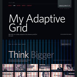
Sure, they may save you a bit of time and some may provide an excellent starting point, but relying heavily on them feels a little like cheating to me. I think that each design challenge is unique and deserves a one of a kind set of solutions. With that out of the way (and since quite a few people have asked about it) I would like to share some details about the adaptive grid system that I am using right here on this site. If you do find it useful and it is a good match for something you are working on, feel free to borrow some of the ideas behind it or grab the entire grid altogether. 24 Columns and Full Pixels Since responsive web design and adaptive CSS grids seem to be two very hot topics at the moment, there are quite a lot of other examples out there.
From 1,920 pixels, all the way down to 240 At 100%, the grid has a full width of 1,200 pixels. What about 320? 5 Useful CSS Tricks for Responsive Design. Making the design to be responsive is very easy as shown in my Responsive Design in 3 Steps tutorial, but maintaining the elements to look aesthetically balanced on all breakpoint layouts is an art.

Today I’m going to share 5 of my commonly used CSS tricks along with sample cases for coding responsive designs. They are simple CSS properties such as min-width, max-width, overflow, and relative value — but these properties play an important part in responsive design. View Demos 1. Responsive Video (demo) This responsive video CSS trick was discovered by tjkdesign.com. The Responsive Wireframe Boilerplate.
Wirefy was created as a tool to help web designers and developers create fast, manageable wireframes.
It helps to speed up the journey between sketches and final deliverables. Like the web, it is in constant iteration. This requires a simple workflow and a well-defined collection of atomic elements so that new UIs can be quickly pulled together. It is our belief that we aren't building pages but rather systems of components. This is why Wirefy has been built to be as flexible and comprehensive as it possible can be. Our goal is to help you make smarter UX decisions by focusing on the content first rather than the subjective design decisions. Creating static wireframes can be great but sometimes clients just don't understand how they function or change based on various devices.
Use Wirefy to build prototypes quickly, then without starting from scratch implement your Wirefy foundation into any additional framework or CMS system for a fully designed deliverable. Getting started. The Current State of HTML5 Forms. The Introduction HTML5 is the newest specification for HTML, the language that web browsers read to display web pages.
HTML5 has many new features intended to make creating websites easier and people's experience in using those websites better. Among those features are many enhancements to web forms. Support for HTML5 web form features is improving, but not all web browsers support HTML5 features the same way. This page is intended to explore those new new features and help you understand which browsers are supporting which features and to what degree. The charts below list the most current version of each major browser. About Browser Versions.
HTML5. HTML Email.