
Infographics. 10 Beautiful Social Media Infographics. This series is supported by Ben & Jerry's Joe, Ben & Jerry's new line-up of Fair Trade and frozen iced coffee drinks.
Learn more about it here. Infographics help communicate information in a digestible manner as they creatively present data in an understandable and engaging format. With social media growing at an ever increasing pace, there is now a wealth of data about how people interacting with one another on the web. Naturally, infographics have proven an excellent aid in expressing high volumes of social web information in a clear, visually appealing manner.
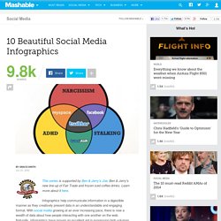
Here are 10 infographics that prove as beautiful as they are interesting. 1. This is a global map of social web involvement which illustrates that hundreds of millions of web users are creating and sharing content every month. Interestingly, it reveals that despite the Twitter hype, microblogging is still not a mass social activity and is nowhere near the size and scale of blogging. The Language of The Beatles’ Abbey Road. Today marks the one week anniversary of the much anticipated Beatles iTunes debut.
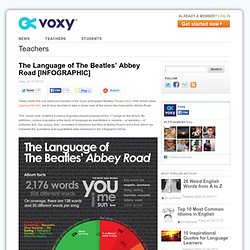
With album sales topping 450,000, we at Voxy decided to take a closer look at the seven-day best-seller: Abbey Road. This “closer look” entailed a corpus linguistics-based analysis of the 17 songs on the album. By definition, corpus linguistics is the study of language as manifested in corpora – or samples – of authentic text. Our corpus, then, consisted of electronic text files of Abbey Road‘s lyrics from which we extracted the qualitative and quantitative data displayed in the infographic below.
Side 1 vs. Over the years, everyone from music critics to Fab Four fans to casual listeners has remarked on the pronounced, but brilliant differences between Abbey Road’s Side A and Side B tracks. The majority of these “musical fragments and lyrical doodlings”, as the infographic shows, are actually composed of significantly less words than their Side 1 counterparts. Embed this image on your site. 6 Gorgeous Twitter Visualizations. Ah, Twitter.
It's impossible to get away from it; it seems that everyone stopped whatever they were doing B.T. (before Twitter) and switched to doing cool stuff for and around the service, and this includes data visualizations. In the past, we've profiled unique Twitter-related visualizations, but now we're after sheer beauty. And that's exactly what we've found; here are six gorgeous Twitter visualizations. Know of a beautiful Twitter visualization? 1. Although it's a bit too slow for everyday usage and functions better as pure eye candy, Social Collider is actually quite an interesting tool. 2. Just Landed is a beautiful geo-visualization of tweets containing the words "Just landed in... ". 3.
In its exploration of Twitter, Twistori goes back to basics: to what we love, hate, believe, think, feel and wish.