
Choosing an Infographic Template. Transforming Info into Clear, Concise Infographics. Infographics, Explained by LEGOs. A Few Rules for Making Homemade Infographics. Like many other fans of infographics, we were excited about today's launch of Visual.ly, a site that helps normal folk create infographics.
The program just requires users to upload data, and it generates a pretty JPG with charts, graphs, and icons -- no PhotoShop skills required. Given the service's ease and availability -- it's free to join -- it will probably mean the proliferation of more infographics. The definition of what an infographic is can be pretty broad. (Wikipedia's history of the form starts out with cave paintings.) Most Loved Color Palettes (Includes Hex Codes) Log In Sign Up COLOURlovers Search Create Explore Over a Million Color Palettes You'll find over 4,210,731 user-created color palettes to inspire your ideas.
New Most Loved Most Comments Most Favorites AllMonthWeekDay Browse Palettes Giant Goldfish by manekineko Loves Views Favorites Comments by sugar! Why Infographics Accelerate Decision Making. Paletton - The Color Scheme Designer. 3 Easy Ways to Pick Great Color Schemes For Your Infographics. This is part of our series on infographic design.
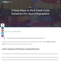
Check out the other posts here! Here’s the number one most common mistake that budding designers tend to make: Adding too many colors. The simple solution is to use more shades instead. Color schemes influence comprehension Is this bruise on my arm bluish black or blackish blue? There is a large spectrum (pun intended) of uncertainty and subjectivity when it comes to using colors for art and design. Subjective as it may be, we can agree that colors affect our moods, perceptions, and adds context to our content. Remember, though, that like all things beautiful there’s a thin line between having an array of colors that would be a sight for sore eyes, and using too many colours that would actually give someone sore eyes.
Here are a few general rules you need to keep in mind before we move on to the nitty gritty details: Stick to 2 main colors, and do not use more than 4 colours. 1. Selecting complementing colors Selecting shades. 7 Steps of Transforming Information Into A Clear And Concise Infographic. Information can be useful – and even beautiful – but only when it’s presented well.
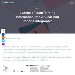
Today, being able to quickly grasp the most important pieces of information about a topic in less than 30 seconds is a luxury, but it shouldn’t be. It should be something everyone is able to do easily. We’re here to help! A great way to solve this issue is by designing infographics that help to explain complicated data in a simple way, but the problem is that infographics sometimes turn out like this: Amongst this symphony of wonderful colors lacks a design that truly makes information comprehensive and easily readable.
5 Design Trends in 2015 to Use in Your Infographic. Design is a funny word.

Some people think design means how it looks. But of course, if you dig deeper, it’s really how it works. – Steve Jobs There’s no clear scientific formula to beautiful design as it’s undoubtedly considered more of an art than a science. Strangely enough, there are many recognizable patterns which seem to reappear time and again in successful works around the web. Luckily for us, these trends aren’t limited to websites. The only problem is that too many articles around the web will tell you what is cool in web design right now – and finding the right inspiration will overwhelm even the most willing beginners. 5 First-Time Infographics That Absolutely Rock. A professional writer is an amateur who didn’t quit. – Richard Bach In 1988, a young boy named Alan had been playing in the Southampton youth ranks.
After two years, the coach promoted him to the first team. In his first game, he scored three goals as the Saints beat Arsenal 4-2. He was 17 years and 240 days old – and became the youngest player to score a hat-trick, beating a 30-year record. The boy’s name was Alan Shearer, who later became a memorable english striker. Piktochart-e-book-2-Create-Your-First-Infographic-In-15-Minutes. The Power of Visual Content. How to Create an Infographic in 5 Minutes. Update: We’ve recently published a series of tips on how to use Piktochart to create creative and engaging infographics.
While we won’t promise that it’ll take five minutes, but you can certainly halve your design time (or more) by trying these six hacks, too. This article can help you if you are worried about creating infographic from scratch. In this post, you will learn how to create infographic in five minutes using Piktochart. Step 1: Login and select a theme First, log in to magic.piktochart to begin. Select Infographic templates. For more info on all the types of infographic formats, check out the links here: Standard Infographics | Report Infographics | Banner Infographics | Presentation Infographics Browse for an infographic theme you like. Mouse-over the theme you want and select Create. Step 2: Configure your canvas The canvas comes in multiple blocks. To set the size of a block, select Settings ( ) and change the sizes accordingly. Step 3: Edit your content.