
RELIC.
45 Awesome Abstract Textures. Finding that perfect texture for your design can be quite the search, and also quite time consuming.
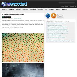
To help you out a bit we’ve browsed through the large collection of textures over at deviantART and picked out some abstract textures. 100 Principles for Designing Logos and Building Brands. Knife maker talks shop and shows the tools of the trade - The Feed Blog. Free High Resolution Textures - Lost and Taken. Color Scheme Designer 3. HitRECord. Origine-univers-creation-big-bang-550x412.jpg (JPEG Image, 550 × 412 pixels)
Mossgraffiti. D&H - PRINT. Tree of Life. Search. #d9e8c3 #ced181 #7c8f50 #555e32 #bf867c #d4b9b9 Find The Palettes You Love turkey tones posted 11.24.11 comments 1.
Painting. Typography. Image Mosaic Generator. Tattoos. Sculpture. Drawing. Light Light's Sublime Levitating Lamps. Posted by Ray | 30 Sep 2011 | Comments (9) Designer Angela Jansen of Design Academy Eindhoven recently collaborated with engineer Ger Jansen on a pair of skeuomorphic LED lamps that they're currently selling as Light Light.
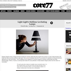
Their website knowingly notes that "It is uncommon for engineers to find good domestic applications for their technology... and it is likewise rare for designers of consumer objects to embrace cutting-edge technology wholeheartedly. " Which, of course, is "perhaps what makes the cross-pollination of ideas between Angela Jansen and Ger Jansen so remarkable. " The Light Light series creates an incredible visual conversation piece. It is like an optical illusion, yet one that is kind to the eyes and easy on the mind. Bombastic copy aside, the products speak for themselves. Some assembly required (illustrated below, not above): In short, Light Light is (the first?) Again, per the designers: "...this handcrafted lamp can be dimmed but never ignored. Logopond - Identity Inspiration. Japanese graphic design from the 1920s-30s. In the 1920s and 1930s, Japan embraced new forms of graphic design as waves of social change swept across the nation.

This collection of 50 posters, magazine covers and advertisements offer a glimpse at some of the prevailing tendencies in a society transformed by the growth of modern industry and technology, the popularity of Western art and culture, and the emergence of leftist political thought. "Buy Domestic! " poster, 1930 [+] Cover of "Nippon" magazine issue #1, Oct 1934 [+] Mods: 26 Sexy Steampunk Gadgets & Hi-Tech Hacks. Mech Mods: 26 Sexy Steampunk Gadgets & Hi-Tech Hacks Article by Angie, filed under Gadgets & Geekery in the Technology category.
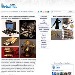
Steampunk is the mating of technology and romance, breeding some of the most wickedly cool gadget’s and art you’ve ever seen. It’s cool and brass-clad sexy. With a post apocalyptic type of rebellion, Steampunk enthusiast mod almost everything you can imagine and then some. A Singular Creation Art Community. We would like to ing you this feature tutorial by Linda Bergkvist, renowned in the digital arts community for her gorgeous portrayal of characters.
In this tutorial, Linda shows us step by step how she paints realistic eyes. About Linda Bergkvist Linda Bergkvist is a renowned digital artist who currently lives in Sweden. Linda Bergkvist's website can be found at www.furiae.com.
How To Build The World's Best Paper Airplanes. TheSlingshot.com. Architecture. The Secret Law of Page Harmony. “A method to produce the perfect book.”
The perfect book. This is how designer-genius Jan Tschichold described this system. Not the ok book, nor the pretty good book, but the perfect book. This method existed long before the computer, the printing press and even a defined measuring unit. No picas or points, no inches or millimeters. And you can still use it. The Secret Canon & Page Harmony Books were once a luxury only the richest could afford and would take months of work to be brought to fruition. And they were harmoniously beautiful. The bookmakers knew the secret to the perfect book. So elegant is this method of producing harmony that a few designers saw to rediscover it. Amazing Design Freebies #3. Embroidery Designs at Urban Threads - Projects.
Paint Moss Graffiti - Step-by-Step Guides for Offbeat DIY Projects. How to Get a Professional Look With Color. What makes a design look coordinated, planned and professional?

The answer is: ‘color’. Not every project needs bland corporate blue to look professional. Planning color means creating a framework that describes which colors to use and how to use them. Color is the slipperiest design element. “Good” color is so closely tied to elusive things like personal taste and intuition, as well as technical considerations such as contrast and monitor calibration. But color is vital to content. In this article we’ll review some techniques to achieve beautiful color palletes for your web designs.
The best way to make a website look unplanned is to choose its colors at random. Even when visitors skim a website’s home page for the first time, the colors influence their attitude towards the content. Color affects how people interpret what they see as much as typography. Finding the right colors isn’t easy, but the process can be systematic.
Photography.