

CSS3 vs Photoshop: Transforms. It's time for some more CSS3 vs.
Photoshop, and on this occasion we're going to dig into transforms. Changing an object's shape is a huge part of any graphic editor's toolset. These days, with CSS3 we can rotate, scale, and skew an element's shape without the need for Photoshop. Let's try it! Note: All the following examples were tested on Mozilla Firefox, Safari and Chrome. Before We Get Started In this tutorial we will use Gradient Backgrounds, Box Shadows and Multiple Images Backgrounds as well as Transition effects and Opacity and Transparency styles, topics covered in the first three tutorials of this series: Step 1: Rotate Rotating an element is one of the more basic features of any graphic editor.
In the past it was typically very complicated to rotate an element in HTML, now with CSS3 everything is very simple: Here are the syntaxes of a Rotation Transform: transform: rotate( <number> deg); CSS3 vs. Photoshop: Complex Backgrounds. This tutorial will outline how to create complex backgrounds which, in the past, could only be achieved by slicing up a design created in Photoshop or another graphic editor.
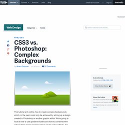
We're going to look at how to use gradient shades and how to combine them with multiple image backgrounds to create radical effects. Are you ready? Before Getting Started This is the first in what will be a series of many examples. Extreme Makeover: jPaginator CSS3 Edition. jPaginator is a nifty jQuery plugin by Remy Elazare which combines pagination and scrolling in a simple user interface.
Remy recently asked me if I would like to use it for something on Webdesigntuts+ and I figured it would be a great candidate for a style make-over. Pagination often involves lots of page links, which themselves need navigating along before you can select them. jPaginator aims to improve the user experience of long pagination lists by offering a slider to animate links left and right. You can also use the control links either side of the pagination, or even rely on the good ol' arrow keys. Introduction Check out jPaginator in its raw state. CSS3 Patterns Gallery.
Browser support The patterns themselves should work on Firefox 3.6+, Chrome, Safari 5.1, Opera 11.10+ and IE10+.

However, implementation limitations might cause some of them to not be displayed correctly even on those browsers (for example at the time of writing, Gecko is quite buggy with radial gradients). Also, this gallery won’t work in Firefox 3.6 and IE10, even though they support gradients, due to a JavaScript limitation. Submission guidelines. 14 Top CSS and HTML5 Files for Web Designers on CodeCanyon. If you read WebDesignTuts+ often, you'll probably have seen many references to ThemeForest, our marketplace for web templates and themes.
However, there's a also a chance you've visited CodeCanyon, the sister marketplace to ThemeForest which retails code snippets and plugins. CodeCanyon is a pretty great resource full of useful, interesting and, well, kick-ass files for web development that might be an untapped resource for you. CodeCanyon covers a wide range of different categories, from PHP scripts to WordPress plugins to code for mobile apps. Today, we're going to take a look at two specific categories, HTML5 and CSS, and some of the good-looking code snippets they contain. If you've got any extra favorites from CodeCanyon, drop some links in the comments! Warp Shadow using CSS 3. It’s an old time to create an effect of drop shadow using Photoshop or any other image editing tool for web page.

Thanks to CSS 3 which enable us to apply nice shadow effect through easy way. It increase the speed of page load and downloads the lesser bytes compare to images for shadow effect. In this blog our main focus will be on applying warp shadow effect using CSS 3. Create a Swish CSS3 Folded Ribbon in Five Minutes. Take one line of markup, a couple of CSS3 rules (no images), and you can have yourself a swish folded ribbon effect in five minutes.
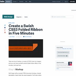
Let's see how.. Step 1: Markup We'll begin with an empty HTML document; doctype, charset declaration, head, body, the usual suspects. You'll also notice we're linking to the Google Web Fonts API so we can make use of the pleasantly decorative Montez typeface. Now we'll add our ribbon element.
Step 2: Stir in Some Style Open up a new CSS file, link to it in the head of your document, then jump into adding some styles. We've started by styling the html and the body, just for the purposes of the demo (and yes, I've used an image for the background, but the ribbon itself is 100% image free). Create Pure CSS3 Ticket-Like Tags. Tags are a familiar feature of many Web 2.0 services, websites and especially blogs.
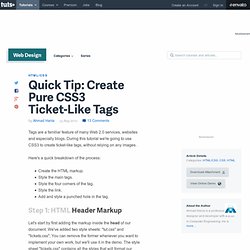
During this tutorial we're going to use CSS3 to create ticket-like tags, without relying on any images. Here's a quick breakdown of the process: Create the HTML markup.Style the main tags.Style the four corners of the tag.Style the link.Add and style a punched hole in the tag. Step 1: HTML Header Markup Let's start by first adding the markup inside the head of our document. Step 2: HTML Tags Markup Now we need to add the markup for the tags. Step 3: CSS Main Tag Let's start by styling the main tags div (.ticket). Our tags should look like this. Step 4: CSS Top Corners Now we style the top two corners to make it look like a cutout quarter of a circle. Start by setting the content value to nothing, position absolute, z-index to 100 or any large positive value, set its position from top, left or right, and zero. To learn more about creating shapes using CSS borders styles you can view this guide.
Conclusion. Css3. CSS3 vs. Photoshop: Rounded Corners and Box Shadows. Perfectly Rotate and Mask Thumbnails With CSS3. Ever seen a website showcasing image thumbnails that are slightly rotated?
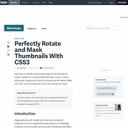
It's a simple effect that adds a layer of visual personality. Saying that, if you're not achieving the rotation effect with CSS, you're working too hard! Learn how to do it right! Republished Tutorial Every few weeks, we revisit some of our reader's favorite posts from throughout the history of the site. Introduction Image galleries with rotated thumbnails are somewhat infrequent, but it's a simple trick to add style to your webpage. To properly achieve this effect, your first thoughts might turn to creating rotated thumbnails in Photoshop. Angle Consistency: If the images are not all rotated at the same angle, the visual consistency of page is lost.