
Pretty scatter plots with ggplot2. @drsimonj here to make pretty scatter plots of correlated variables with ggplot2!
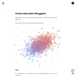
We’ll learn how to create plots that look like this: Data In a data.frame d, we’ll simulate two correlated variables a and b of length n: set.seed(170513) n <- 200 d <- data.frame(a = rnorm(n)) d$b <- .4 * (d$a + rnorm(n)) head(d) #> a b #> 1 -0.9279965 -0.03795339 #> 2 0.9133158 0.21116682 #> 3 1.4516084 0.69060249 #> 4 0.5264596 0.22471694 #> 5 -1.9412516 -1.70890512 #> 6 1.4198574 0.30805526 Basic scatter plot Using ggplot2, the basic scatter plot (with theme_minimal) is created via: library(ggplot2) ggplot(d, aes(a, b)) + geom_point() + theme_minimal() Shape and size There are many ways to tweak the shape and size of the points. Ggplot(d, aes(a, b)) + geom_point(shape = 16, size = 5) + theme_minimal() Color We want to color the points in a way that helps to visualise the correlation between them. One option is to color by one of the variables. To do this, we can color points by the first principal component. Using 2D Contour Plots within {ggplot2} to Visualize Relationships between Three Variables.
The Goal To visually explore relations between two related variables and an outcome using contour plots.
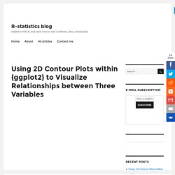
We use the contour function in Base R to produce contour plots that are well-suited for initial investigations into three dimensional data. We then develop visualizations using ggplot2 to gain more control over the graphical output. We also describe several data transformations needed to accomplish this visual exploration. The Dataset The mtcars dataset provided with Base R contains results from Motor Trend road tests of 32 cars that took place between 1973 and 1974. Head(mtcars) ## mpg cyl disp hp drat wt qsec vs am gear carb ## Mazda RX4 21.0 6 160 110 3.90 2.620 16.46 0 1 4 4 ## Mazda RX4 Wag 21.0 6 160 110 3.90 2.875 17.02 0 1 4 4 ## Datsun 710 22.8 4 108 93 3.85 2.320 18.61 1 1 4 1 ## Hornet 4 Drive 21.4 6 258 110 3.08 3.215 19.44 1 0 3 1 ## Hornet Sportabout 18.7 8 360 175 3.15 3.440 17.02 0 0 3 2 ## Valiant 18.1 6 225 105 2.76 3.460 20.22 1 0 3 1 Preliminary Visualizations.
Plot Group Means and Confidence Intervals - R Base Graphs. Ggplot2 scatter plots : Quick start guide - R software and data visualization - Documentation - STHDA. This article describes how create a scatter plot using R software and ggplot2 package.
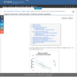
The function geom_point() is used. mtcars data sets are used in the examples below. Simply creating various scatter plots with ggplot #rstats. Inspired by these two postings, I thought about including a function in my package for simply creating scatter plots.
In my package, there’s a function called sjp.scatter for creating scatter plots. To reproduce these examples, first load the package and then attach the sample data set: The simplest function call is by just providing two variables, one for the x- and one for the y-axis: which plots following graph: If you have continuous variables with a larger scale, you shouldn’t have problems with overplotting or overlaying dots. The same plot, when auto-jittering is turned off, would look like this: You can also add a grouping variable. If the groups are difficult to distinguish in a single plot area, the graph can be faceted by groups.
Find a complete overview of the various function options in the package-help or at inside-r. Gefällt mir: Gefällt mir Lade...