

Computing and visualizing PCA in R. Following my introduction to PCA, I will demonstrate how to apply and visualize PCA in R.
There are many packages and functions that can apply PCA in R. In this post I will use the function prcomp from the stats package. I will also show how to visualize PCA in R using Base R graphics. However, my favorite visualization function for PCA is ggbiplot, which is implemented by Vince Q. Vu and available on github. Factoextra R package : Quick Multivariate data analysis (PCA, CA, MCA) and visualization - R software and data mining. The R package factoextra provides some easy-to-use functions to extract and visualize the output of PCA (Principal Component Analysis), CA (Correspondence Analysis) and MCA (Multiple Correspondence Analysis) functions from several packages : PCA, CA, MCA [FactoMineR]; prcomp and princomp [stats]; dudi.pca, dudi.coa, dudi.acm [ade4]; ca [ca]; corresp [MASS].
Ggplot2 plotting system is used. Principal Component Analysis is used to summarize the information contained in a continuous (i.e, quantitative) multivariate data by reducing the dimensionality of the data without loosing important informations.Correspondence Analysis (CA) is an extension of Principal Component Analysis suited to analyse a large contingency table formed by two qualitative variables (or categorical data).Multiple Correspondence Analysis (MCA) is an adaptation of CA to a data table containing more van two categorical variables.
If you want to do this, there is no other package, use factoextra, it’s simple. Get_pca: Extract the results for individuals/variables in Principal Component Analysis - R software and data mining. Extract all the results (coordinates, squared cosine, contributions) for the active individuals/variables from Principal Component Analysis (PCA) outputs. get_pca(): Extract the results for variables and individualsget_pca_ind(): Extract the results for individuals onlyget_pca_var(): Extract the results for variables only These functions are included in factoextra package.
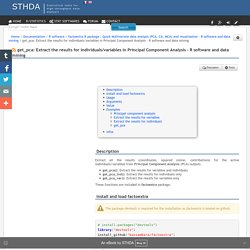
The package devtools is required for the installation as factoextra is hosted on github. library("devtools")install_github("kassambara/factoextra") Load factoextra : Get_mca: Extract the results for individuals/variables in Multiple Correspondence Analysis. Extract all the results (coordinates, squared cosine and contributions) for the active individuals/variable categories from Multiple Correspondence Analysis (MCA) outputs. get_mca(): Extract the results for variables and individualsget_mca_ind(): Extract the results for individuals onlyget_mca_var(): Extract the results for variables only These functions are included in factoextra package.

Get_ca: Extract the results for rows/columns in Correspondence Analysis - R software and data mining. Fviz_pca: Quick Principal Component Analysis data visualization - R software and data mining. Draw the graph of individuals/variables from the output of Principal Component Analysis (PCA).
Fviz_mca: Quick Multiple Correspondence Analysis data visualization - R software and data mining. Draw the graph of individuals/variables from the output of Multiple Correspondence Analysis (MCA).
The following functions, from factoextra package are use: fviz_mca_ind(): Graph of individualsfviz_mca_var(): Graph of variable categoriesfviz_mca_biplot() (or fviz_mca()): Biplot of individuals and variable categories The package devtools is required for the installation as factoextra is hosted on github. Fviz_contrib - Quick visualization of row/column contributions - R software and data mining. This function can be used to visualize the contributions of rows/columns from the results of Principal Component Analysis (PCA), Correspondence Analysis (CA) and Multiple Correspondence Analysis (MCA) functions.
The function fviz_contrib() [in factoextra package] is used. The package devtools is required for the installation as factoextra is hosted on github. Fviz_ca: Quick Correspondence Analysis data visualization using factoextra - R software and data mining. Graph of column/row variables from the output of Correspondence Analysis (CA).
The following functions, from factoextra package are use: fviz_ca_row(): Graph of row variablesfviz_ca_col(): Graph of column variablesfviz_ca_biplot(): Biplot of row and column variablesfviz_ca(): An alias of fviz_ca_biplot() These functions are included in factoextra package. Eigenvalues: Quick data visualization with factoextra - R software and data mining. This article describes how to extract and visualize the eigenvalues/variances of the dimensions from the results of Principal Component Analysis (PCA), Correspondence Analysis (CA) and Multiple Correspondence Analysis (MCA) functions.
The R software and factoextra package are used. The functions described here are: Reinventing the wheel for ordination biplots with ggplot2 – R is my friend. I’ll be the first to admit that the topic of plotting ordination results using ggplot2 has been visited many times over.

As is my typical fashion, I started creating a package for this purpose without completely searching for existing solutions. Specifically, the ggbiplot and factoextra packages already provide almost complete coverage of plotting results from multivariate and ordination analyses in R. Being the stubborn individual, I couldn’t give up on my own package so I started exploring ways to improve some of the functionality of biplot methods in these existing packages.
Multidimensional Scaling (MDS) with R. Multidimensional Scaling (MDS) with R This page shows Multidimensional Scaling (MDS) with R. It demonstrates with an example of automatic layout of Australian cities based on distances between them. The layout obtained with MDS is very close to their locations on a map. At first, the data of distances between 8 city in Australia are loaded from dist.au <- read.csv(" Alternatively, we can download the file first and then read it into R from local drive. dist.au <- read.csv("dist-Aus.csv")dist.au Then we remove the frist column, acronyms of cities, and set them to row names. row.names(dist.au) <- dist.au[, 1]dist.au <- dist.au[, -1]dist.au After that, we run Multidimensional Scaling (MDS) with function cmdscale(), and get x and y coordinates. fit <- cmdscale(dist.au, eig = TRUE, k = 2)x <- fit$points[, 1]y <- fit$points[, 2] Then we visualise the result, which shows the positions of cities are very close to their relative locations on a map.
Like this: Like Loading... Metaphors Matter: Factor Structure vs. Correlation Network Maps. The psych R package includes a data set called "bfi" with self-report ratings on 25 personality items along a 6-point agreement scale. All the details are provided in the documentation accompanying the package. My focus is how to represent the correlations among these ratings: factor analysis or network graphics?
Let's start with the correlation network map produced by the R package qgraph. As always, all the R code can be found at the end of this post. First, we need to discover the underlying pattern, so we will begin by looking for nodes with the highest correlations and thus interconnected with the thickest lines. Using this approach, we can identify several regions that are placed near each other because of their interconnections. Plotting principal component analysis with ggplot. Visualizing Principal Components « Systematic Investor. Interactive MDS visualisation using D3 « dahtah.
Here’s a sneak peak into upcoming visualisation work. I’ve been working a bit on MDS (Multi-dimensional scaling), a classical technique for visualising distance data. Classical MDS is useful, but interactive MDS is *much* more useful. 7 Functions to do Metric Multidimensional Scaling in R « Data Analysis Visually Enforced.