
[nytlabs] Project Cascade. Relation Browser / Visualisations showing relations. Relation Browser - Moritz Stefaner Different types of relations, different type of entities. Number of relations should not get bigger then ~25. Nice animations. "Flat" - every relation is equal. No sorting, or filtering. Ask Ken - Michael Aufreiter (Linz) In contrast to the "relation browser" (by moritz s.) here a whole graph opens. Image swirl - G. The start is a Grid View. PaperCube - Peter Bergstrom my thoughts are here Publication Map - Moritz Stefaner Publications are clustered according their cross-references of single articles.
50 Great Examples of Data Visualization. Wrapping your brain around data online can be challenging, especially when dealing with huge volumes of information.

And trying to find related content can also be difficult, depending on what data you’re looking for. But data visualizations can make all of that much easier, allowing you to see the concepts that you’re learning about in a more interesting, and often more useful manner. Below are 50 of the best data visualizations and tools for creating your own visualizations out there, covering everything from Digg activity to network connectivity to what’s currently happening on Twitter. Fizz — Social Network Visualization — by Bloom. Cartagram — Geocoded Image Visualization — by Bloom. Cartagr.am This is Cartagr.am, by Bloom . It shows popular public photos from Instagram arranged on a map. Click and drag to pan around ... Scroll with your mouse or + and - to zoom ... Search for a place name like New York , Paris or London or zoom to your current location . InfoGraphics. The importance of frame: why Apple gets it, and Google doesn’t.
The screen frame is an important element that is playing a huge role in the current war in the mobile world between Apple, Google and Microsoft.
It's interesting to see how much it's overlooked, and why it has a huge role in defining the final user experience... for both users and developers. Think about painting: we have painters that created entire worlds inside the frame and still the frame was often part of the painting itself: by negating the view of a larger picture, we have to use our imagination to fill it. At times, artists also worked around that limit, going beyond the canvas, using a wider space as their canvas. Www.newlaunches.com/entry_images/1107/12/nokia_timeline.php. Social Media Graphics - collecting all kinds of social media related charts, graphs and infographics.
Well-formed data. B.Sc. Thesis. Projection Techniques for Document Maps This thesis compares different vector space projection techniques for creating two–dimensional maps out of text document collections.
I describe the process from raw text information to similarity maps and implemented a working prototype. September 2005 University of Osnabrück Supervisors: Dr. M.A. Thesis. Visual tools for the socio–semantic web This thesis contributes to a new discipline of science: web science, as introduced by Tim Berners-Lee and others in 2006.
Designers, computer scientists, sociologists, cognitive scientists, psychologists etc. have individual perspectives on the complex and rapidly evolving interplay of technological and social infrastructure and human society. However, a well-defined discipline — unifying the scientific analysis of social and human factors to understand, but also to shape and steer web developments by informed design and engineering —is not established yet. I hope to contribute to an interdisciplinary dialogue between science, engineering and design with this thesis. Master’s Thesis Interface Design Programme University of Applied Sciences Potsdam Moritz Stefaner, June 2007 Supervisors: Prof. All you need to know about Visual Thinking. An =mcm Interview with Dave Gray on Visual Thinking in Management. Supercharge yourself. Think, talk and work more creatively.
Home. Il canale di theRSAorg. RSA Animate - Changing Education Paradigms. The Art of War (2nd edition) from SmarterComics. The Long Tail from SmarterComics. Visual telling: il business a fumetti. La guida in italiano a Prezi « Presentazioni Efficaci. Marumushi's posterous - Home. Graphical visualization of text similarities in essays in a book. AmMap: Interactive flash maps. Visual Thinking. Design Language News. Internet Statistics & Social Media Usage. Statistiche download di Firefox 4.
– June 14, 2011Posted in: Archived, Retired We launched the first version of glow.mozilla.org with the Firefox 4 release in March 2011 as a way to visualize Firefox downloads and community involvement around the world.
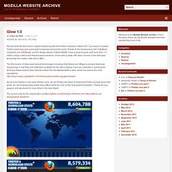
Thanks to the development skill of Matthew Claypotch and Jeff Balogh, and the design talents of Sean Martell, it was a great success, with more than 1.2 million unique visitors and frequent press mentions. (It was also a pretty nifty demo of some of the best open technology the modern web has to offer.) The first version of Glow used several technologies including SQLStream and HBase to process download request logs in real time and make them available for the site to display.
If you are interested in learning the technical details behind Glow read this article from the Mozilla Metrics team, which has links to the code repositories: As we move toward a new rapid release cycle, we are finding new ways of measuring Firefox success across the globe. 31 Interesting Social Media Data Visualization Tools. Tags: Digg, Facebook, Flickr, Google Maps, Last.fm, Lists, Reddit, Twitter, YouTube.

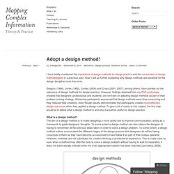
Set, Track & Achieve Goals with Crystal Mapping. Enquiring Minds. Social bookmarking for pictures on VisualizeUs. Web & Social Media Infographics. Adopt a design method! « Design Method for Mapping Complex Information. I have briefly mentioned the importance of design methods for design practice and the current lack of design methodologists in a previous post.
Now, I will go further explaining why design methods are essential for the design discipline more than ever. Gregory (1966), Jones (1992), Conley (2004) and Cross (2001, 2007), among others, have pointed out the relevance of design methods for design practice. However, findings obtained from my PhD workshops showed that designers (professional and students) are not keen on adopting design methods as part of their problem-solving strategy.
Workshop participants expressed that design methods were time-consuming and they reduced their creativity, even though results demonstrated that participants created more effective design outcomes when they applied a design method. 6a00d8341f98b553ef0115721c40cb970b-pi (2500×1727) Il primo eBook italiano gratuito sulla comunicazione visiva. Elementi di Comunicazione Visiva. TheFWA. Multinational Corporations. Dipity - Find, Create, and Embed Interactive Timelines. Online Visualization and Organization Tools. Gephi, an open source graph visualization and manipulation software. David McCandless on the Beauty of Data Visualization. Information aesthetics - Information Visualization & Visual Communication. Visualization Options.
The Art of Insight and Action.