

Grand Theft: Annenberg. A Trip Through Internet History with @wwwtxt. As ethereal as the internet seems sometimes, it is also an amazing archive of words and language.

Tweets are stored with the Library of Congress (and perhaps other government agencies), entire web sites are slurped up into archive.org, and deleting your LinkedIn profile remains a mystery. We know these facts intuitively and while we often discuss the privacy implications of this reality, it’s also striking to see how that archival quality can come to life in new ways. I’ve been following LA-based artist Daniel Rehn’s @wwwtxt for a few months now. What does the internet's physical structure look like? Sally Adee, features editor SCIENCE fiction author William Gibson famously described cyberspace as a shared hallucination.
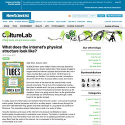
Most people struggle to imagine what the internet's physical structure looks like, but in Tubes, Andrew Blum sets out to find it. His first task is to disentangle our familiar, if not strictly accurate, conceptions about the internet from its actual cables, boxes and routers. One such notion is the idea that the internet finds a route around censorship. This is true of the metaphorical overlay - take down a website and it can pop up elsewhere in an instant. In reality, every bit of information sent between New York and London - every email, Facebook status update, financial transaction and bid on an eBay teapot - makes its way through the same thin 4300-kilometre-long garden hose that submerges in Long Island and surfaces in Penzance.
Internet Mapping Project. What does the Internet look like? Map of the Internet. Can you draw the internet? Internet Mapping Project: Map gallery. This map appeared in the December 1998 Wired.
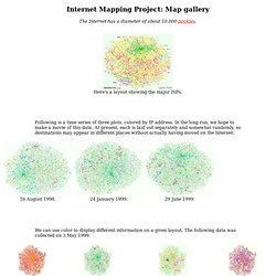
If you are interested in using this image in some way, contact the folks at Lumeta, who own the rights to the images and technology. These are variations on the IP address-based color schemes, basically just switching around R, G, and B. These have the technical names of color schemes 0, 1, and 2. Notes Both my wife and Lillian Schwartz, a noted artist, say this is better with a black background.
www.opte.org/maps/mpeg/movie4.mpeg. The Internet map. The map of the Internet Like any other map, The Internet map is a scheme displaying objects’ relative position; but unlike real maps (e.g. the map of the Earth) or virtual maps (e.g. the map of Mordor), the objects shown on it are not aligned on a surface.
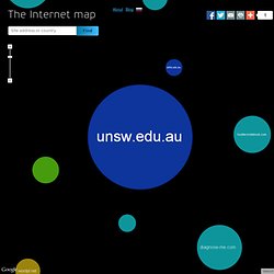
Mathematically speaking, The Internet map is a bi-dimensional presentation of links between websites on the Internet. Every site is a circle on the map, and its size is determined by website traffic, the larger the amount of traffic, the bigger the circle. Users’ switching between websites forms links, and the stronger the link, the closer the websites tend to arrange themselves to each other. Charges and springs To draw an analogy from classical physics, one may say that websites are electrically charged bodies, while links between them are springs.
Also, an analogy can be drawn from quantum physics. The Internet map. PEER 1 Hosting Launches Map of the Internet App. Wednesday, March 6, 2013 - 04:00.

10 Awesome Twitter Analytics and Visualization Tools. Recently Twitter rolled out their native analytics platform for all users and now you can get some quality data about your tweets directly from Twitter.
After researching over a thousand Twitter Tools for the Twitter Tools Book I came across many Twitter analytics and visualization tools. These Twitter tools were designed to add value by presenting a different way to visualize or analyze your tweets, the people in your network, and the tweets from the people in your network. Many tools tried to add value and failed.
At least they tried. The following tools, however, stand out in my mind as exceptional or entertaining and I recommend you check them out if you want to analyze and visualize your activity on Twitter. 1. TweepsMap is an excellent Twitter tool for both analyzing and visualizing your Twitter network. The maps transforming how we interact with the world. 12 September 2013Last updated at 19:35 ET By Matthew Wall Business reporter, BBC News An Ordnance Survey staff member interrogates 3D aerial mapping data The modern map is no longer an unwieldy printed publication we wrestle with on some blustery peak, but digital, data-rich, and dynamic.
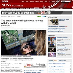
It is transforming the way we interact with the world around us. Thanks to "big data", satellite navigation, GPS-enabled smartphones, social networking and 3D visualisation technology, maps are becoming almost unlimited in their functionality, and capable of incorporating real-time updates. "Advanced LED screen technology and smartphones equipped with projectors are going to transform the way we interact with maps," says Ian White, founder and chief executive of Urbanmapping.com, a San Francisco-based geoservices provider. Norwayweb and Data Bodies. Taking tax information and putting it into real time artwork Featuring: Bjorn Magnhildoen, Norwayweb I came across the Net Artwork Norwayweb whilst receiving my usual mass of e-mails.
Even though I usually use filters, far too much spam still gets through. So, like so many other's around the world, I have the arduous process of picking out what is deemed worth keeping. Lost in despair, numerous individuals choose to delete everything rather than cyphering through an ever expansive junk mail infestation. As we all adapt and mutate in response to a more technologically determined world, we become something else. Online_communities.png (PNG Image, 1024 × 968 pixels) - Scaled (98. Mercator's Projection. The Mercator projection was invented by Gerardus Mercator, a Flemish mapmaker.

His name is a latinized version of Gerhard Kramer. This is his famous world map of 1569. Google and Apple Digital Mapping. Over the past few years, at the kinds of conferences where the world's technological elite gather to mainline caffeine and determine the course of history, Google has entertained the crowds with a contraption it calls Liquid Galaxy.
It consists of eight large LCD screens, turned on their ends and arranged in a circle, with a joystick at the centre. What the Internet Actually Looks Like - Megan Garber. GeoTel Communications via Fortune and Mashable Here is what the Internet looks like: not a series of GIFs or a video of surfing goats, but a spindly collection of fiberoptic cables. The Internet, as a physical thing, actually looks a lot like a series of tubes. We know this, of course, but it's nice to be reminded of the physical filaments that afford our digital connections. This Is the Most Detailed Picture of the Internet Ever (and Making it Was Very Illegal) Why would you need a map of the Internet? The Internet is not like the Grand Canyon. It is not a destination in a voyage that requires so many right turns and so many left turns. What Does the Internet Look Like? Christine Smallwood imagines the place where we live, in a freshly re-uploaded essay from The Baffler’s archives.
The magazine has just re-launched; you can order issue 19 at The Baffler, and help fund its future on Kickstarter. * Also see the most detailed map of the Internet. In 2007, Popular Science broke important ground in Internet visualization theory—an ongoing effort to describe what happens behind our computer screens, or, more accurately, beyond them, inside Ethernet cables and satellites lying around in the upper atmosphere. What does all this activity look like? The Internet in 1969. Warriors of the Net HD. Interactive map: how the brain sorts what we see. UC BERKELEY (US) — Scientists have found that the brain is wired to put the categories of objects and actions we see daily in order, and have created the first interactive map of how the brain organizes these groupings.
The result—achieved through computational models of brain imaging data collected while the subjects watched hours of movie clips—is what researchers call “a continuous semantic space.” Maps show how different categories of living and non-living objects that we see are related to one another in the brain’s “semantic space.” (Credit: Gallant lab) » Mapping the brain’s semantic space Rungy Chungy Cheese Bees. Stefan Greuter. Visualization is one of the most important communication and analysis tools available. It enables humans to process large amounts of data rapidly, to gain insights and to understand linkages and trends and to bring meaning out of complexity. However, statisticians often analyse markets based on two-dimensional graphs.
MARIKO MORI : : LINK. Japanese artist Mariko Mori moved from fashion into art during the late 1980s. Since this time, she has created photographic and video installations that often feature her adopting fictional guises. Future Internet From Johnny Mnemonic. Tron Lightbike Scene. TRON: LEGACY Official Trailer. Measuring Influence: The Value of 3D Data Visualization. Rack.0.mshcdn.com/media/ZgkyMDEyLzA4LzAyLzEwXzA0XzI5XzExNF9maWxlCnAJdGh1bWIJMTIwMHg5NjAwPg/5f4a24d7.
Atlas of Cyberspace - Full Content. Ever wonder what happens on the Internet every minute? Do you know what goes on the Internet every single minute? Google processes 2 million search requests. 72 hours of videos are uploaded on YouTube. And over 204 million emails are sent. This happens every minute. Digg - What the Internet is talking about right now. David Roessli's Empty Set.