
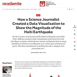
Soft Drink Industry Structure. The illusion of diversity: visualizing ownership in the soft drink industryPhil Howard,1 Chris Duvall2 and Kirk Goldsberry3August, 2010 BackgroundThree firms control 89% of US soft drink sales [1].
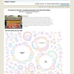
This dominance is obscured from us by the appearance of numerous choices on retailer shelves. Steve Hannaford refers to this as "pseudovariety," or the illusion of diversity, concealing a lack of real choice [2]. To visualize the extent of pseudovariety in this industry we developed a cluster diagram to represent the number of soft drink brands and varieties found in the refrigerator cases of 94 Michigan retailers, along with their ownership and/or licensing connections. Click for zoom.it (scroll in and out) version or extra large versionPDF version of Soft Drink Industry Structure, 2008 ResultsWe recorded 993 varieties of soft drinks.
The most successful competitors in these new categories may eventually be bought out. Coca-Cola’s 25 brands and 133 varieties Pepsi’s 17 brands and 161 varieties. Information aesthetics - Data Visualization & Information Design. Not shaking the grass - Romeo and Juliet poster by Beetroot Design Group:... Is Barack Obama the President? Infographic: Using 2 Million Instagram Pics to Map a City's Visual Signature. The visual signature of San Francisco.
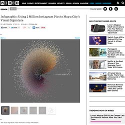
Image: Phototrails Above: A detail of one of Tokyo's visual signatures. Below: The full visual signature for Tokyo. Images: Phototrails Above: The visual signature of New York City. Below: A detail of one of New York City's visual signatures. Images: Phototrails Image plot of 33,292 photos uploaded to Instagram from Tel Aviv between April 20–26, 2012. One version of Tel Aviv's visual signature, using more than 30,000 randomly chosen Instagram photos. The visual signature of San Francisco. Image plot of 33,292 photos uploaded to Instagram from Tel Aviv between April 20–26, 2012. The photos you take on Instagram are not just about you. The Instagram photos create gorgeous “visual signatures” for each city. The figure above shows a side-by-side comparison of San Francisco and Tokyo based on brightness and hue mean. “We see a clear line that separates ‘before’ and ‘after’ Sandy.”
Interdisciplinary engagement through artistic visualisation. Making visible the invisible: Art, design and science in data visualisation International Advisory Board Ralph Ammer, deSimon Biggs, ukEmil Bjerrum-Bohr, dkDavide Bocelli, itStephen Boyd-Davis, ukCezanne Charles, usRosan Chow, deDave Clements, uk Joe Faith, ukMalcolm Ferris, ukMonika Fleischmann, deAlexandra Daisy Ginsberg, uk, zaRanulph Glanville, ukDerek Hales, uk Idea & Organisation Michael HohlCover illustration: All the water by Adam Nieman.
This Beautiful 19th-Century Org Chart Puts Your Company's To Shame. In 1855, Daniel McCallum, the general superintendent of the Erie Railroad, had a problem.
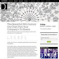
First founded in 1832 as a railroad line originally linking New York with its titular lake, Erie Railroad had undergone a period of explosive growth with the laying of more than 2,316 miles of track at its peak. Thanks to the invention of the telegraph in 1844, these tracks were overseen by a number of workers and superintendents, who were responsible for reporting information down the track about potential problems in order to prevent train wrecks and delays. But McCallum found it hard to keep track of who in his ever-expanding network of superintendents was responsible for what sections of track. From a distance, McCallum's chart looks less like it deals with railroads than the blossoming of some exotic flora. How a Science Journalist Created a Data Visualization to Show the Magnitude of the Haiti Earthquake. On the one year anniversary of the Haiti earthquake, journalist Peter Aldhous created a data visualization that shows how the Carribean country's relatively low seismic earthquake had as many fatalities as all but one earthquake over a time span of almost 40 years.
The data visualization is striking but also a study in how journalists are increasingly telling stories that leverage datasets that are freely available to the public. Peter Aldhous, San Francisco Bureau Chief for New Scientist magazine, created the interactive graphics. We asked him to explain how he created the visualizations which compare seismic activity to fatalities caused by earthquakes over the span of four decades. Aldhous posted the data visualizations on his Web site with the following explanation: The earthquake that struck near the Haitian capital, Port-au-Prince, on 12 January 2010, was unremarkable in seismic terms -- barely making the year's top 20 most powerful quakes. The bar graph marks fatalities. Fiction-thumb.jpg 814×515 pixels. Get Your Dose of Innovation.
The Social Life of Visualization: Part 1. In 2009 we are in the midst of an interesting era for data visualization, particularly as it becomes coupled with the social web.
Increasing processing speed, bandwidth and storage capacity are making it relatively simple to render and access visual representations of data. Developers have released libraries of code so we can easily create our own visualizations; and access to all kinds of data is becoming incredibly standardized, particularly through the use of APIs. So as visualization becomes much more straightforward to integrate into online environments, it makes sense to rethink how it can best be used in this setting. You will have possibly already come across social networks about visualizations if you’ve ever used IBM’s Many Eyes or Swivel. Support storytelling After some extensive research into the area, our take on visualization within a social space is that it should support a shared storytelling process around a data set. Visualization bringing it to life with Flickr photos.