
Aligning text smartly in CSS. Have you ever thought of aligning text smartly in CSS?

You must try now. All the Generic CSS Data Types. Values for properties in CSS can be in a number of formats.

In order for a user agent to be able to determine if a value is valid, it needs to make sure it conforms to one of the speicfic types of values. These are called data types, and are typically written in the specs like <this>. There are two kinds of data types - specific and generic. Specific data types are related a single property or a small group of properties.
For example, the <transform-function> data type is used as the value for the transform property alone. Generic data types, on the other hand, are not related to any specific property. In this article, I'm going to give an overview of all the generic data types. AllThingsSmitty/css-protips. Bootstrap 3 Tutorials - #1 Installing Bootstrap & Introducing the Grid System. Bring your animations to life with physics – ReactJS News. Getting started with animations To animate is to transition the user interface from one display to another.

Animation enhances user experience, providing feeback to user actions and making screens that haven’t been introduced before easier to understand. An example can be seen with this React Material UI datepicker. The animations respond to user input and inform the user with transitions that show they are moving back or forward when they change month or select a date. This post will compare using CSS transitions based on time against using spring phsyics to animate transitions. Example with no Animation We will build on this example which doesn’t have any animation. Using timed CSS animations A CSS transition can be added to the properties of an element with the CSS transition property. Cubic Bezier A cubic bezier curve is a timing function that starts at position 0 and time 0 and ends at 1,1. Transition: '0.5s cubic-bezier(0.25, 0.1, 0.25, 1)' CSS Reference - A free visual guide to the most popular CSS properties. Form Validation Techniques. We all know that online forms can be a hassle to have to fill out.

Especially when there is nothing but a list of inputs presented without much guidance or feedback. But as form creators, there are many things we can do to improve the experience for the users filling out forms online. How to Create Modals with Bootstrap 3. In this tutorial you will learn how to create modals with Bootstrap.

Creating Modals with Bootstrap Modals are basically a dialog box that is used to provide important information to the user or prompt user to take necessary actions before moving on. Modal windows are widely used to warn users for situations like session time out or to receive their final confirmation before going to perform any critical actions such as saving or deleting important data. You can easily create very smart and flexible dialog boxes with the Bootstrap modal plugin.
The following example will show you how to create a simple modal with a header, message body and the footer containing action buttons for the user. — The above example launches the modal window when the DOM is fully loaded via JavaScript. Activate Modals via Data Attributes You can activate a Bootstrap modal by clicking on the button or link via data attributes without writing any JavaScript code.
Explanation of Code Activate Modals via JavaScript. How to use CSS linter in Meteor. How to use CSS linter in Meteor CSS linting is a topic which is often overlooked and this is quite understandable because CSS formatting, providing rules for it, etc., are not so important in many teams and projects.

But sometimes they are. We will take a look at how to prepare CSS linter in the Meteor app. You are probably thinking — why do I need this if I use Sass or Less preprocessors? My CSS will be well formatted anyway. So how do you lint CSS in the Meteor app? Introduction to CSS3 - Week One - a Collection by Colleen van Lent on CodePen. React Flexbox Grid. Reimagining Single-Page Applications With Progressive Enhancement. What is the difference between a web page and a web application?

Though we tend to identify documents with reading and applications with interaction, most web-based applications are of the blended variety: Users can consume information and perform tasks in the same place. Regardless, the way we approach building web applications usually dispenses with some of the simple virtues of the readable web.
Single-page applications tend to take the form of runtimes, JavaScript executables deployed like popup shops into vacant <body> elements. They’re temporary, makeshift and not cURL-able1: Their content is not really there without a script being executed. They’re also brittle and underperforming because, in service of architectural uniformity and convenience, they make all of their navigation, data handling and even the basic display of content the responsibility of one thing: client-side JavaScript. Writing Views Link <main role="main"> /* Views go here. */ </main> One View At A Time Link Fancy! Rofrischmann/react-look - JavaScript - GitHub.
The vertical-align Property. The vertical-align property controls the vertical positioning of elements within their parent.
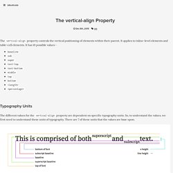
It applies to inline-level elements and table-cell elements. It has 10 possible values - baselinesubsupertext-toptext-bottommiddletopbottom<length><percentage> Typography Units The different values for the vertical-align property are dependent on specific typography units. The Values The vertical-align property vertically aligns an inline or table-cell element according to these units of typography. Baseline The baseline value, for inline elements, aligns the current element’s baseline to the parent element’s baseline. For table-cell elements, the value aligns the current cell’s content with the baseline of all other baseline-aligned cells in the same row. Sub The sub value, for inline elements, aligns the current element’s baseline to the parent element’s subscript baseline. Top 20 Twitter Bootstrap Interview questions. What are CSS Modules and why do we need them?
By Robin Rendle On April 4, 2016 css modules I’ve been intrigued by CSS Modules lately.
If you haven't heard of them, this post is for you. We'll be looking at the project and it's goals and aims. If you're intrigued, stay tuned, as the next post will be about how to get started using the idea. If you're looking to implement or level up your usage, part 3 will be about using them in a React environment. #Article Series: #What are CSS Modules? According to the repo, CSS modules are: CSS files in which all class names and animation names are scoped locally by default.
So CSS Modules is not an official spec or an implementation in the browser but rather a process in a build step (with the help of Webpack or Browserify) that changes class names and selectors to be scoped (i.e. kinda like namespaced).