
Don't Overthink It Grids. The vast majority of websites out there use a grid.
They may not explicitly have a grid system in place, but if they have a "main content area" floated to the left a "sidebar" floated to the right, it's a simple grid. If a more complex layout presents itself, people often reach for a grid framework. They assume grids are these super difficult things best left to super CSS nerds. That idea is perpetuated by the fact that a lot of the grid systems they reach for are very complicated. Here's how I build grids. Context A block level element is as wide as the parent it's inside (width: auto;). Columns Let's start with a practical and common need: a main content area being 2/3 the width and a sidebar being 1/3 the width. <div class="grid"><div class="col-2-3"> Main Content </div><div class="col-1-3"> Sidebar </div></div> To make them next to each other, we just need to float them and apply widths.
And individual width like this: That's the whole premise of not overthinking grids. Clearing Context. Golden Grid System. GGS was my next step after Less Framework.
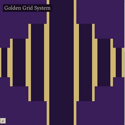
Instead of a fixed-width grid, it used a fully fluid-width one, without even a maximum width. The resources it was published with are still available on GitHub. The idea was to take a 18-column grid, use the outermost columns as margins, and use the remaining 16 to lay elements out. On smaller screens the 16 columns could be folded into 8, 4 and 2. This behaviour was inspired by Massimo Vignelli's Unigrid system. While the grid's columns were fluid — proportional to the screen's width — the gutters (spaces between the columns) were proportional to the font-size being used. GGS also contained a set of typographic presets, strictly to a baseline grid. Correctly setting all of these measurements is difficult, of course.
When published, GGS gained a lot of attention, as the web design community was searching ways to work with fluid-width grids, which have always been troublesome, running counter to many graphic design principles. Spend your time innovating, not replicating. 960 Grid System. Zen Grids: A Responsive Grid System Built on Sass.
Building grids was moderately complicated before responsive design, these days they can be downright intimidating.
When you dive into a complex layout, it’s easy to get lost in all of the math and percentages. Sure, the hardcore nerds among us love to play with this stuff, but some developers just want to get to work! Today we’re going to look at an awesome grid system that will help you set up your responsive grids with very little effort. It’s semantic, built for responsive design, completely flexible to the way you work, and powered by Sass. Meet Zen Grids. See It in Action If you want a sneak peek of what we’re building today with Zen Grids, click on the link below. Demo: Click here to launch. What is Zen Grids? I know what you’re thinking, “Another freaking grid system!?” There are lots reasons that I think Zen Grids is a really great tool that you should check out, here are a few of them: None of the Stuff That You Hate There are plenty of reasons to hate grid systems. Built on Sass. Unsemantic CSS Framework.