
Quaderns. Okolo web. Gau:di European Student Competition on Sustainable Architecture 2010-2012. The Urban barge is conceived as a multi functional space which adapts itself to the needs and places of where it docks.
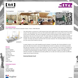
The case studied here is the iconic fish market which settles every morning of the year on the docks of the old port of Marseille. The issue of modularity is above all the accordance of the equipment needed depending on the hours of the day and night. The Urban barges are intended to be the catalyst of numbers of activities like a fish market, a public space, an exhibition area. The system proposed is based on the idea of reusable. The barge and mats are elements which have been retrieved. La barge urbaine est une unité modulable pouvant composer un ensemble. Download Booklet A3.pdf. Have a Nice Day. Urban Speculation in Los Angeles and Beyond. [Image: Photo by Iwan Baan, from No More Play: Conversations on Urban Speculation in Los Angeles and Beyond edited by Jessica Varner].
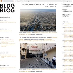
Last autumn, I had the pleasure of speaking with architects Michael Maltzan and Jessica Varner for the new book No More Play: Conversations on Urban Speculation in Los Angeles and Beyond. That conversation was then included in the book itself, alongside conversations about the city with such artists, architects, and writers as Catherine Opie, Matthew Coolidge, Mirko Zardini, Edward Soja, Charles Jencks, Qingyun Ma, Sarah Whiting, James Flanigan, and Charles Waldheim. It will surprise no one to read that my interview is the least interesting of the bunch, but it's an honor even to have been invited to sit down as a blogger amidst that line-up.
In many ways, then, the book is astonishingly extroverted. Pruned. Multiple Backgrounds with CSS3. Home / CSS3 Previews / Multiple Backgrounds with CSS3 CSS3 allows web designers to specify multiple background images for box elements, using nothing more than a simple comma-separated list.
Browser support for multiple backgrounds is relatively widespread with Mozilla Firefox (3.6+), Safari/Chrome (1.0/1.3+), Opera (10.5+) and even Internet Explorer (9.0+) all implementing the feature. 3 Lightweight, Minimal, Grid-based Portfolio Themes For Wordpress: W—port Theme Suite. Perfect Full Page Background Image. Learn Development at Frontend Masters This post was originally published on August 21, 2009 and is now updated as it has been entirely revised.
Both original methods are removed and now replaced by four new methods. How To: Resizeable Background Image. Published by Chris Coyier If you are looking for how to do FULL SCREEN BACKGROUND IMAGE, go here. FancyRhino. Andrea mandini experimental - Mauti. How To : Change Page Background as User Scrolls. How To : Create A Simple Parallax Scrolling Web-Portfolio. Karey Helms. CSS: Using Percentages in Background-Image. Last week you might have noticed we’re trialling a new experimental screen gadget in our books section — a JavaScript-powered book that allows you to thumb through the book to get a quick sense of the layout and feel.
While I might talk about that directly later, I thought I’d share some of my research on CSS background images along the way. Like a lot of CSS/JS based animation these days, I used ‘background image sprites‘ — a large background-image containing all the frames, with background-position used to control which frame (or animation cell) is being displayed. Each click moves the background position exactly one frame down. The key advantage to using one image is you can guarantee all frames will be cached the moment your animation is ready. There are three viable methods available to control background-position, and you are not allowed mix and match them (i.e. background-position: top 50%;). 1) Keywords : i.e. background-position: top right Suffice to say, very frustrating stuff.
Applying Responsive Layout to One Page Websites. There is no one fixed solution on applying Responsive Layout to one page websites because all greatly depend on what type of one page website you are designing.
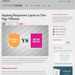
So before you get your mouse dirty and start designing, get a better understanding of the relationship between Responsive Layout and one page websites. Responsive Layout Responsive Layout (or “adaptive layout”) is a grid-based fluid website layout that uses CSS percentage ratio towards each grid width which automatically adjusts its content to fit the browser size. Images are also flexible as long as you do not apply height and width variables to the img tag, and CSS media queries are usually use to target mobile devices.
_Your Digital Agency in Asia. Skeleton: Beautiful Boilerplate for Responsive, Mobile-Friendly Development. What Is It? Skeleton is a small collection of CSS files that can help you rapidly develop sites that look beautiful at any size, be it a 17" laptop screen or an iPhone. Skeleton is built on three core principles: Responsive Grid Down To Mobile Skeleton has a familiar, lightweight 960 grid as its base, but elegantly scales down to downsized browser windows, tablets, mobile phones (in landscape and portrait). Go ahead, resize this page! Fast to Start Skeleton is a tool for rapid development. Style Agnostic Skeleton is not a UI framework. The Grid.
Students portfolio 2011. Studium architektury v angličtině : Architectural Institute in Prague.