
Perfect Full Page Background Image. Learn Development at Frontend Masters This post was originally published on August 21, 2009 and is now updated as it has been entirely revised.

Both original methods are removed and now replaced by four new methods. The goal here is a background image on a website that covers the entire browser window at all times. Let’s put some specifics on it: Fills entire page with image, no white spaceScales image as neededRetains image proportions (aspect ratio)Image is centered on pageDoes not cause scrollbarsAs cross-browser compatible as possibleIsn’t some fancy shenanigans like Flash Image above credited to this site.
Awesome, Easy, Progressive CSS3 Way We can do this purely through CSS thanks to the background-size property now in CSS3. Works in: Safari 3+Chrome Whatever+IE 9+Opera 10+ (Opera 9.5 supported background-size but not the keywords)Firefox 3.6+ (Firefox 4 supports non-vendor prefixed version) View Demo. CSS Image Opacity / Transparency. Clean and pure CSS FORM design. CSS3 Gradient Buttons. Last week I talked about Cross-Browser CSS Gradient.

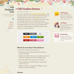
Today I'm going to show you how to put the CSS gradient feature in a good practical use. Check out my demo to see a set of gradient buttons that I have created with just CSS (no image or Javascript). The buttons are scalable based on the font-size. The button size can be easily adjusted by changing the padding and font-size values. The best part about this method is it can be applied to any HTML element such as div, span, p, a, button, input, etc. What Is So Cool About These Buttons? Pure CSS: no image or Javascript is used. Preview The image below shows how the button will display in different browsers. Button States normal state = gradient with border and shadow styles. hover = darker gradient active = gradient is reversed, 1px down, and darker font color as well. General Styles For The Button The following code is the general styles for the .button class. Color Gradient Styles The code below is the CSS styling for the orange button.
4 methods of adding CSS to HTML: link, embed, inline and import. By Matthew James Taylor on 18 February 2009 There is more than one way to add a Cascading Style Sheet (CSS) to your HTML document.

In this short tutorial I will explain the strengths and weaknesses of the four main methods. Linking to a separate CSS file This is the most common method of attaching CSS rules to an HTML document. With this method all of your style rules are contained in a single text file that is saved with the .CSS extension. Make sure you include the correct path to your CSS file in the href. How to create Tabs with CSS and jQuery from scratch.
Another feature that is often added to Web 2.0 sites is tabbed content.

I'm not talking about tabbed navigation. Tabbed content is when different chunks of HTML are shown depending on what tab is clicked. If you don't know about jQuery yet, let me have the pleasure to introduce you to it. CSS Tutorial. How to Create a Drop-down Nav Menu With HTML5, CSS3 and JQuery. In this tutorial, we’ll take a look and see what we can achieve with HTML5 and CSS3 when it comes to the staple of current web sites: the humble drop-down navigation menu.

We’ll also use jQuery to handle the effects and add the finishing touches for us. HTML5 brings to the spec a dedicated <nav> element that should be used as the container for any major navigation structure, such as the main vertical or horizontal site navigation menus, or an in-page table of contents for example. IE unfortunately doesn’t support this new element yet, but there is a simple fix we can use, of which I’m sure you’re all aware. Using CSS3 we can do away with what would have required the use of several background images and possibly an additional wrapping container or two and rely (almost) purely on some of the new style properties, such as rounded corners and drop-shadows for example, that are available to supporting browsers.
Again, not all browsers (cough, IE!) Step 1. Step 2. the Underlying Page Step 3. How To Use CSS3 Media Queries To Create a Mobile Version of Your Website. Advertisement CSS3 continues to both excite and frustrate web designers and developers.

We are excited about the possibilities that CSS3 brings, and the problems it will solve, but also frustrated by the lack of support in Internet Explorer 8. This article will demonstrate a technique that uses part of CSS3 that is also unsupported by Internet Explorer 8. However, it doesn’t matter as one of the most useful places for this module is somewhere that does have a lot of support — small devices such as the iPhone, and Android devices. In this article I’ll explain how, with a few CSS rules, you can create an iPhone version of your site using CSS3, that will work now.
Media Queries If you have ever created a print stylesheet for a website then you will be familiar with the idea of creating a specific stylesheet to come into play under certain conditions – in the case of a print stylesheet when the page is printed. The Media Queries in CSS3 take this idea and extend it. How to Create Rounded Corners for Your Box Borders in CSS. How to Use Border-Radius to Create Rounded or Curved Corners by Christopher Heng, thesitewizard.com If you were to create a rectangular box outline around the content on your web page using Cascading Style Sheets (CSS), the default is that your box borders will have pointed right-angled corners.

To get rounded corners for the box, many webmasters in the past have resorted to using images to give the appearance of curved corners. How to Design a Two Column Layout for Your Website Using CSS. 2 Columns Using Float, with Optional Header and Footer by Christopher Heng, thesitewizard.com There are many ways to create a two column layout using Cascading Style Sheets (CSS).

This article takes you through the steps of using one method. The code given here will also allow you to add an optional header and footer that spans both columns to your pages should you wish. CSS Tutorial.