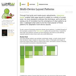

Customizable user interfaces PSD templates for iPad and iPhone apps. PHP Scripts, WordPress Plugins, HTML5, jQuery, and CSS. Five Simple Steps. Multi-Device Layout Patterns. Through fluid grids and media query adjustments, responsive design enables Web page layouts to adapt to a variety of screen sizes.

As more designers embrace this technique, we're not only seeing a lot of innovation but the emergence of clear patterns as well. I cataloged what seem to be the most popular of these patterns for adaptable multi-device layouts. To get a sense of emerging responsive design layout patterns, I combed through all the examples curated on the Media Queries gallery site several times. UX Movement - Articles on Interface Design. Foundation: Swizzle Case Study.
Responsive Navigation Patterns. Update: I’ve also written about complex navigation patterns for responsive design.

Top and left navigations are typical on large screens, but lack of screen real estate on small screens makes for an interesting challenge. As responsive design becomes more popular, it’s worth looking at the various ways of handling navigation for small screen sizes. Mobile web navigation must strike a balance between quick access to a site’s information and unobtrusiveness. Here’s some of the more popular techniques for handling navigation in responsive designs: There are of course advantages and disadvantages of each method and definitely some things to look out for when choosing what method’s right for your project. Five Simple Steps - Welcome.