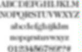
Une police de caractères dédiée aux dyslexiques. Saviez-vous qu’en moyenne la dyslexie touche 10% de la population ? Si ce handicap ne touche que 5% de la population en France (7% pour les enfants scolarisés), il est responsable de problèmes d’assimilation des textes et de retard dans l’apprentissage. Sans trop rentrer dans les détails, les personnes atteintes de dyslexie ont tendance à inverser les lettres (comme illustré plus bas) et donc à changer la signification des mots. Souffrant moi-même de légère dyslexie depuis mon enfance (je ne crois pas que ça se soigne d’ailleurs), je suis particulièrement sensible à ce sujet.
Non pas que je souffre d’un gros handicap, mais j’ai tout de même conscience de faire beaucoup de fautes d’orthographe dans mes écrits, maintenant vous en connaissez la cause. Pour pallier à ce problème d’inversion, un graphiste néerlandais souffrant de dyslexie, Christian Boer, a conçu une police de caractères permettant de mieux identifier les lettres : Une police d’écriture pour les dyslexiques.
Web fonts. Web Typography: Educational Resources, Tools and Techniques. Why Subtle Typographic Choices Make All The Difference. Advertisement A strong understanding of how designers control meaning is essential for anyone interested in graphic design or typography. In a previous article, we discussed how sophisticated and complex visual and verbal language can get, examining instances that show how type can be used to effectively take control of meaning.
In this article, we’ll look at the reasons why subtle typographic changes can create considerable effect. We’ll refer to one or two linguistic and semiotic examples, as well as design case studies, to get to grips with why subtle changes can make all the difference. Let’s consider a couple of simple sentences: “The boy walks a dog” and “The boy walks the dog.” Two visualizations of the same word but with typographic treatments that have entirely different emphases and meaning. However, meaning comes not simply from comparing one visual interpretation to another. The name style of an iconic fashion brand. The online masthead of one of the UK’s premier newspapers. Mind Your En And Em Dashes: Typographic Etiquette. Advertisement An understanding of typographic etiquette separates the master designers from the novices.
A well-trained designer can tell within moments of viewing a design whether its creator knows how to work with typography. Typographic details aren’t just inside jokes among designers. They have been built up from thousands of years of written language, and applying them holds in place long-established principles that enable typography to communicate with efficiency and beauty. Handling these typographic details on the Web brings new challenges and restrictions that need to be considered. Setting Body Copy Good typography comes down to communicating information, and the basis of information is good old-fashioned body copy – simple blocks of text. Indentation or Space After a Paragraph? When signalling the end of a paragraph and the beginning of another, you can generally either indent or insert a space between the paragraphs. But there is no hyphenation control in CSS.
The Hyphen (al) Présentation et typo. Petit guide typographique à l’usage de l’internet.