
HOME. Infographic Of The Day: The Tweet That Broke News Of Osama’s Killing. By now, we're all familiar with the story of Keith Urbahn, the former chief of staff to Donald Rumsfeld who was the very first person in the world to break the news, via Twitter, that the U.S. had killed Osama Bin Laden.
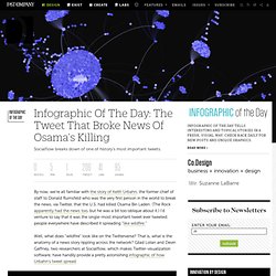
(The Rock apparently had the news too, but he was a bit too oblique about it.) I'd venture to say that it was the single-most important tweet ever tweeted; people everywhere have described it spreading "like wildfire. " Well, what does "wildfire" look like on the Twitterverse? That is, what is the anatomy of a news story rippling across the network? Gilad Lotan and Devin Gaffney, two researchers at Socialflow, which makes Twitter-visualization software, have handily provide a pretty astonishing infographic of how Urbahn's tweet spread. As they note, Urbahn wasn't necessarily the first to suggest that OBL had been killed. But looking at the tweet above, it's spread doesn't really look like you'd expect.
Which isn't to say that Urbahn's tweet died out in some quadrants. Word Cloud: How Toy Ad Vocabulary Reinforces Gender Stereotypes. Preamble (Added April 12, 2011).
Thanks so much to everyone who has weighed in on this post. I am adding this preamble to address two main points of criticism that I should have discussed in the original post. First, there is the point that the ads use vocabulary to reflect the nature of the toys and not necessarily gender, that regardless of the target audience a toy about fighting will naturally include words about battling while a toy like an Easy Bake Oven will not. While this is absolutely true, my intention here was to use the toy vocabulary to show the nature of the toys marketed predominantly to boys. The inclusion of the girls’ list was just to show contrast. This leads to the second question/criticism: how did I determine which toys were “boys’ toys”?
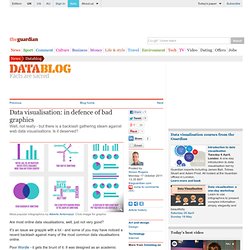
What's Smaller Than Apple? [Infographic] Apple’s (AAPL) market cap recently hit $370 billion US dollars.
![What's Smaller Than Apple? [Infographic]](http://cdn.pearltrees.com/s/pic/th/smaller-infographic-walyou-20953903)
This is an amount that may not seem that large when compared with the $700 billion bank bailout of 2008. Looking at it next to other things, such as the size of certain industries and government programs, and you may be surprised. Infographic by Visual.ly The US retail industry for prok is $30 billion, cattle is $74 billion and poultry $45 billion – all of which total $149 billion, or $181 billion dollars less than Apple’s value. Even the 10 largest software companies’ revenues combined are smaller than Apple. All the federal taxes paid by all corporations in 2010 are $198 billion compared to Apple’s $370 billion. The US pharmaceutical market also comes closer to Apple’s revenues, but is still shy by $81 billion dollars.
Even Apple beats out itself, as the Apple of previous years has been smaller than Apple today. So the question then becomes, what’s bigger than Apple? Data visualisation: in defence of bad graphics. Are most online data visualisations, well, just not very good?
It's an issue we grapple with a lot - and some of you may have noticed a recent backlash against many of the most common data visualisations online. Poor Wordle - it gets the brunt of it. It was designed as an academic exercise that has turned into a common way of showing word frequencies (and yes, we are guilty of using it) - an online sensation.
There's nothing like ubiquitousness to turn people against you. The Best Tools for Visualization. Visualization is a technique to graphically represent sets of data.
When data is large or abstract, visualization can help make the data easier to read or understand. There are visualization tools for search, music, networks, online communities, and almost anything else you can think of. Whether you want a desktop application or a web-based tool, there are many specific tools are available on the web that let you visualize all kinds of data. Here are some of the best: Visualize Social Networks Last.Forward: Thanks to Last.fm's new widget gallery, you can now explore a wide selection of extras to extend your Last.fm experience.
Last Forward Friends Sociomap: Friends Sociomap is another Last.fm tools that generates a map of the music compatibility between you and your Last.fm friends. Fidg't: Fidg't is a desktop application that gives you a way to view your networks tagging habits. Fidg't The Digg Tools: One more: Digg Radar. YouTube: Visualize Music Musicovery Last.fm music visual tools: Amazon.