
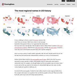
Alung sur Twitter : ""One person would [extract the data], another would try to figure out what that means" @christianrudder in #Dataclysm. Feast Your Eyes on This Beautiful Linguistic Family Tree. 552K 18.4KShare337 When linguists talk about the historical relationship between languages, they use a tree metaphor. An ancient source (say, Indo-European) has various branches (e.g., Romance, Germanic), which themselves have branches (West Germanic, North Germanic), which feed into specific languages (Swedish, Danish, Norwegian). Lessons on language families are often illustrated with a simple tree diagram that has all the information but lacks imagination. E-Mail: Not Dead, Evolving. 10 things statistics taught us about big data. How quickly Ebola spreads compared to other diseases - Washington Post. How Nations Fare in PhDs by Sex [Interactive] In the U.S., women are going to college and majoring in science and engineering fields in increasing numbers, yet here and around the world they remain underrepresented in the workforce.
![How Nations Fare in PhDs by Sex [Interactive]](http://cdn.pearltrees.com/s/pic/th/interactive-scientific-92601967)
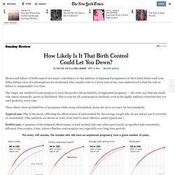
Comparative figures are hard to come by, but a disparity shows up in the number of Ph.D.s awarded to women and men. The chart here, assembled from data collected by the National Science Foundation, traces the gender gap at the doctoral level for 56 nations. The situation in individual countries varies widely, but as the numbers make clear, there are interesting exceptions to the global trend. Interactive by Periscopic; Research by Amanda Hobbs Science and Engineering Indicators 2014. The Global Gender Gap Report 2013. How Likely Is It That Birth Control Could Let You Down? - NYTimes.com.
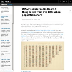
Misuse and failure of birth control are major contributors to the millions of unplanned pregnancies in the United States each year.
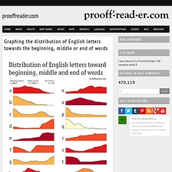
When failure rates of contraceptives are mentioned, they usually refer to a given year of use. Less understood is that the risk of failure is compounded over time. The longer any method of contraception is used, the greater the probability of unplanned pregnancy — the same way that any small risk, taken repeatedly, grows in likelihood. I Pinged All Devices on the Internet, here's a Map of them [OC] : dataisbeautiful. Cyceron: Les pros de la dataviz pourraient ... Data visualizers could learn a thing or two from this 1898 urban population chart. If reading up on 19th century US city population rankings sounds like a fun way to spend an afternoon, have we found the charts for you.
Originally published in the Statistical Atlas of the United States in 1898, Larry Gormley of HistoryShots (a company that designs and restores data visualizations) first came across this old census visualization over at David Rumsey’s online map database. Compelled by its restrained use of shapes, colors, and lines, Gormley, who scours map and book fairs in his native New England, eventually tracked down a printed copy to restore. “Rank of the Most Populous Cities at Each Census Chart” published in 1898.
All the Drug References In Hip-Hop, Visualized. Graphing the distribution of English letters towards the beginning, middle or end of words - Prooffreader. Some data visualizations tell you something you never knew.
Others tell you things you knew, but didn't know you knew. The Internet in Real-Time. Randal_olson : #Rappers sorted by size of... The Largest Vocabulary in Hip hop. Where people run. There are many exercise apps that allow you to keep track of your running, riding, and other activities. Record speed, time, elevation, and location from your phone, and millions of people do this, me included. We Can Do Better. Onehumanheartbeat. Graph TV. Data: Twitter Conversation about... Ukr. Chris_bour : Like this analogy explaining... Budget de l'Etat : où économiser des milliards ? Budget 2014.
En millions d’euros et en notation anglophone (la virgule marque les milliers). Cliquez sur une case pour voir le détail - POUR REVENIR AU DÉBUT, CLIQUEZ ICI. Sightwind. Données publiques / Open Data. Regional names. It was a challenge to choose a name for my son, someone who wasn't born yet, because I didn't know where to start amongst hundreds of thousands of choices.
So I approached the decision the best way I knew how, through data. That brought me back to Hilary Parker's analysis on the most poisoned name in history, which led me to the most trendy, and then the most unisex. Chart: The Family Tree of Bourbon Whiskey. Click to enlarge.
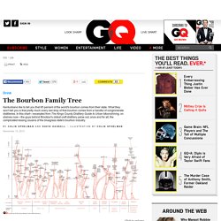
A few words on how to read this chart... This chart shows the major distilleries operating in Kentucky, Tennessee, and Indiana, grouped horizontally by corporate owner, then subdivided by distillery. Each tree shows the type of whiskey made, and the various expressions of each style of whiskey or mash bill, in the case of bourbons.
Courrierinter: 30 millions d’esclaves sur... 30 millions d’esclaves sur la planète. Le mot sonne comme la réminiscence d'une époque révolue.
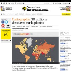
Mais l'esclavage n'appartient pas à l'Histoire. Il est bien présent au XXIe siècle – partout dans le monde. Million Lines of Code. Map: Six Decades of the Most Popular Names for Girls, State-by-State. Bros or hoes? What the data from rappers' lyrics shows. Treemap Art. Proxem » Analyse de données à grande échelle : quels métiers se combinent le plus avec d’autres ? Good morning! Perspective - how big is our Moon? ... Behind the numbers: how to understand big moments on Twitter.
Can Concentric Circles Save Subway Sanity? If you're new to New York City, simply visiting for vacation, or, if you're a born-and-raised New Yorker that still can't point out any other states on a blank map besides Florida and Jersey, then you might also mistakenly believe what the MTA subway map tells you about the city—that it lacks any realistic level of fidelity and Manhattan is the blown-up silhouette of a Motorala RAZR: Image via The U.K.'

Du jeu de données au jeu avec les données. Web Traffic. For Young Drivers, Drinking Is More Dangerous - Interactive Graphic. Y oung drivers are more likely to have accidents than older ones.
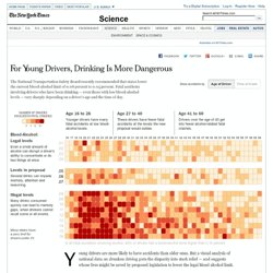
But a visual analysis of national data on drunken driving puts the disparity into stark relief — and suggests whose lives might be saved by proposed legislation to lower the legal blood alcohol limit. The recommendation, by the National Transportation Safety Board, asks the 50 states and the District of Columbia to lower the current limit of 0.08 percent to 0.05 percent, the standard in most industrialized countries.
Drivers younger than 26 cause the most auto fatalities in the United States, regardless of alcohol consumption. Stunning Images of NYC, Tokyo and Istanbul Using Geotagged Tweets. The Visual Insights team at Twitter has published some pretty spectacular images today which depict Europe, as well as a number of iconic cities including New York, Tokyo and Istanbul, using nothing more than the locations of geotagged Tweets. The images here incorporate every geolocated Tweet sent since 2009 – “billions” of Tweets, according to Twitter – with every dot representing a post and the intensity of the color showing the total Tweet count.
What’s so impressive is that with all of this context stripped away, the images just look like normal, incredibly accurate maps of the world. Teens on Facebook: What They Share with Friends. The typical (median) teen Facebook user has 300 friends. The larger a teen’s network, the more likely they are to have a wider variety of friends and share more personal information. In the interactive below, click through the range of network ‘friend’ sizes to see changes in what they share, and how they compare to all teen Facebook users. The % of Facebook-using teens who say they have shared their… * Teens with 1-150 friends All teen Facebook users The % of Facebook-using teens who are friends with… Top CEO Pay Ratios. To calculate compensation ratios, Bloomberg used the most recent chief executive officer pay figure reported to the Securities and Exchange Commission as of noon on March 26.
Only fiscal years ending in 2011 and 2012 were considered. Because most companies don't disclose average worker pay, the CEO compensation was divided by an estimate of industry-specific rank-and-file employee compensation calculated from government data. The methodology is based on one developed by the nonprofit Economic Policy Institute for a 2012 study that focused on aggregate trends, not company-specific findings. Workers' salaries for 2011 and 2012 were determined from the Bureau of Labor Statistics' database of average hourly pay for production and nonsupervisory employees by industry, which is based on the agency's Current Employment Statistics survey. History of San Francisco Place Names. HERE IS TODAY. Most popular surnames of Great Britain mapped. En France, le big data manque d'industriels - Distributique.
Le big data est perçu comme une opportunité par les entreprises. Données fleuries, une veille hebdomadaire de datajournalisme. En vedette. The Seas of Plastic Interactive - by dumpark. Où sont servies les soupes populaires pour les plus démunis à Paris ?Urbi et Orbi. A Paris, 16% des ménages sont pauvres, selon une étude publiée l’année dernière. Le diagnostic est connu : la pauvreté s’aggrave, et s’étend aux travailleurs. La grande pauvreté est également en augmentation, et les personnes ne bénéficiant d’aucune ressource sont de plus en plus nombreuses, alors que la trève hivernale prendra fin le 30 mars. The Power of Visualization's "Aha!" Moments - Scott Berinato - Our Editors. Mega-Commuters Take Manhattan. Disease and death around the world visualised. Des outils de visualisation en sciences sociales.
Au programme du séminaire de recherche en Digital Humanities “DHLausanne” de ce 25 janvier, une présentation centrée sur les réflexions d’Andreas Perret, chercheur qui aime à se présenter comme ayant « un pied dans les arts graphiques et un pied dans les sciences sociales », en clair « un décorateur de statistique ». La suite nous montrera que cette définition est bien réductrice puisqu’il s’agit ici d’étudier les modalités d’expression des scientifiques (en se limitant ici à la sociologie) en matière de visualisation de données, tout sauf une simple « décoration » !
Esthétique et science, un désamour ? D’emblée, on constate que dès que l’on met le doigt dans l’engrenage des aspects esthétiques, on se dirige vers des controverses, dans le milieu académique du moins. De fait, c’est une approche anthropologique qu’il faut adopter vis-à-vis des chercheurs pour comprendre leur manière de présenter leurs travaux. Les outils de visualisation Publier des visualisations ? INFOGRAPHIC: Breaking Down Twitter Data. Twitter's languages of New York mapped. Remittances: how much money do migrants send home? – interactive. What's in a name? Visualised. Every line becomes a circle line: a new way to see the tube map. Visualizing Networks: Beyond the Hairball. Geek philanthropy: Data huggers. How hard is it to get into Oxbridge? Hadopi : 14 dossiers transmis aux tribunaux, ça fait quoi concrètement ? #dalalalataviz. Code civil des Français. L’e-réputation globale n’existe pas. Share photos and videos on Twitter. Pretty pictures: Can images stop data overload?
The Hillis Knowledge Web. Wolfram Alpha Now Lets You Analyze Famous Plays. Radicalcartography. Sublyn, votre plan de métro parisien en HTML, tout léger et relié en temps réel à twitter !
Dassault Systèmes abandonne le cloud computing à la française. IBM's Big Data Challenge: A Telescope That Generates More Data Than the Whole Internet. The Internet Is Ruining Your Brain [INFOGRAPHIC] Data visualisation DIY: our top tools. Population Density.