
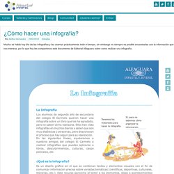
Convertir-una-infografia-en-un-video-de-youtube-infografia. Una guía de 5 pasos para crear sus propi... ¿Cómo hacer una infografía? - Aldea Virtual. Mucho se habla hoy día de las infografías y las usamos prácticamente todo el tiempo, sin embargo no siempre es posible encontrarlas con la información que nos interesa, por lo que hoy les compartimos este documento de Editorial Alfaguara sobre como realizar una infografía.
Para descargar el documento completo haga click aquí. Finalmente les recomendamos revisar este blog en el cual se presenta un pequeño taller sobre la construcción de infografías. ¿Qué es una Infografía y c... Diseña infografías con Sprites. Infografia_anfix_10_herramientas_infografias.fw_ Cómo crear una infografía: Paso a. Una imagen vale más que mil palabras: 10.
Infografía con cifras de las redes sociales en un futuro próximo. Empleo / 15 consejos para ser feliz en el trabajo #infografia. [Visual.ly] Employers identify Top 5 job skills #infografía. Colores y tipografía para el éxito de un logo #infografia #infographic #design. Big Data: el nuevo recurso natural #infografia #infographic #internet. La siguiente generación de mujeres trabajadoras #infografia #infographic. Mapa de las redes sociales con más de 10 millones de usuarios en una interesante infografía. A FANCY INFOGRAPHIC RÉSUMÉ PAINTS A THOUSAND WORDS. 2013-2150. Qué ocurre en 60 segundos en las Redes Sociales. 8-tipos-de-emprendedores-1. Ránking de los 10 mejores trabajos virtuales (Infografía) Infografia-millonarios. 6 Emerging Technologies In Education. 5 Reasons We Use Social Media 8.48K Views 0 Likes There are many reasons we use social media. From the basic to the more advanced, the tool is simply ubiqutious and addictive.
This infographic sheds some light for us all. 5 Things To Know About SXSWedu 5.65K Views 0 Likes The real story for anyone reading this is SXSWedu, the education-oriented version of the conference that's turning into a force of nature. INFOGRAFÍA: ¿Qué es el abismo fiscal? - Economía. Twitter Tips Every Teacher should Know about. As a teacher,Twitter is one of my favourite tools .
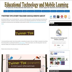
I use it on a daily basis and for a variety of educational and professional development purposes. I have been posting a lot about this social networking website here in Educational Technology and Mobile Learning and have even dedicated a whole section for all the Twitter tips and tools teachers should know about. I am also planning to publish, when times permits, a comprehensive guide on the use of Twitter in education but until then, let me share with you a great guide realized by Chery Lawson. This is, by all means, one of the best guides I have ever read about Twitter and I am pretty sure you will find it quite useful as well. Please read and share with your colleagues Thanks to Edudemic , we can also view these tips in a slideshow. Edumorfosis (Edumorfosis)
The 2012 Legatum Prosperity Index. The Anatomy Of An Infographic: 5 Steps To Create A Powerful Visual Information is very powerful but for the most bit it is bland and unimaginative.

Infographics channel information in a visually pleasing, instantly understandable manner, making it not only powerful, but extremely beautiful. Once used predominantly to make maps more approachable, scientific charts less daunting and as key learning tools for children, inforgraphics have now permeated all aspects of the modern world. I designed a couple of infographics back in college, the need arising especially around the time Soccer World Cup fever spiked. It was a fun process representing the different groups, predicting winners in each group at each stage and creating a mock pairing of teams that would clash all the way leading upto the finals.
I was a devout Argentinian supporter at the time. Infographics can appear daunting to some with the sheer amount of data they present, but designed in the right manner and step by step, they can actually be one of the most fun things you will ever create. 1. 15frasessobreeducacion1. La informática y su impacto en el futuro #infografia #infographic. Los beneficios del teletrabajo.
Por Editorial TICBeat. El trabajo del futuro solo se comunicará mediante tecnología #infografia #infographic #socialmedia « TICs y Formación. Qué es el crowdsoucing - Infografía. Google vs Facebook. Estudisntes US y Redes Sociales. In the last decade, the Internet has changed how teachers and students learn in the classroom.

Companies like Google, Wikipedia, and WordPress have opened the door to instant exploration of subjects and questions that haven’t been available in the classroom before. Students are now able to explore the ancient Egyptian pyramids using Google Maps, see updated facts and information on a wiki, or read a famous explorer’s blog posts on their expeditions, all safely from their desks. Classrooms, schools and even districts are able to share and collaborate in private social networks, expanding collective knowledge and relationships to new horizons. The Internet has allowed education to expand past local resources, and draw from a vast library of knowledge that organizations and businesses are actively contributing to everyday.
With our culture’s shift to “social,” companies have created tools that offer free platforms for blogs, wikis and private social networking sites. Infografía: los datos que se mueven por internet. Cómo será Internet en 2020 [Infografía] ¿Cuán popular es el iPhone? Infografía de los Medios Sociales.