
Helping students interpret visual representations of information. Update: Feb. 29, 2012 Please note: The original video we used for this post was a video podcast by Gestalten TV in which New York Times Graphics Director Steven Duenes and Graphics Editor Archie Tse describe how their team works with breaking news to create clear, concise visualizations of data for readers.
Since that has now been taken down, we have substituted a classic TED talk by David McCandless that we refer to in the post. We’re declaring this week Infographics Week on The Learning Network because we know how important it is for students to be able to read and interpret visual representations of information — and because The New York Times consistently creates useful and elegant examples that we think teachers across the curriculum should know about. Not only do charts, graphs and maps show up on standardized tests of all kinds, but whiteboard technology has made the graphic depiction of information that much more useful and ubiquitous in classrooms. 12 Inspirationally Designed Infographics for Designers. Infographics have been a part of human communications since the invention of the first “writing” utensils.
Cave paintings, rock carvings, and sculptures have been found to integrate both images and written symbols (a type of pre-writing). These artistic efforts were created some 32,000 years ago; they illustrate stories, record history, religious ideas, and much more. Even among prehistoric people, infographics were an ideal method to communicate an infinite types of information. In modern terms, infographics are the visualizations or charts that are used to present a large amount of material to readers. This type of design is utilized to communicate information that would be impossible or too time-consuming to be explained solely by text or series of illustrations. Infographics continue to teach, inform, and entertain modern readers. Below is a showcase of some brilliant infographics found around the net. America Hungry, Need Data Prism Social Media 2010 2012: The End Of The World?
Visualthinkmap's Profile. Data Visualization and Infographics Resources. Cool Infographics - Cool Links. Randy's infographic design consultancy to Visualize Business Intelligence Jacob O'Neal's site focused on designing animated GIF infographics Company that helps visualize business data Rose Zgodzinski's site to help client find visual solutions Consulting, Design and Social + PR Brian Cragin is an infographic designer in San Diego A masterfully constructed infographic campaign can work wonders for your business Dashboard Design: Data Driven helps your clients better understand and act upon your information Dejure Design provides interactive and visual design services to social justice organizations seeking to make their legal work more accessible and engaging.
Showcase of Beautifully Designed Charts & Graphs. These can even be constructed dynamically with libraries such as jQuery and MooTools.
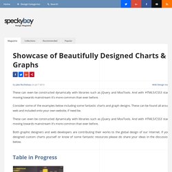
And with HTML5/CSS3 standards moving towards mainstream it’s more common than ever before. Consider some of the examples below including some fantastic charts and graph designs. These can be found all around the web and included onto your own website, if need be. Both graphic designers and web developers are contributing their works to the global design of our Internet.
If you have designed custom charts yourself or know of some fantastic resources please do share your ideas in the discussion area below. Table in Progress Pretty Little Pie Chart Ring Chart Infographic DDFreebie – Bar Graph Graph2. Infographics. Innovation web.
Ideas, issues, concepts, subjects - v. Information aesthetics. Andrew Vande Moere (infosthetics) Data visualization chart. Infographic. Infographics & Visualizations. Create, Share, Explore. The Joy of Stats. About the video Hans Rosling says there’s nothing boring about stats, and then goes on to prove it.
A one-hour long documentary produced by Wingspan Productions and broadcast by BBC, 2010. A DVD is available to order from Wingspan Productions. Director & Producer; Dan Hillman, Executive Producer: Archie Baron. ©Wingspan Productions for BBC, 2010 The change from large to small families reflects dramatic changes in peoples lives.
Hans Rosling asks: Has the UN gone mad? Hans Rosling explains a very common misunderstanding about the world: That saving the poor children leads to overpopulation. A Periodic Table of Visualization Methods. Visualization. Data Visualization. The Best Tools for Visualization. Visualization is a technique to graphically represent sets of data.
When data is large or abstract, visualization can help make the data easier to read or understand. There are visualization tools for search, music, networks, online communities, and almost anything else you can think of. Whether you want a desktop application or a web-based tool, there are many specific tools are available on the web that let you visualize all kinds of data. Here are some of the best: Visualize Social Networks Last.Forward: Thanks to Last.fm's new widget gallery, you can now explore a wide selection of extras to extend your Last.fm experience.
Last Forward Friends Sociomap: Friends Sociomap is another Last.fm tools that generates a map of the music compatibility between you and your Last.fm friends. Fidg't: Fidg't is a desktop application that gives you a way to view your networks tagging habits. Fidg't The Digg Tools: One more: Digg Radar.