
Lesson Plan: Infographics – Digital, Visual Stories – The Digital Writing & Research Lab. In class, the instructor will introduce infographics as visual stories, explaining their use as modern educational and awareness-raising tools that utilize graphic representation to present an argument.
Instructors might want to compare information presented in infographic form to information presented in text or speech form to explore affordances and limitations, asking students why and in what cases they might choose infographics as a strategy over other methods. Classes will then discuss infographics as rhetorical texts, identifying arguments and strategies. Below are a number of examples of infographics (or you can find your own). As with traditional texts in Unit 1, have students locate and restate the argument being made, contextualize the argument by providing background information, and describing the piece’s substance, tone, and arrangement of text and graphics. Infographics Lesson Plans – SchoolJournalism.org.
ASNE Lessons for Infographics Day OneInfographics Lesson – Day OneInfographics ANIMOTO – Day OneCompare/Contrast/Consider Day TwoInfographics Lesson – Day TwoInfographics PowerPoint – Day TwoInfographic Planner Other Lessons Introduction to Infographics short, introductory lesson on what infographics are, how they are used, what they convey and how to create them.
Infographic Lesson Plan. What are the elements of an effective Infographic Assignment? – Teachology. This post is a summary of the eLearning Lunch and Learn session presented on October 2nd, 2017.
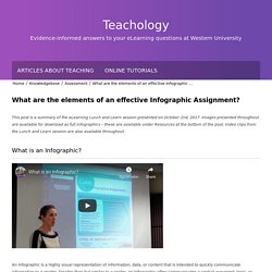
Images presented throughout are available for download as full infographics – these are available under Resources at the bottom of the post. Video clips from the Lunch and Learn session are also available throughout. What is an Infographic? An infographic is a highly visual representation of information, data, or content that is intended to quickly communicate information to a reader. Smaller than but similar to a poster, an Infographic often communicates a central argument, topic, or thesis focusing on the overall patterns, themes, or salient points. Infographicprojectsummativeassessmentprojects. A Great List of Tools for Making Cool Infographics. Cool Infographics is a book and a blog written by Randy Krum.

I read his book a few years ago and came away with some great design ideas that I now use in my slides and in some social media posts. On his blog Randy critiques the design quality and information accuracy of infographics found around the Internet. His blog also contains a section in which he lists dozens of tools for creating all kinds of data visualizations. The Cool Infographics tools page lists dozens of tools for building all kinds of data visualizations from simple word clouds to complex interactive designs. The Cool Infographics tools page also lists resources for free images, resources on picking the right design for your project, and places to find data to use in your projects.
Zanifesto. Tools - Cool Infographics. Adioma creates information graphics out of your textual data, using timelines, grids and icons.
Create impressive charts from spreadsheets. Assemble into dashboards, embed in websites, or simply share a link. A Python interactive visualization library that targets modern web browsers for presentation Cacoo is a free online drawing tool that allows you to create a variety of diagrams such as site map, flowchart, mind map, wire frame, UML diagram and network diagram. Crowdsourced Analytics Solution Marketplace - Make Sense of Big Data Free interactive charts created online in seconds ChartGo is an online graph maker tool.
What are the elements of an effective Infographic Assignment? – Teachology. Infographicprojectsummativeassessmentprojects. Documentation:Infographic Assignments - UBC Wiki. Note: this article is a re-published version of a blog post (May 28th, 2015) by Dr.
April Lawrence, at William & Mary University in Williamsburg Virginia. The republished version was produced with permission of the author (see the discussion page) and represents the entire content of the blog post . Learning Theory, Inquiry, and Instructional Design - Ms. Bessin's Ed Tech Site. Books about Mental Health It’s kind of a funny story (Ned Vizzini) All the broken pieces (Ann E.
Burg) All the bright places (Jennifer Niven) Thirteen reasons why (Jay Asher) What Are the 9 Types of Infographics? (+Infographic Templates) Infographics can make dry and boring information exciting.
Whether you’re a marketer looking to make your content more engaging, or a manager looking to communicate more effectively with your team, infographics can be a handy visual tool. But if you’re new to designing infographics, you might not be sure how to visualize your information effectively. That’s where this guide can help you. How do you pick the best infographic style for your information?
Student Designed Infographics: Process & Products. Last year my students designed infographics for the first time.
I enjoyed the process and the products. It was a fun strategy to teach my students crucial research skills while encouraging them to think creatively about how to visually communicate information. This year I was literally blown away by the work my students did on their infographics. Which Data Table or Tool Should I Use? Why these tools may be right for you: You wish to display American Community Survey data visually.Tools are interactive and allow users to zoom in and select topics of interest.Most of the maps can be shared.
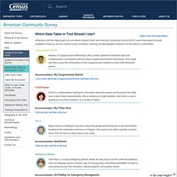
Why you may want to consider other tools: You prefer information in tabular format.Geography selection is limited depending on the mapping tool.They contain only a subset of ACS topics. Census Flows Mapper - provides maps showing county-to-county migration flows maps by various ACS characteristics. TIGER/Line Shapefiles with Selected Demographic and Economic Data - provides files in geodatabase format for GIS users to map selected ACS data. Thematic Maps - create maps using any estimate from a data table (Subject Tables, Data Profiles, Comparison Profiles, Detailed Tables) in data.census.gov. Student Designed Infographics: Process & Products.