

Worms & Germs Map: Veterinary Disease Reporting, Mapping and Trending. Death data mapped. What factors may contribute to mortality rates?
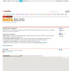
We've built this interactive tool so that you can investigate trends in your primary care trust. What have we mapped? • Deprivation: The Index of Multiple Deprivation (IMD) considers economic, social and housing issues. Higher score indicates more deprivation• Female/Male health inequality: A score which indicates the gap in life expectancy between the economically best and worst off in an area. Higher score indicates more health inequality• % deaths in usual residence: The proportion of people that die at home• Circles: Indicate the location of 14 health trusts included in the Keogh Mortality Review Download the data.
Health Map: Real-Time Sickness and Disease Reports at GermTrax. New model of disease contagion ranks U.S. airports in terms of their spreading influence. World map shows flight routes from the 40 largest U.S. airports.Image: Christos Nicolaides, Juanes Research Group Public health crises of the past decade — such as the 2003 SARS outbreak, which spread to 37 countries and caused about 1,000 deaths, and the 2009 H1N1 flu pandemic that killed about 300,000 people worldwide — have heightened awareness that new viruses or bacteria could spread quickly across the globe, aided by air travel.
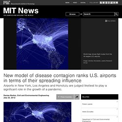
While epidemiologists and scientists who study complex network systems — such as contagion patterns and information spread in social networks — are working to create mathematical models that describe the worldwide spread of disease, to date these models have focused on the final stages of epidemics, examining the locations that ultimately develop the highest infection rates. A more realistic model However, people don't travel randomly; they tend to create patterns that can be replicated. Outsize role for Honolulu. ESRI updates geomedicine smartphone app, My Place History. Esri launched a newer version of its geomedicine app, My Place History, which includes an updated version of the US Environmental Protection Agency’s (EPA) Toxics Release Inventory (TRI) database.
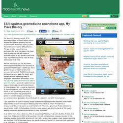
The app enables users to store a permanent list of all the places they have lived or work and the app creates a shareable report of any specific toxins that were reported within three miles of those addresses at that time. We first mentioned the Esri My Places History app last October in our roundup of geolocation health apps. X years ago, Esri’s global manager of health and human services. At the 2009 TEDMED conference, Bill Davenhall, who leads the health and human services marketing team at geographic information service Esri, made the case that adding environmental data to patients’ charts — places the patients lived, types of chemicals and particulates found in those locations’ air — could be important in improving patient care.
John Snow. Environmental Health Maps. Journals & Articles. General Outbreak Maps. Influenza Maps. SupraMap. Ticks. Dengue. Malaria Maps. The revised global yellow fever risk map and recommendations for vaccination, 2010: consensus of the Informal WHO Working Group on Geographic Risk for Yellow Fever : The Lancet Infectious Diseases. Introduction Yellow fever is an acute infectious disease caused by the yellow fever virus, a flavivirus transmitted in tropical or subtropical areas, mainly through the bite of infected Aedes spp mosquitoes in Africa or Haemagogus spp mosquitoes in South America. On both continents, both jungle (sylvatic) and urban transmission cycles exist. In the jungle cycle, the virus is transmitted between non-human primates and various mosquito species in the forest canopy. In the urban cycle, the virus is transmitted between human beings and mosquitoes (predominately Aedes aegypti) in urban areas. Tropika Tropical Disease map (flash)
Myhealthlondon GP compare site. 8 December 2011 Rebecca Todd A new website showing performance and patient satisfaction levels at London’s GP practices is being launched today.
The myhealthlondon website brings together data on a set of 22 standards developed by NHS London with Londonwide Local Medical Committees. Patients will be able to see how their practice performs against national standards such as childhood immunisations and cervical screening, as well as how they compare with other London practices. Lives on the Line. Health Indicators iPad App: Using GIS and BI to Make Sense of Health Data. This article from Critigen’s Community Health Team Leader, Kenny Ratliff, highlights what GIS can do for health data in our communities and nationally.
Ratliff reviews how Critigen’s free app for the iPad allows users to understand how traditional BI (Business Intelligence) & GIS can come together to make big data and health data meaningful to professionals and ordinary people alike. International Diabetes Federation. AIDSMap. A Graph of the Laziest Countries in the World (Hooray! We're Not #1) - Derek Thompson. Congratulations, Maltese women: You are the world's most physically inactive demographic!
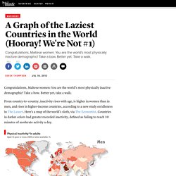
Take a bow. Better yet, take a walk. From country-to-country, inactivity rises with age, is higher in women than in men, and rises in higher-income countries, according to a new study on idleness in The Lancet. Here's a map of the world's sloth, via The Economist. Countries in darker colors had greater recorded inactivity, defined as failing to reach 30 minutes of moderate activity a day. Inactivity might rise with income, but some of the world's most inactive groups are women in countries with barriers to female employment, such as Libya and Saudi Arabia. What about America, the alleged king of couch potatoes? Find your GP. MOH/Epi. Japan mapping (Rad/Quake) Malaria Maps Survey.