
HTML DOM Style display Property. CSS Display and Visibility. CSS display property. Display: inline-block. Works (more or less) in: IE5+/Win, IE5/Mac, Op7+, Saf, Gecko 1.9+.
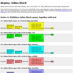
Many differences in vertical-align interpretation. Note: The first series of tests (A, B, C) have not valid HTML, since a span element is used as inline-block and there is an ul inside. This is for testing purpose, since with a span IE7-/Win works more "easily" (see below, and IE/Win: inline-block and hasLayout.) Most browsers work as desired even with the not valid HTML. Float vs. Inline-Block. Float vs.

Inline-Block This is an interesting topic for me as a web designer who is also a programmer. My mind is almost always geared toward efficiency in my work which draws me to the question which is most efficient; floating elements or making them inline and block level. I suppose these are not our only options but these are the two main methods I’ve employed when rendering my designs so these are the two I’ll write about.
Both of these methods have their flaws and quirks which present themselves uniquely in different browsers. The Float The first thing we should know about floating elements is why this method was invented in the first place. The main issue presented by floating elements is that a floated element is not automatically recognized by its containing parent element. The second and daunting issue with floats is that you can’t center floated items. What’s the Deal With Display: Inline-Block? We’ve been using floats for layout pretty much since we left tables behind.
It’s a quirky solution that can often cause troubles, but if you know what you’re doing, it works. One interesting alternative to floats that people are turning to more and more lately is to set the display value of an element to inline-block. What does this do exactly? How is it like a float? How is it different? The Display Property Web browsers render different elements in different ways. What is Inline-Block? If you’ve been developing with CSS for some time now, you’re certainly familiar with the inline-block value for the display property.
The most common use for this property/value pair is when getting IE6′s margins to behave. To briefly explain what I’m talking about, if you float an element in IE6 and give it a margin setting on the same side as the direction of the float, the margin will (strangely) be doubled. You could fix this with an IE6 hack with a margin setting that’s half the value of the original, or you could (in many cases) give the element’s display property a value of inline-block (again in an IE6-only hack or stylesheet).
This will resolve the issue in most, if not all circumstances. CSS display: inline vs inline-block. Inline & Block Elements. Assignment 1: Inline & Block Elements Do some research on inline and block level HTML elements.
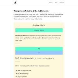
Using a little CSS for simple styles, (color, type, etc) make a visual representation of those elements and their natural behavior. CSS display: inline-block: why it rocks, and why it sucks. Usually when you want a horizontal list, you need to use float in the CSS code to make it work, with all its drawbacks.
However, there is an alternative with display: inline-block. Problems with float The problem when you have float in your CSS code is that you need to take some precaution to make the surrounding element to encompass the floated elements, and also to avoid following elements in the code to sneak up next to it. Another problem is that if you have a floated list that will take up several rows (visually speaking) and the content is of varying height, you are in for a world of hurt. Fighting the Space Between Inline Block Elements. I've seen this come up a couple of times lately on Twitter and then an interesting Dabblet so I figured it would be an important thing to document.
Here's the deal: a series of inline-block elements formatted like you normally format HTML will have spaces in between them. In other words: <nav><a href="#">One</a><a href="#">Two</a><a href="#">Three</a></nav> Will result in: We often want the elements to butt up against each other. Using Flexbox: Mixing Old and New for the Best Browser Support. Published by Chris Coyier Flexbox is pretty awesome and is certainly part of the future of layout.
The syntax has changed quite a bit over the past few years, hence the "Old" and "New" syntax. But if we weave together the old, new, and in-between syntaxes, we can get decent browser support. Especially for a simple and probably the most common use case: order-controlled grids The HTML A semantically meaningless wrapper goes around the three main areas and will set the flexbox context. Display. Every element on a web page is a rectangular box.
The display property in CSS determines just how that rectangular box behaves. There are only a handful of values that are commonly used: The default value for all elements is inline. Most "User Agent stylesheets" (the default styles the browser applies to all sites) reset many elements to "block". Let's go through each of these, and then cover some of the other less common values. A Complete Guide to Flexbox. Background The Flexbox Layout (Flexible Box) module (a W3C Candidate Recommendation as of October 2017) aims at providing a more efficient way to lay out, align and distribute space among items in a container, even when their size is unknown and/or dynamic (thus the word “flex”).
The main idea behind the flex layout is to give the container the ability to alter its items’ width/height (and order) to best fill the available space (mostly to accommodate to all kind of display devices and screen sizes). A flex container expands items to fill available free space or shrinks them to prevent overflow. Most importantly, the flexbox layout is direction-agnostic as opposed to the regular layouts (block which is vertically-based and inline which is horizontally-based). While those work well for pages, they lack flexibility (no pun intended) to support large or complex applications (especially when it comes to orientation changing, resizing, stretching, shrinking, etc.).
Basics & Terminology. Display. Learn CSS Layout.