
Big Menus, Small Screens: Responsive, Multi-Level Navigation. Responsive WordPress Menu Plugin for Mobile Devices. The Responsive Select Menu plugin lets you automatically turn your “WordPress 3 Menus” into an easy-to-scroll select box/dropdown menu.

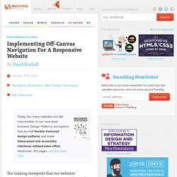
(A “WordPress 3 Menu” is a menu created through the WordPress admin area: Appearance > Menus. Many people typically use these menus in their top navigation spot, as well as other places.) The Plugin in Action Let’s go ahead and jump right into some examples to show you what it looks like. Here’s a look at a normal top menu in a mobile device using the WordPress Twenty Ten theme. And now here’s a look at that same top menu with the Responsive Select Menu plugin activated. When you touch the menu and pull it down, you get a select box/dropdown menu that you can easily scroll through with your finger. Featured Plugin - WordPress Newsletter Plugin Now there's no need to pay for a third party service to sign up, manage and send beautiful email newsletters to your subscriber base - this plugin has got the lot.
Find out more Settings Width Breakpoint See a Working Demo. Implementing Off-Canvas Navigation For A Responsive Website. Advertisement Today, too many websites are still inaccessible.
In our new book Inclusive Design Patterns, we explore how to craft flexible front-end design patterns and make future-proof and accessible interfaces without extra effort. Hardcover, 312 pages. Get the book now! The varying viewports that our websites encounter on a daily basis continue to demand more from responsive design. With the likes of Firefox OS2 (Boot to Gecko), Chrome OS3 and now Ubuntu for phones4 — an OS that makes “Web apps” first-class citizens — delivering native app-like experiences on the Web may become a necessity if users begin to expect it. A Demonstration Link In this article, I’ll be walking through a build demo that centers on two topics.
Responsive Navigation: Optimizing for Touch Across Devices. As more diverse devices embrace touch as a primary input method, it may be time to revisit navigation standards on the Web.
How can a navigation menu be designed to work across a wide range of touch screen sizes? In these demos, Jason Weaver and I decided to find out. The Demos Why do these navigation menus work across a wide range of touch screen sizes? Why do we care about touch across a wide range of screen sizes? Across Screen Sizes First, why do we care about touch across a wide range of screen sizes?
Tablets are no different. And the very notion of what defines a tablet is being challenged by laptop/tablet convertibles and touch-enabled Ultrabooks. Even beyond 13 inches, touch and gesture interfaces are possible. Accounting For Touch So what does it mean to consider touch across all screen sizes? Touch target sizes are relatively easy: just make things big enough to prevent accidental taps and errors.
These common patterns of posture create easy to hit and hard to reach touch areas. Responsive Menu Concepts. The following is a guest post by Tim Pietrusky.
I know Tim from his prolific work on CodePen and from being a helpful community member there. He wrote to me with this guest post about responsive menus which I'm more than happy to share with you below. Not only is it a timely concept, but one of the concepts improves upon a clever CSS trick we've covered here in the past. Big Menus, Small Screens: Responsive, Multi-Level Navigation.